Friday, August 10, 2012

Jean Draper and Dorothy Tucker

Two contemporary embroiderers whose work may have been influenced by Kantha embroidery - please refer to project 3 - Understanding the textile world

Jean Draper and Dorothy Tucker

Jean Draper joined TSG (Textile Study Group) in 1989, she is also a member of the 62 Group

In her Artist Statement Jean states that she mainly stitches by hand,
"The rhythm of the repetitive stitch - the gesture - is a very important aspect in the making of my work. My stitching is a form of drawing, an intensely physical activity; the actual process being as meaningful as the finished work."
The picture below shows Jean's work featured in Stitch - with the Embroiderer's Guild 
Making Waves by Jean Draper
Here she "makes waves" with a simple running stitch.
Running stitch is used in Kantha work for practical and decorative reasons.
The stitching on the cloth gives it a slightly wrinkled, wavy effect.

She is also interested in:
"how land is shaped by time and natural elements and is also affected by the generations of people who have lived, worked and left their marks upon it."
This piece is called Aftermath it represents the effects of fire on rocky hillsides.
Aftermath - Jean Draper
Kantha work has always been influenced by factors like climate and geography (amongst many others). The pictures will often 'tell a story' or depict day to day activities.
In 'Aftermath' Jean tells the story of the devastating wildfires that affected the Arizona landscape through her work.

The rhythm and the meditative quality of the stitching turns the work into something that,
 "visually resembles the surface textures of the land." 
The piece below is called Rock ruins and rock shadows - evening
Jean Draper
The surface textures of the rocks have been created by the techniques Jean uses in her stitching. As the piece has been stitched, waves and ripples appear across the surface of the fabric.

Once the work is complete she will,
"treat it with clay slip, paint and sandpaper, emulating wear and erosion, creating in the piece its own history."
In traditional Kantha work old sari's and cloth are used to create a new 'piece', the fabrics already have a story, a history.
The fabrics have an aged, soft appearance that you cannot achieve with new cloth.
Once Jean has aged her fabrics with sandpaper and clay slip they begin to tell their own story and have a history of their own.

In her interview with Workshop on the Web
Jean says herself that she wouldn't have been able to create the American south-west landscapes without her trips to India.
There she learned some of the stitching techniques that have gone on to influence her work.
In order to emulate the eroded rock structures Jean realised that she had to manipulate the fabric by changing the directions of the rows of stitching and applying more tension to those stitches.

So although not a traditional approach to Kantha work - Jean draper's stitching and the tales she tells through her work show an influence from this very beautiful folk art.


Dorothy Tucker is also a member of the TSG (Textile Study Group), joining in 1979.

In her Artist Statement Dorothy's current work is inspired by her research into traditional Kantha techniques, the designs and the stitching that are used to create quilts and throws.
"I love the tactile and visual pleasure gained from handling old worn cloth and stitching into it by hand. I find that this absorbing process expands and transforms my original drawing and leads me into finding ways to evoke what I have seen and experienced"
This echoes the traditional way of working a Kantha cloth where originally the designs were outlined using a needle and thread, focal points were then worked, followed by working motifs that 'filled in' the design. It was a way of working intuitively - the designs being developed at the pace of the stitching.

Below, the piece Marigolds is one of Dorothy's working samples which explores the translation of drawing into stitch.
Marigolds - Dorothy tucker
This piece which has it's roots in tradition is very much a contemporary piece.

Dorothy has worked in collaboration with other contemporary artists using Kantha as a theme.
Surjeet Husain and Jenny Bullen (both members of TSG) created the following pieces:
Creative Dialogue
This was their Creative Dialogue.
A sari was cut and divided into three, each of the artists then stitched their Kantha in their own style.
"Over several months of stitching, meeting together and exchanging emails, their creative dialogue turned into a celebration of how pleasure, inspiration and skills can be passed on informally from person to person."
Traditionally kantha's were not made for money, during the 1980's there was a growing interest in this type of embroidery and commercial ventures began.
Women worked together on these projects - this gained them a financial independence that they had not previously experienced.

The women would share their experience and knowledge. Some things changed with the advent of a commercial rather than a personal enterprise (designs would now be traced onto the fabrics rather than drawn by hand), however the old ways of several women working on one large piece remained unchanged.

Although Dorothy, Jenny and Surjeet's project evolved into not one large quilt, but three smaller pieces - their collaboration mirrors the work of the women stitching kantha in India. They shared their knowledge and ideas, they shared an experience together.  


Additional information gathered from:
http://en.wikipedia.org/wiki/Kantha
http://en.wikipedia.org/wiki/Nakshi_Kantha
http://www.sashaworld.com/kantha/kantha.htm
http://www.sashaworld.com/family/kantha.htm
http://kkantha.com/
http://kkantha.com/design.html
http://kkantha.com/artisans.html
http://www.craftandartisans.com/kantha-embroidery-of-west-bengal.html
http://kanthathreads.com/
http://www.philamuseum.org/exhibitions/364.html
 

Thursday, August 9, 2012

Part Three: Pausing between assignment 2 & 3

The pressure is officially now on....

Time was running out for finishing the work for this module, fortunately the OCA staff have come through and allowed me to extend the deadline. That deadline which seemed so far away at the start of the course.

I think my big mistake (yes, apart from procrastination) was not letting the staff know as soon as I encountered any problems (health and family issues, not "I just can't do it" issues.)

So, having just returned from the UK I know I have to concentrate and work hard for the next few months.

I have received good feedback on Assignment 2 and some constructive hints and tips from my tutor on how to make improvements to the work that will be presented for assessment.

So far the main pointers to look at are:
  • "your development would benefit from some opportunity to undertake practical workshops"
This will be difficult to achieve, but something I will try to book myself on over the next year - not being in the UK is a problem many of the OCA students have to contend with. A compromise to this could be setting time aside to experiment with different techniques and materials.

  • To try not to add unnecessary details to your work (the pencil shadows). Achieve a better result by concentrating on mixing the colours of the shadows with paint.

  • Read some basic design books to expand my design knowledge. (book list to follow)

Jean Draper's work will be added to the post.

  • When reviewing my work - "try to vocalise why an image works for you and not another. Trust your instincts, but always ask why."
I find this hard when I go to see an exhibition never mind when I look at my own work - this point is a real challenge.
I think I may need to take more notes as I work through an exercise.
I have always tried to say why I have chosen a certain image to work on - but realise that I forget to point out why the other images were not followed through any further. 
I try to update my blog post as soon as I finish each exercise - but even when I do that, I find time has elapsed from my first thought to finished piece.

  • Visual diary - "try to show that you are keeping a visual diary of ideas and especially sketches from what you are seeing in the visual environment."
This has been missed out so far - and I intend to address this.
I spend a lot of time thinking about things - but if I don't draw / write the ideas down - how will the tutor / assessor know that i think about design, colour, artists and textiles in ways that aren't just associated with the proscribed projects and exercises.

The suggested books are:
  • Colour and Fiber: Patricia Lambert, Barbara Staepelaere, Mary Fry
  • Kandinski: Point of line to plane
  • Basic Design: The Dynamics of Visual Form
By addressing these points I should be able to improve not only the quality of my work, but also gain a better understanding of the techniques and materials that I will be using (and get an "A"!)

Tuesday, July 3, 2012

Part Two: Project 5 - What have I achieved?

I have enjoyed project 5.

It took the drawing through to the design, and then, from the design to a finished sample in a simple progression.

Did I feel that I made a good selection from my drawings to use as source material for my design ideas?
I felt happy with the selection of drawings that I chose as source material for my design ideas.
There was a lot of potential in each of the original sketches.
I had many ideas in my head of how each drawing could develop before I started the samples, and of course the results were very different from how I imagined they would be.
I really enjoyed creating the repeat patterns, the unusual shapes that appear when reflecting and rotating the shapes added interest to the design.

Which fabrics did I choose?
I chose mostly fabrics with a smooth finish: satin and cotton.
I wanted to be able to produce a clean, crisp finish to the prints that I would be making.
I also chose neutral coloured fabrics: off-white and white, so that the print would show up clearly.
This may be something that I explore further as I work through the course.

Were the scale of the marks and shapes on my samples appropriate to the fabric? Would any of my ideas have worked better on a different type of fabric? Was I aware of the negative shapes that were forming in between the positive shapes? What elements were contrasting and what elements were harmonising in each sample? Is there a balance between the two that produces an interesting tension?
The scale of the marks and shapes on the samples were appropriate to the fabrics chosen.
I chose fabrics that were suitable for the ideas that I was working on, although sample 1 in stage 3 could have worked equally well on a sheer fabric.
I was very aware of the negative shapes that were forming in between the positive shapes - that was the aspect that I found the most exciting when developing the designs.
I found that the starfish design has the most 'interesting tension' in it: there were diagonal lines, unusual negative spaces; the lines created in the design made your eye travel to all areas of the image.

How successful do I feel my larger sample is? Do I like the design? Have I recreated or extended my ideas from the smaller samples so that there is a visible development between the two? Does my repeating design flow across the surface, without obvious internal edges? Do they make an interesting composition on this larger scale?
I really, really like my larger sample. It is not at all how I envisaged it would look.
It wasn't until I finished working on it that I realised how well the design turned out.
It is the negative spaces that make the design work; the starfish aren't the predominant image that you see when you look at it now.
I extended my ideas from the smaller sample: I kept to the same design, but developed the colour scheme.
The repeating design does flow across the surface of the fabric - there are no obvious internal edges, just lots of interesting shapes.
The composition works better on this larger scale, I think it is a very interesting composition.
                                            -----------------------------------------

The assignment is now packed in its red bag, I send it off to my tutor in the morning.
I am so glad this assignment is finished, I can't believe the amount of work that I have produced for it.
The really nice thing about collating all the work to send off to the tutor is seeing all the work together - the mountains of samples that I have made.....


Monday, July 2, 2012

Part Two: Project 5 - Stage 4

A Larger Sample

I sit looking at the range of samples that I produced for stage 3.
I enjoyed the process of making the samples and creating the designs on fabric - this was a very different experience from working with paper.

For Stage 4, I have to produce a larger sample. The choices are:

1: To make an extended version of a repeating pattern: a design that can continue beyond the edges of the sample and is not a complete unit in itself.

2: To develop an image or motif built up or extended to make a 'single unit' piece: the design will be complete within itself.

I had intended to experiment more at this stage, to work on the design in my sketchbook, to perhaps amalgamate several of the design ideas into a new motif.
After dwelling on this overnight, I decided to choose my favourite sample and work with it.
I thought I would see where the design took me.

The sample I chose to develop further was the starfish design.
The original sketch
Close up of the starfish
Starfish
Repeat pattern of the starfish
Repeat pattern of starfish: Project 4; Stage 4
Stylised design of the starfish. Based on the repeat pattern above
Stylised starfish sample: stage 3
I initially thought that I would reverse the stencil, making the background neutral and emphasising the starfish.
Looking back to the repeat pattern, I realised that what I liked most about the design was the negative shapes that were produced.

I decided to keep the stencil the same - but just make ALOT of them.
I cut out 16 stencils from sticky backed plastic.
My starfish stencils
I prepared my fabric: approximately 40cm x 40cm of off-white cotton sheeting taped on to a printing board.
I placed the stencils on top of the fabric to see how they would fit together:
The fabric allowed for 12 stencils.
I realised at this stage that each stencil did not require a frame around it, as I attached each one to the fabric I trimmed off any parts of the stencil that was not needed
Laying out the stencils
I chose the colour scheme based on this sample:
I liked the colours in this sample
I started to apply Napthol Red to the fabric.
At this stage the suggested guideline of 10 hours seemed a long way away.
Applying red Markal Stick to the design
This was where I realised just how long the project might take.
I stopped to have a tea break and to gather my thoughts.
Work in progress
Second tea break, half way through applying the background colour.
Half way through
Another tea break, at this stage I could see how well the design was working out.
Near the end ....
Having completed the bright red background, I added Dioxadine Purple, Light Gold and Pearl White to some of the shapes that were repeated throughout the design.
Adding more colours to the design
I really liked the way the colours were working, but felt it needed 'something else'.
Turquiose was added to areas in the design
Adding turquiose
I decided to see what the design looked like once the stencil was removed.
I thought it may have needed over printing with small stars.
Once the stencil was pulled away I realised my design was complete.
Finished design with stencil removed
A close up of the finished design.
Close-up of the design

I am very happy with the finished design.
The colour combination works well.
Using strong colours in the negative spaces of the design makes the design look very different to the original repeat pattern.
The starfish are now almost lost in the design.

The stencils worked well, occasionally part of the stencil would come unstuck and there are some blurred edges.
The fabric was also a good choice. The smooth finish helped produce a nice crisp design.
Markal sticks worked well to colour the fabric - the shading worked very well. Applying the initial layer of red took a huge amount of time - maybe try to learn how to use my silk screen next time.

I have such a feeling of relief that I have now completed this project - now to send off my second assignment.
                                              ------------------------------------------------
Finished page:


Sunday, July 1, 2012

Part Two: Project 5 - Stage 3

Printing and Painting on Fabric.

Having been away for several weeks, it was hard to start the course work again...
I sat, cleared a space, gathered my ideas and art supplies around me and re read the outline for Stage 3.

Stage 3 asks us to work closely with the design ideas pinned up on a board. I selected my ideas in Stage 2.
We are to experiment freely with printing and painting techniques on different fabrics and to concentrate on developing ideas rather than on producing neat, finished samples.

Working mainly with the shell images I produced the following samples.

Sample 1:
I fixed my fabric to the printing surface and cut a stencil based on my shell drawing.
I used an off-white cotton sheeting for the fabric, the smooth surface would help produce a crisp outline.
Sticky backed plastic was used for the stencil, it would adhere well to the fabric surface and prevent colour bleed. 
Stencil cut from sticky-backed plastic
I prepared several individual stencils so that I would be able to produce a multiple image of the shell.
Markal sticks were used to apply colour to the fabric surface.

Having placed the stencils on the fabric surface, Raw Umber was applied from the Markal Stick with a toothbrush.
Sample 1: repeat pattern of shells
I liked the image that was produced.
The way the Markal Stick is applied by brushing colour on to the fabric, means that you can build up depth of colour gradually. The result isn't 'flat'.
Having chosen several colours to be applied to the fabric - I like the result using just the one colour.

The problem that I encountered was that the stencil was quite delicate - it didn't stand up to repeated use.
The toothbrush was too strong a tool to brush colour onto the fabric where the stencil was fragile.
Next time I wouldn't cut as many small pieces from the stencil, this would make it stronger.
Also I would choose a softer brush to apply colour to any fragile areas.

I really like the design, it is a stylised version of the original shell.
The repeated pattern leaves areas of negative space that will be interesting to work with.

Sample 2:
I used the same materials to produce sample 2: off-white sheeting; stencil made using sticky backed plastic; markal sticks.
This time I produced a repeat image to print with rather than four individual starfish stencils
Stencil cut from sticky backed plastic
Again I limited my colour pallette to one colour: Red
Sample 2: Starfish stencil
Knowing the limitations of the stencil I brushed colour on to the fabric in smaller areas, this seemed to help keep the stencil in one piece.

I liked the result of the repeat pattern, but I think it would have been better to have the starfish as the positive image.
Although, some interesting shapes have been created using this technique.
There is some potential to develop this design further.

As a point of interest I tried overlaying the Markal sticks to see how well the colours would work.
Overlaying colours with Markal Sticks
You can achieve some really nice effects with the Markal Sticks.
The fabric hasn't lost any of it's feel by adding the colour in this way.

Sample 3:
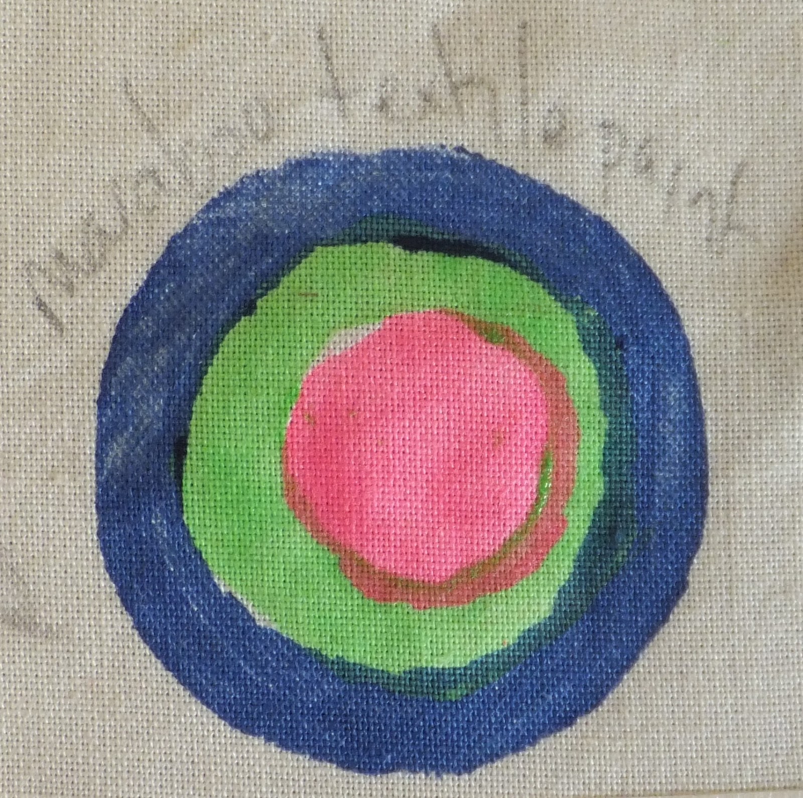
Using the round shell as inspiration I made the following stamps.
I cut out 3 different circles from dense foam (funky foam) and glued them to a stiff cardboard surface.
My intention is to use the cotton sheeting as a fabric base, and to stamp images with fabric paint.
Stamps made with funky foam on cardboard
I have some Marabu textile paint which is ready mixed.
I applied the paint with a brush and achieved the following:
Sample 3: concentric rings of fabric paint
I didn't like the result.
It may have been better if I had been able to cut the circles so that the paint didn't overlap.
I was disappointed in the thinness of the paint, it was almost translucent.
I hadn't really thought about the colour combination for this sample.

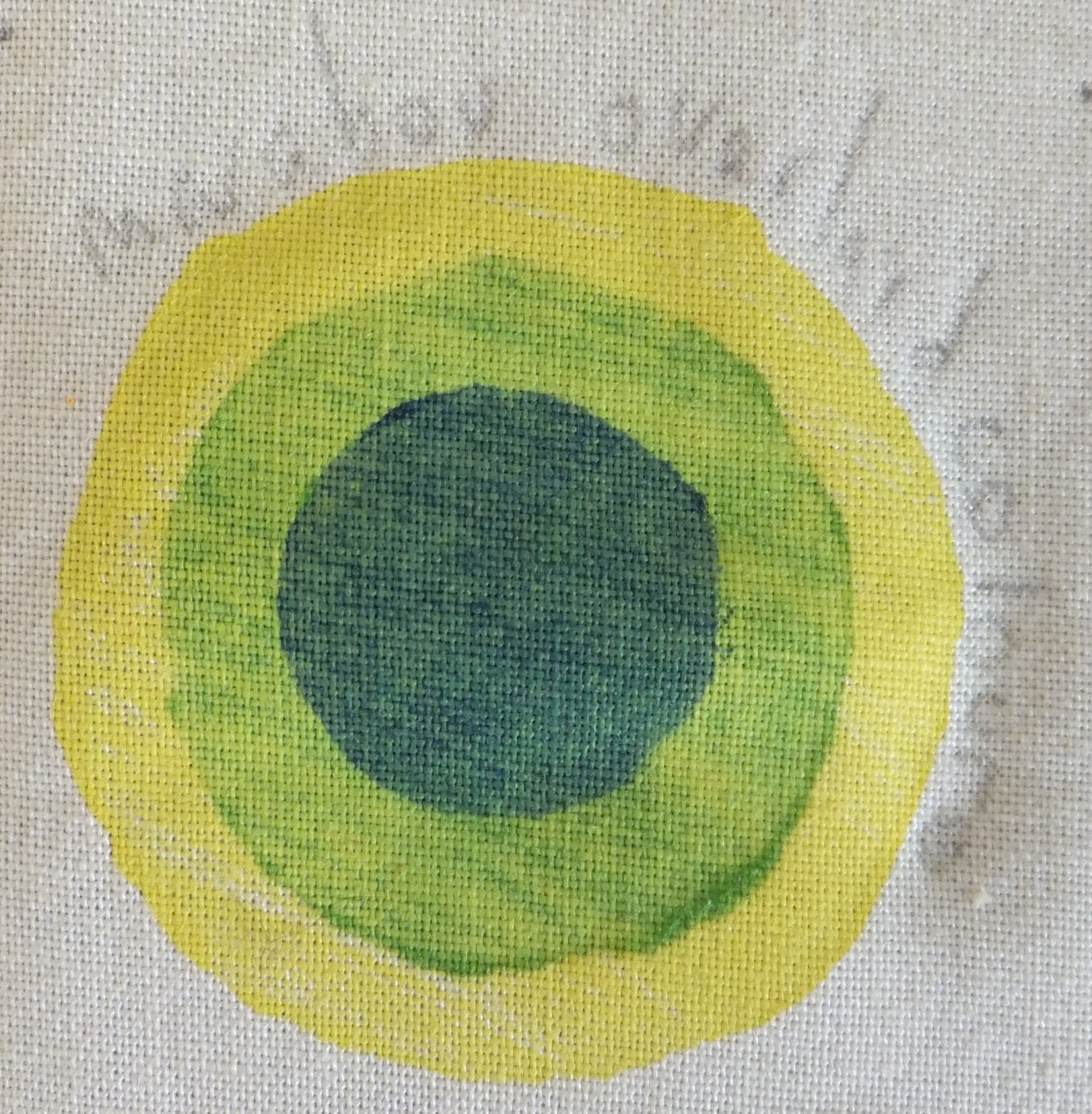
Sample 4:
I went on to make some more stamps using funky foam and cardboard.
Stamps made from funky foam on cardboard
Using the same background fabric and fabric paint, this time I was more careful in my choice of colours.
I overprinted the paints: the largest foam circle was yellow; the middle size circle was green and the smallest circle was a dark blue.
Sample 4: rings of colour.
This had a nicer finish than sample 3 - but I still didn't like the translucent finish of the fabric paint.

Sample 5:
For this sample I painted sheets of paper with transfer paint: Scarlet, orange, lime, yellow.
I cut these into circles to carry on with the design I used in samples 3 & 4.
For transfer paint you need a synthetic surface; I chose a white polyester satin.
Fabric transfer paint cut into shapes for printing
Using a second sheet of copy paper I glued the shapes in place.
I placed the paper face down on the satin and applied heat from the iron.
Transfer paint circles
This print is actually the second time the paper was used to print from.
The first print didn't work as well.
Transfer paint circles: 1st and 2nd print
The first print, on the left, I didn't leave the iron on long enough.
The colours were too pale and there are gaps in the colour from where the glue must have accidentally got on to the transfer paper.
The fabric has also been scorched where it wasn't protected from the iron.

I then tried a different colour combination.
This time I placed the shapes face down on the fabric and covered with a sheet of paper.
I was hoping to avoid scorching the fabric and the problems I had using the glue.
Transfer paint circles
This was also the second print, below are the first and second prints together (first print on left).
Transfer paint circles: 1st and 2nd print
Not fixing the shapes in place before ironing meant that the shapes were prone to moving and this created a shadow image.
It is probably better to fix the shapes in place with a dab of glue, but to be more careful in the process.

The repeat pattern using both colourways:
The repeat pattern created with transfer paint
This is a nice simple design.
I like the bright fresh colours in the sample, but I think it would also work using monochromatic colours.
I also like the smooth, shiny finish of the fabric, the design has a clean, crisp finish. 
There is again potential to develop this sample further.
                                          ------------------------------------------------------

Although I have spent the time in preparing these samples, I probably haven't been as 'free' as we were asked to be.
I am however happy with the results.

I intend to work on linking the images; to use mark making techniques; to combine images and create more interest in the finished piece in Stage 4.
I aim to develop my ideas further for a larger sample.
                                             ----------------------------------------------------

Finished Pages:


Tuesday, May 8, 2012

Part Two: Project 5 - Stage 2

Knowing that I really enjoyed the painting and printing exercises in the Interlude, why am I reluctant to select my design ideas for Stages 2 - 4?

It could be because I put my work down for a couple of weeks and lost my 'flow' - my family filled the house over Easter, I worked, and then I tidied it all away... big mistake.

It could be fear - but I thought I was over that now.

It could be the strain of a deadline nearing.. this was set by my tutor (and I am grateful to her for keeping me on track), but I also travel to the UK in a weeks time and I really want to have this finished, packed into its little red bag and sent off by then.

So, I have got out my work from Stage 4 of Project 4 and am determined to select some designs that can be translated and developed on to fabric.

Stage 2: Selecting your design ideas
Having looked at my work these are the images that I feel have potential to be worked with on to fabric.

Design Idea 1:
I really liked this image, it has already been developed from a sketch, this process was shown in this link: project 4, stage 2
Design idea 1
It developed into a really nice repeat pattern and should translate well on to fabric.
Repeat pattern

Design Idea 2:
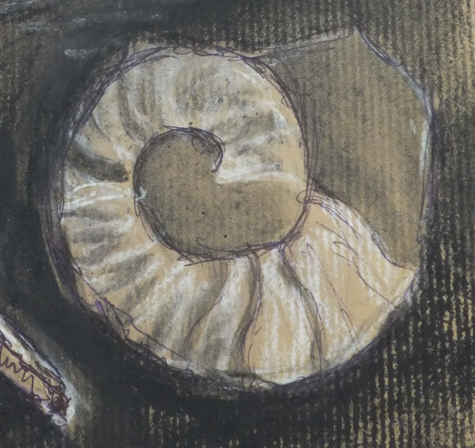
Shell 1: I like the shape, the markings and the contrasts in colour
Design idea 2
This also developed into a good repeat pattern, it has lots of potential.
Repeat pattern

Design Idea 3:
Shell 2: This shell has an interesting shape, texture and lines.
Design idea 3

The repeat pattern shows new shapes created from the negative spaces
Repeat pattern

Design Idea 4:
Shell 3: I like the texture and shape of this shell
Design idea 4
The repeat pattern shows the interesting lines and marks that were created:


Repeat pattern

I feel better for having made a decision..
I am going to start working on these designs tomorrow.

I deliberately didn't use my design ideas during the Interlude experiments so that it would make this stage clearer and less confusing..... I remember thinking that that was a really sensible idea... If only I had remembered it!!
                                                --------------------------------------------

Finished page

Monday, May 7, 2012

Part Two: Project 5 - Stage 1

Painting and Printing.
It is time to put some of my design ideas into practice by painting and and printing them.

I have practised  many painting and printing techniques during the interlude, I used block printing, relief printing, stencils, masks and hand painting.

We are now asked to remember that there are other ways of expressing design ideas other than paint and print, stitch was also used in some of the past projects. A combination of different media can be used successfully to enhance the creative work.

Stage 1 - Reviewing your Collection of Fabrics
The first instruction in this project is to "Take out your fabric collection" - this may take some time.....

We need to
  •  find at least a dozen textile surfaces on which to paint and print.
  • Spend some time handling each one.
  • Notice the particular qualities of surface and weight
We are reminded that neutral and plain coloured fabrics are best to print or paint on, and that, some fabrics have special finishes that will influence the way fabric paints are received on to the surface.

I have a large cupboard of fabrics, I had initially worried that I would not have enough choice.... until I looked through - here is what I found.

(A Note:
I have edited this post before it appeared in the blog - further down in this post I mention a site which tells you how to determine the fabric content of material by burning it.
I have just done this - I set fire to a small piece of each fabric with a lighter and noted down the different aspects of each as they burned.  I tried to note what colour the flame was, what the smell was, the type of ash produced etc.
Although I may not be completely accurate, I did have some assistance from my son as well, some of my fabrics have changed.)

Fabrics 1 - 5 (left to right
Selection 1 of fabrics from my stash

Fabric 1 - Silk
This is a soft, off-white fabric that has a sheen to it.
Closely woven - doesn't fray as easily as some fabrics will.
It is fine, smooth and slightly transparent.
I have a small amount of this fabric in my collection - but it is easily available to buy locally, both in the fabric stores as well as the craft shops.
I know from my painting experiments that it will take paint beautifully, but, not being synthetic, may not take some of the transfer paints and crayons.
Burn test: yes it is silk.

Fabric 2 - Voile
This is a crisp, pure white fabric that is prone to fraying, it has a shimmering quality.
It is fine, smooth, transparent and made from a synthetic fibre - polyester.
I have a large piece of this fabric - but it is also easily available in the local fabric stores.
The synthetic nature of this material will make it easy to cut with a soldering iron (this would also prevent it from fraying). It would also make it suitable for use with transfer paints and crayons.
Burn test: yes it is polyester.

Fabric 3 - Satin
This is a soft, supple white fabric that has a soft sheen to it.
It has a smooth finish, is opaque and made from a polyester fibre.
I have used this fabric successfully with the transfer paints/crayons in the Interlude experiments, being synthetic it would also cut well with a soldering iron.
The fabric does fray, but not excessively. It is widely available locally.
Burn test: yes it is Polyester.

Fabric 4 - Printed Satin.
This is similar to the previous fabric.
The main difference is that the fabric is printed with flowers across the surface.
The body of the fabric is shiny the flowers are dull - this should create an interesting finish when printed or painted on.
Burn test: It turned out to be nylon.

Fabric 5 - Cream silky fabric
Have just looked up a site which has information on How to determine fabric content - to ascertain what kind of fabric this is. I will be burning a piece of it later to find out.
However, it is smooth and silky and creamy in colour.
It has a synthetic feel to it, although it resembles the silk fabric when handling it - it is soft and smooth, but feels colder to the touch.
It appears to fray more easily than the silk does.
Burn test: it appears to be acetate.

Fabrics 6 - 11 (left to right)
Selection 2 of fabrics from my stash

Fabric 6 - Butter muslin
It is a fine fabric, loosely woven with a creamy colour.
A natural fibre that frays easily.
It takes paint well and will mould into shapes and texures when glue is applied to the surface.
Muslin has a nice smoothish texture.
Burn test: cotton.

Fabric 7 - Calico
This is another fabric made from natural fibres.
It has a smooth surface, but is much thicker and more tightly woven than muslin.
The colour is a natural cream.
This is a great painting and stitching surface, and should take most printing processes well - unless they require a synthetic surface. 
Burn test: cotton

Fabric 8 - Quilting quality cotton
This was sold to me as muslin for quilting.
It is 100% cotton and is a creamy colour.
This fabric is not as heavy as the calico, but will take painting and printing  and stitching processes well.
I used a similar fabric (in blue) for some of the stencil and masking techniques in the Interlude experiments.
Burn test: cotton

Fabric 9 - Cotton lawn
This is a soft, semi sheer, off-white fabric, made from natural fibres.
It has a smooth surface and is more tightly woven than the muslin fabric, but not as tight as the quilting cotton.
It would work well with paint, print and stitch techniques; as well as being suitable to layer and mould like the muslin.
Burn test: Definitely not cotton, we think this one is polyester from the amount of black smoke that appeared.

Fabric 10 - Synthetic felt.
Soft, white slightly bumpy surface.
This would work well with the transfer paints and crayons, (I have used this before), being careful not to melt/singe the fabric under the hot iron.
It is soft and would take stitching very well - depending on the type of paint used would determine whether the felt would become stiff.
Burn test: Acrylic

Fabric 11 - Quilt batting
Off-white fabric with a slightly bumpy surface.
It would work well as a surface to stitch, also to pad out a fabric surface.
This will be an interesting surface to work with as I'm not sure how the fabric would take paints and printing techniques.
Burn test: Cotton

Fabrics 12 - 16 (left to right)
Selection 3 of fabrics from my stash

Fabric 12 - linen: printed and reverse sides shown in the photograph
This has a smooth finish and a tight weave.
The fabric frays if pulled.
It is a beige fabric with printing on the surface.
It is easy to stitch and will take some of the painting and printing techniques.
Burn test: linen

Fabric 13 - Painters canvas
This is a stiff, tightly woven fabric.
It is specifically designed to take paints well, and even after washing, probably has some finishing products on the surface.
It is an ideal base fabric and is robust enough to have other fabrics and paints attached to it without warping the surface.
Hand stitching is possible, but the tight weave of the fabric will make it harder to stitch than the linen.
Burn test: cotton

Fabric 14 - Hessian
A coarse fabric that can be made softer with washing and harder when glues are applied.
It has a natural beige finish.
It has a close weave, but is an ideal painting, stitching and printing surface.
Fibres can be pulled easily from the weave, this would make it easier to thread thicker yarns through or to 'darn' with other fibres.
Burn test: this burned in a similar way to linen - hessian is a plant fibre, jute.

Fabric 15 - Scrim
This is a very loose weave fabric that is the same as hessian.
Having just looked up a description of this fabric it is referred to as: plasterers jute scrim
This fabric would not make an ideal painting and printing surface - there is not enough surface, but it could be used to mould other fabrics over, or as a surface to weave other threads and fibres through.
I have just found this link to workshop on the web which shows an interesting use of the jute scrim.
Burn test: see hessian

Fabric 16 - Fine scrim
This is another interesting product, it has a very fine thread that is woven into a loose weave fabric.
It is white in colour and seems to be used in the building and bookbinding trade.
This burned so quickly and left no ash, so it was hard to ascertain the origin of the material.
It would be similar to the jute scrim when used for textile purposes.

I intend to experiment with as many of these materials as possible in stage 3, to see how the different fabric surfaces influence the design idea.
                                                          -----------------------------

Finished page