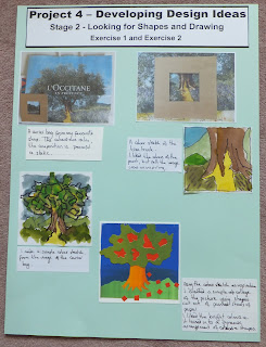
I have read Project 4 through so many times, I have had to work really hard to break down the instructions, and mainly just not to worry - follow blindly and see what happens. (this has worked for me before)
In the first part of Stage 2 I had to isolate areas of a picture that were visually interesting.
Exercise 1 takes these images and develops them further in terms of
- surface texture
- colour
- shape
I have decided to include all the work for both exercises in one post as it was hard to separate the results.
Image 1: railway station
 |
| Line drawing - railway station |
 |
| With colour and shape |
I didn't like the colours.
With this in mind I worked on the next image.
Image 2: railway station II
 |
| Line drawing: railway station |
 |
| With colour and shape |
I liked the colourway, and felt the area of this image was less cluttered and more interesting than the previous image.
I then tried the same image in brighter colours, this time using watercolour dyes.
 |
| Watercolour dyes and black marker pen |
Adding the marker pen details improved the quality and interest of the image.
Using the first colour sketch of image 2 as inspiration, I created two pieces using watercolour dye and bleach.
 |
| Piece 1: watercolour dyes and bleach |
 |
| Piece 2: watercolour dye and bleach |
The bleach worked really nicely and freely when the dye was wet.
It didn't flow as well once the dye had dried.
Image 3: Vase of flowers
 |
| Line drawing: Vase of flowers |
 |
| Collage shapes: poster paints |
Image 4: Ink and bleach page from my sketchbook.
 |
| Line drawing: ink and bleach sketch |
 |
| Colour sketch in watercolour |
It has started to look like a seascape, as if a seagull is flying across the ocean on a calm evening.
I produced a sketch concentrating on the textures of the image.
I used a mapping pen and black ink
 |
| Texture sketch: mapping pen and ink |
I had to concentrate on making the marks darker and larger in the foreground to create a sense of perspective.
I then went back to the watercolour sketch and worked on a paper cutout of the image.
I used painted sheets of paper and created a silhouette.
 |
| Silhouette |
I tried changing the colourway and cut out a repeat pattern of the image;
 |
| Repeat pattern in a new colourway |
I also knew I couldn't cut out any more intricate shapes with a scalpel.
I used the computer (PowerPoint) to create the following repeat pattern.
 |
| Repeat pattern using the computer |
I really like the pattern that was created from this design.
I also like the accidental gaps that appear in the pattern from where the pieces didn't quite fit together.
This exercise had asked to look at shape, texture and colour.
I felt that I had not included an image with which I could make a separate study of the colours.
I decided to introduce a new image.
I love the image on the carrier bag, the colours are really calm.
The composition is very peaceful and static.
 |
| Paper carrier bag |
Image 5: close up of the tree trunk.
 |
| Close up of the tree trunk |
 |
| Colour sketch of the tree trunk |
Image 6: a simple colour sketch of the image from the carrier bag.
 |
| Colour sketch of a tree |
 |
| Collage of the tree |
It was a dynamic arrangement of colours and shapes.
From this image I produced the following repeat patterns.
 |
| Mirror image reflections of the tree |
The arrangement of the shapes has the tree shape, but the small red squares on the green background are also now a significant part of the pattern.
I tried a different arrangement of the image.
I used a triangle to shape the tree and repeated the pattern until a circle was formed.
 |
| Seven triangle pieces of tree |
 |
| Connected patterns |
I then went on to mask off another area from the image on the paper carrier bag.
Image 7: Lavender field and tree
 |
| Area showing lavender and trees |
I produced a quick colour sketch in watercolour
 |
| Watercolour sketch of the lavender and trees |
 |
| Texture sketch: mapping pen and black ink |
 |
| Simple paper collage |
 |
| The colours of the tree and lavender field. |
In conclusion:
I feel I have designed and developed the images.
Some of the images lent themselves to being developed further, for instance, the last lavender sketch and the one using bleach and ink as a source.
Some of the images did not inspire me to develop them further, for instance, the close up of the tree trunk and the image inspired by the vase of flowers.
Although I have not included exercise 2 as a separate entry, I feel that the work was covered in this section.
Each design that was developed was simplified and worked on using a personal response to that particular image.
Exercise 3 continues the theme of design and development of a chosen image from this exercise.
--------------------------
Finished Pages:


No comments:
Post a Comment