Sunday, March 25, 2012

Part Two: Project 4 - Stage3

Selecting from your Drawings

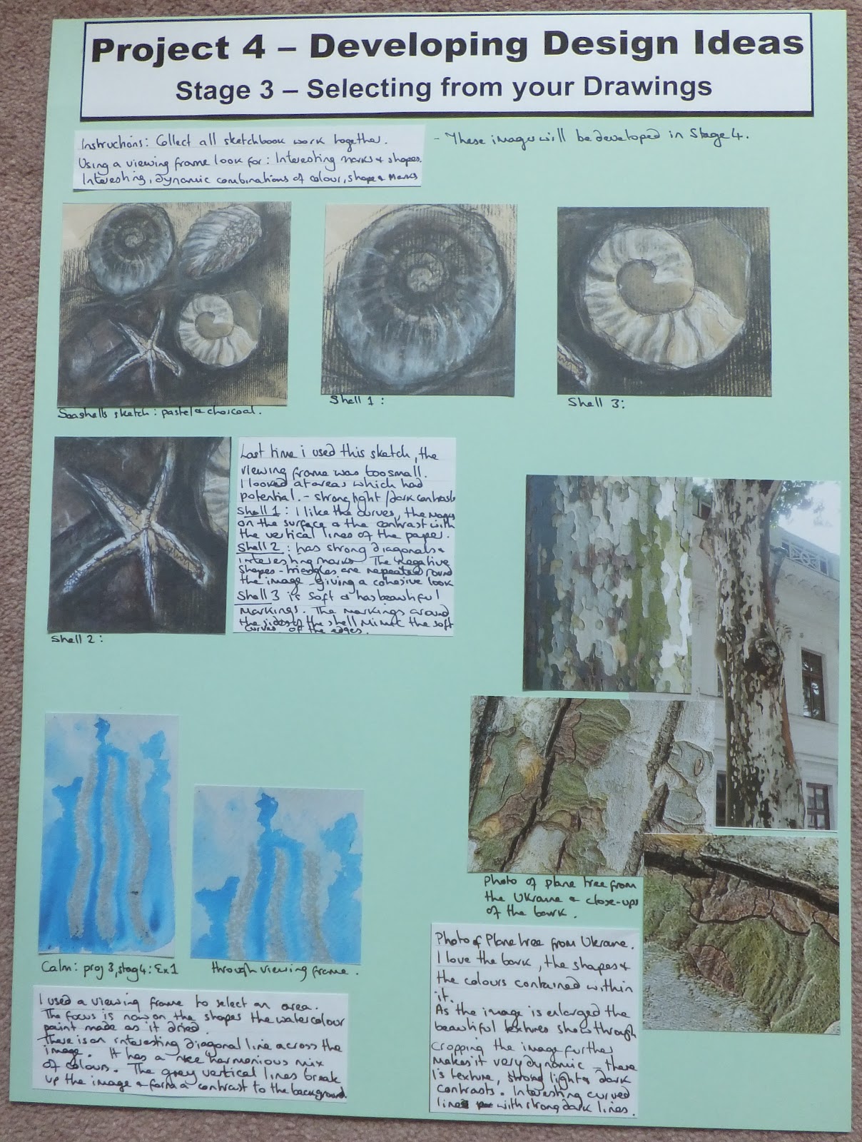
Stage 3 carries on with the idea of selecting an interesting visual image with the potential for further development.

We are to collect all drawing, colour and sketchbook work done so far.
Then, using a viewing frame, look for:
  • interesting marks and shapes contained within the area.
  • interesting, dynamic combinations of colour, shapes and marks.

There is quite a large body of work completed so far.
There are sketches I have done, work and samples produced for each of the exercises, as well as all the colour study and texture work.
Where to begin?

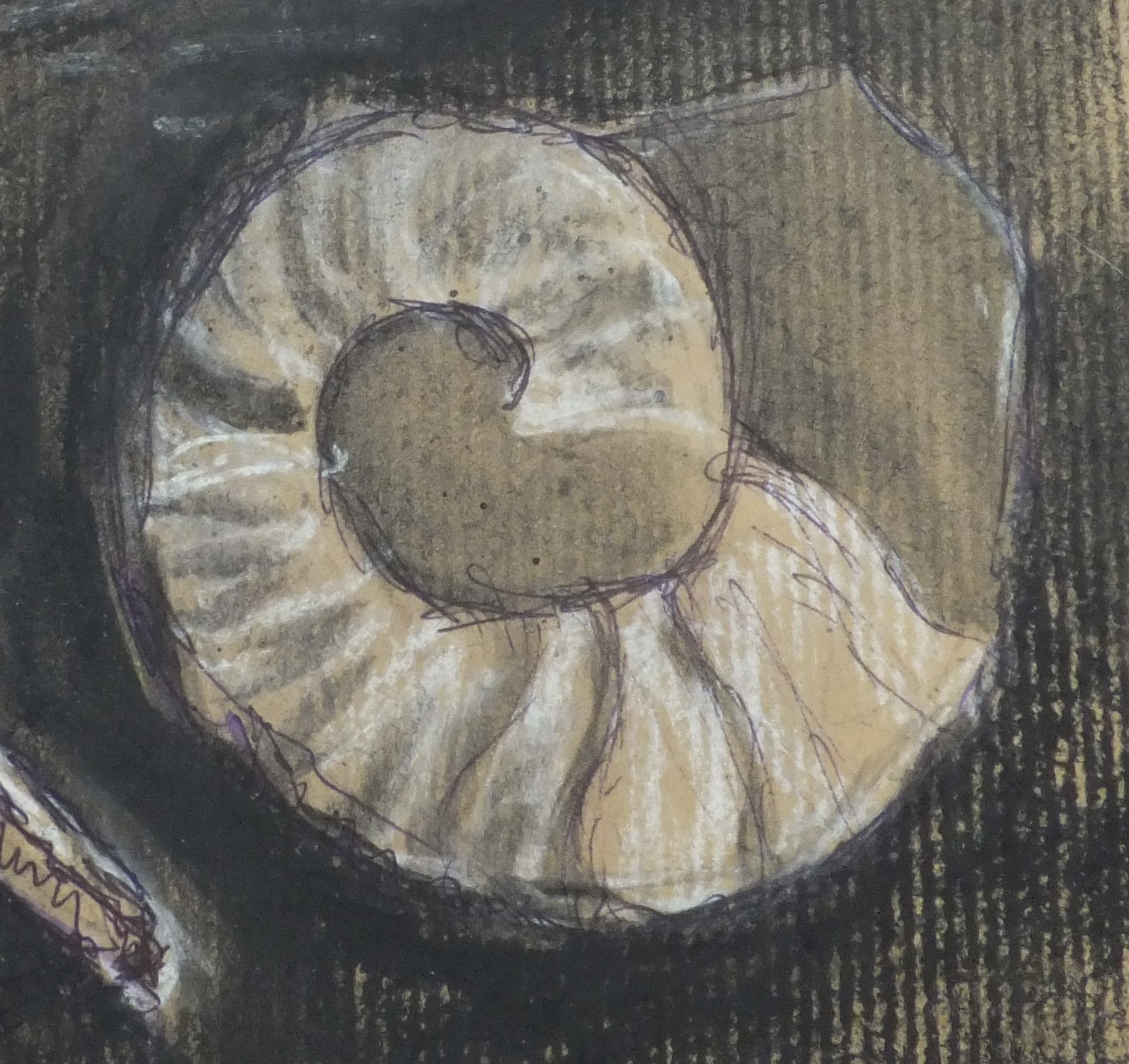
I returned to a sketch that I liked previously from project 4, stage 2.
Seashells: pastel and charcoal
When I looked at this image through a viewing frame in Stage 2, the area I chose to look at did not work.
This time I used a larger viewing frame for the picture.
This opened up the possibilities. 

I looked at the following areas which appear to have potential.
All the images have strong light and dark contrasts.

I really like the curved shape, the way the shell is rounded.
I like the marks that are laid on the surface of the image.
The soft, curving lines are in contrast to the vertical lines caused by the grain in the paper that run through the image
Shell 1

This image has a strong diagonal and interesting marks.
The negative shapes, the triangles, that form the starfish are repeated around the edges of the image, giving it a cohesive look.
Shell 2

This image is softer and has beautiful markings.
The markings around the sides of the shell mimic the soft curves of the edges of the shape.
Shell 3

I then returned to project 3, stage 4, exercise 1 to one of the samples that represented the word 'calm'.
Calm: oil pastel and watercolour
I used the viewing frame and selected the following area.
Calm: a close up
This focus is now on the shapes the watercolour paint made as it dried.
There is a diagonal line across the image, which I feel makes it more interesting.
It has a nice mix of harmonious colours, and an even mix of deep and light blue.
The vertical lines drawn in grey oil pastel break up the image and form a contrast to the painted background.

Looking through some of my source pictures I came across one of my photos that I took when we visited the Ukraine.
The Plane Tree
This tree had really beautiful bark.
I didn't have a photo which showed the bark at its best, so I found these images on the Internet.
This image was found on the following site
I love the shapes that are created naturally by the peeling bark, and the soft grey colours which are in contrast to the bright greens.
Close up of the Plane Tree bark

I then found another great close up of the bark on this site
The texture is now more evident and more dominant than the shapes from the previous image.
Detail of the bark
Cropping this image further makes it more dynamic.
There are some great textural marks within the picture.
There are strong light and dark contrasts.
I like the soft colours and the curving lines which are in contrast to the straight dark lines.
Using a viewing frame

Conclusion
These are the parts of drawings that I have chosen from my collection of work.
They are all interesting for different reasons.

Having found and selected these drawings; listing the reasons why I liked the images helped to formulate some design ideas.
I had to think about:
  • Whether it was the shape, colour or texture which was important. 
  • What it was about the composition that made it appealing
This seems to be a great way to start the design process.
I am usually guilty of envisioning a finished product before I start.

By working my way through a slightly structured investigation into an image, the results are bound to be more interesting.
It also is a great way to stimulate some inspiration and generate some new ideas.

These images are going to be developed in Stage 4.
                                                        ------------------------

Finished Page:

Saturday, March 24, 2012

Part Two: Project 4 - Stage2: Exercise 4

Looking for Shapes and Drawing 

Exercise 4 asks us to apply everything we have learned so far in order to draw from real objects. 

Instructions:
Find a collection of objects that are visually stimulating and group them in a way that looks interesting.
Then make a series of studies separating shapes, colours and textures.
Use any media and work on a scale that feels comfortable.

Remember:
  • to have a point of view or attitude when drawing.
  • to be aware of what is interesting about the group of objects.

The group of objects I chose were things that we have been using to create the work for each project.
These were: a machine embroidery hoop; a scalpel: large scissors; small scissors; a pencil; a rotary cutter; a paintbrush and a tube of glue.
The group of objects that I chose for Exercise 4
I rearranged the objects and drew the outlines of each object.
I was most interested in the shapes that would be created by the interlocking and overlaying of these objects.
The outlines of each object.
In order to try and see the negative spaces I made a monochromatic study of the group.
This enabled me to see the shapes contained within the arrangement, but I felt I needed to explore the design more.
Monochromatic study
I wasn't particularly interested in recording the real colours of the objects, so I produced a warm and a cool study of the arrangement.

So that I would not just see the real objects contained within the sketch, I painted according to the following rules:
  • Include all the lines of the objects.
  • Change colours each time a line is crossed.

Warm colour study:
With warm colours
Cool colour study:
With cool colours
I liked both of these colour studies and felt the warm colours were more successful.

Abstracting the shapes within the image helped me to see the different areas that were contained within the design.
The objects were no longer identifiable as individual, real looking items.

I liked these watercolour sketches but still felt I had not pushed the original image, the design had not developed.

I used a viewing frame against the original line drawing to isolate an interesting area.
I liked the strong shapes that were contained within this image.
Close-up of a section: Scissors and glue
I used some of the shapes that were contained within the above image to create a repeat pattern.
Using felt pens I used muted colours to see if the pattern worked.

Repeat pattern using shapes
Although I felt the design had some merit, I didn't think that I had taken it far enough.

I took the original line drawing and used it to make a stylised sketch.
I now had a more interesting arrangement of shapes to work with.

A stylised sketch of the line drawing.
I took a section from this drawing and painted the shapes contained within it, using black as a background.

Colour sketch in acrylics
I liked the shapes in the arrangement.
I was unhappy with the colours against the black background
I was also unhappy with the composition, I felt it was too cluttered.

I knew I had to narrow down the choice of shapes that I wanted to use.
I also needed to experiment with the shapes and the colour of the background.

I played with the layout of two of the shapes and the concept of using white as a background.
I used a strong alizarin crimson for one shape and a soft pink for the other, against the white background the difference in the colours was lost.
It still felt a little flat.
Shapes against a white background
I placed the shapes against a black background.
The difference in the colours of the shapes showed up better, but it still didn't work.
It felt dull and too minimalist.

Shapes against a black background.
I then painted a sheet of paper in shades of green, from bright to dark.
I hoped that the complementary colour would brighten up the composition.
I knew I had to think about adding some more shapes to the arrangement.


I was happier with the new arrangement.
I liked the effect of using two shades of green in the background.
The addition of the extra shapes helped to unify the composition.
With a green background

Conclusion:
I liked my final design and I enjoyed the design process.

My final image did not resemble, but was based on my original line drawing of familiar artist tools.

My emphasis throughout the drawing and design process had been the shapes and the colours.

When you look at the image your eye looks around the whole picture, it is unable to settle in any one place.

The final design was no longer static and dull, but vibrant and dynamic.
The colours were eye-catching.

I now feel more confident about my ability to design and develop a piece of work.
                                                          -------------------------
Finished Pages:


Tuesday, March 20, 2012

Part Two: Project 4 - Stage 2: Exercise 3

Looking for Shapes and Drawing 
So far, in project 4 we have looked at composition and developed a design.
I have looked and worked on the colour, shape and texture of an image.
 
Exercise 3 takes the development stage further.
We are to make three more drawings based on the drawing that has been finished in exercise 2.
Trying out:
  • dry media - colour pencils, crayons, pastels
  • wet media - gouache, watercolour, ink
  • collage materials
I have decided to use the collage I made in response to the lavender fields as the drawing that I will develop.
I liked the shape of the row of trees; the way the line is drawn across the page where the trees meet the sky.
Collage of lavender fields and trees
 I also liked the textures that were drawn in the texture study:
Texture study: lavender fields

Image 1: 
I started by concentrating on the shape.
I decided to make a monochromatic study to emphasise this aspect.

Originally I painted black acrylic ink onto a heavy weight cartridge paper.
The black acrylic ink looked quite flat at this stage - whenever I have used Indian Ink or Quink Ink, the finish has always had a sheen to it.
I decided to introduce white acrylic ink drawn with a mapping pen.
I also added more lines and marks in black ink, to the central white area of the image.
Image 1: Black and white acrylic inks
I really liked the outcome of the piece.
I viewed the image from another angle, and it began to resemble a torso.
Image 1: Rotation
The lines that run down the centre could almost represent a spine.
The marks that move out from the centre might represent the nervous system
Using white ink at the edges of the image helped to emphasise the shape.
The image no longer looked flat.

Image 2:
I used the same shape as before.
It worked really well for the first sample.
This time I used black Quink Ink and bleach.

Using bleach with this particular ink helps to separate the pigments contained within the black ink.
Once the bleach is added, a sepia colour begins to appear.
Using the bleach when the ink is wet creates a softer line; a much crisper line is produced if you add the bleach when the ink is dry.
Image 2: Black Quink Ink and bleach
I also liked the outcome of this piece.
Adding bleach to the ink at the top and bottom of the piece helped to soften the edges.
It almost created a 'glow' around the central shape.

I decided to view the second image from another angle:
Image 2: Rotation
This image also resembled a torso.
The bleached marks that had looked like reflected trees, started to look like the spine and nervous system when viewed from this direction.

Image 3:
Using the same image with a dry media - charcoal.

Charcoal was smudged away from the edge of a paper stencil.
I deliberately left a gap around the central shape, as well as in the centre of the image.
Image 3: Charcoal
The image that was produced using this technique is very dramatic.
The white areas really emphasise the shape.
The central white line helps to draw the eye in.

In conclusion:
I thought I had exhausted the development of this image when I worked my way through exercises 1 and 2.

I am really glad I continued to experiment with different media, this exercise has resulted in the creation of a very different image to the one I started with.

It is a much stronger piece than the images I originally produced.
                                                            -------------------

Finished Page:

Monday, March 19, 2012

Part Two: Project 4 - Stage2: Exercise 1 & 2

Looking for Shapes and Drawing 

I have read Project 4 through so many times, I have had to work really hard to break down the instructions, and mainly just not to worry - follow blindly and see what happens. (this has worked for me before)

In the first part of Stage 2 I had to isolate areas of a picture that were visually interesting.

Exercise 1 takes these images and develops them further in terms of 
  • surface texture
  • colour
  • shape
Exercise 2 then goes on to study an image in further detail, working on a personal response to one of the images.
I have decided to include all the work for both exercises in one post as it was hard to separate the results.

Image 1: railway station
Line drawing - railway station
I added colours using felt pens (Lyra Aquabrush)
With colour and shape
I wasn't sure that I really liked the result that the pens produced.
I didn't like the colours.
With this in mind I worked on the next image.


Image 2: railway station II
Line drawing: railway station
I added colours using felt pens - this time I chose a quieter colourway
With colour and shape
I still didn't really like the effect of the pens.
I liked the colourway, and felt the area of this image was less cluttered and more interesting than the previous image.


I then tried the same image in brighter colours, this time using watercolour dyes.
Watercolour dyes and black marker pen
I like the effect of the paint, it has a nicer quality than the pens.
Adding the marker pen details improved the quality and interest of the image.

Using the first colour sketch of image 2 as inspiration, I created two pieces using watercolour dye and bleach.
Piece 1: watercolour dyes and bleach
I liked the effect of the bleach on the dye, but felt that by turning the curved lines into leaf shapes I had lost sight of the source picture.
Piece 2: watercolour dye and bleach
I liked the outcome of this experiment with bleach better.
The bleach worked really nicely and freely when the dye was wet. 
It didn't flow as well once the dye had dried.
 
Image 3: Vase of flowers
Line drawing: Vase of flowers
I painted sheets of paper with poster colour and cut out collage shapes to represent the image.
Collage shapes: poster paints
I liked the colours and the flat, matt effect of the paints, but I felt the image produced was visually uninteresting.


Image 4: Ink and bleach page from my sketchbook.
Line drawing: ink and bleach sketch
I added cool colours in watercolour paint.
Colour sketch in watercolour
This image hasn't lost any interest by adding colour.
It has started to look like a seascape, as if a seagull is flying across the ocean on a calm evening.

I produced a sketch concentrating on the textures of the image.
I used a mapping pen and black ink
Texture sketch: mapping pen and ink
I really like the mapping pen sketch. 
I had to concentrate on making the marks darker and larger in the foreground to create a sense of perspective.


I then went back to the watercolour sketch and worked on a paper cutout of the image.
I used painted sheets of paper and created a silhouette.
Silhouette
This has changed the image - the shapes are suddenly more important.


I tried changing the colourway and cut out a repeat pattern of the image;
Repeat pattern in a new colourway
Having tried this, I knew I preferred the original colourway.
I also knew I couldn't cut out any more intricate shapes with a scalpel.


I used the computer (PowerPoint) to create the following repeat pattern.
Repeat pattern using the computer

I really like the pattern that was created from this design. 

I also like the accidental gaps that appear in the pattern from where the pieces didn't quite fit together.


This exercise had asked to look at shape, texture and colour.
I felt that I had not included an image with which I could make a separate study of the colours.
I decided to introduce a new image.

I love the image on the carrier bag, the colours are really calm.
The composition is very peaceful and static.

Paper carrier bag

Image 5: close up of the tree trunk.

Close up of the tree trunk
I produced a colour sketch:
Colour sketch of the tree trunk
I liked the colours and the paint used to create the colour sketch, but felt the image was uninspiring.


Image 6: a simple colour sketch of the image from the carrier bag.
Colour sketch of a tree
Using this image as visual information, I created a simple collage of the picture using shapes cut out of painted sheets of paper.
Collage of the tree
I liked the very bright colours that I used in the collage.
It was a dynamic arrangement of colours and shapes.


From this image I produced the following repeat patterns.
Mirror image reflections of the tree
This changed the look of the piece. 
The arrangement of the shapes has the tree shape, but the small red squares on the green background are also now a significant part of the pattern.


I tried a different arrangement of the image.
I used a triangle to shape the tree and repeated the pattern until a circle was formed.
Seven triangle pieces of tree
I then repeated the shape and connected the pieces together.
Connected patterns
I liked the results of the patterns that were created, the way the shapes and colours worked when connected and arranged together.

I then went on to mask off another area from the image on the paper carrier bag.

Image 7: Lavender field and tree
Area showing lavender and trees
I thought I would try to work with a peaceful and static composition

I produced a quick colour sketch in watercolour
Watercolour sketch of the lavender and trees
I then produced a texture sketch of the image using a mapping pen and black ink.
Texture sketch: mapping pen and black ink
 Using the colour sketch as inspiration, I produced a simple collage of the image
Simple paper collage
Finally I looked at the colours contained within the masked area and recorded them.
The colours of the tree and lavender field.


In conclusion:
I feel I have designed and developed the images.

Some of the images lent themselves to being developed further, for instance, the last lavender sketch and the one using bleach and ink as a source.

Some of the images did not inspire me to develop them further, for instance, the close up of the tree trunk and the image inspired by the vase of flowers.


Although I have not included exercise 2 as a separate entry, I feel that the work was covered in this section.
Each design that was developed was simplified and worked on using a personal response to that particular image.


Exercise 3 continues the theme of design and development of a chosen image from this exercise.
                                                              --------------------------

Finished Pages: