Having completed the stitched sample for exercise 2, we are required to find a drawing with pastel colours to develop in terms of image making.
I spent some time before starting to work on this sample looking through Gwen Hedley's book, 'Drawn to Stitch'.
I felt this would help me concentrate on the design process in an ordered way.
I looked through several of the projects for inspiration, in terms of what I should look for when selecting an image and in terms of how to begin the design process.
I also looked at my book of Audrey Walker's work, which has beautiful examples of her stitched pictures.
 |
| Audrey Walker: Eve 2000 |
If you haven't seen her work before, click here
There are also images of her paintings and drawings, these are just as delicate as her stitched work.
The marks she makes in her drawings almost resemble stitches.
I have looked through my range of sketches and drawings and settled on this image to work with for the last part of exercise 2. This image was featured earlier in this blog.
 |
| Project 1: Stage 3; Exercise 1 |
I used a viewing frame to isolate potential areas for development.
 |
| Areas isolated from the image above |
From these 6 areas I chose the following area to develop into a stitched sample.
It has directional lines: areas of contrast where lights areas are next to dark.
 |
| The chosen image |
I worked in my sketchbook first and created a drawing using colour pencils.
I enjoyed making the sketch, I made stitch-like marks on the surface of the paper.
This process helped me to understand the image I had chosen - the colours that would be used and where they would be placed; the areas that would be worked heavily with stitch, versus the areas that would be sparsely stitched.
 |
| Sketch completed using colour pencils |
I took a photo of the sketch with the pencils used alongside.
 |
| Sketch with colour pencils |
From this image I made a thread wrap in order to have a colour reference to relate to.
This enabled me to separate the threads with which I would be using to create the sample.
 |
| Thread Wrap |
I taped some off-white fabric to a board and marked out the area that I was going to work within.
My intention was to make two different samples from the image:
- Use a fabric background on which to apply papers, then stitch.
- Use a paper background on which to apply fabrics, then stitch.
I then prepared different papers to use during this exercise: newspapers and tissue paper painted with different coloured inks.
 |
| Preparing papers for the stitch sample |
Stage 1:
I applied some of these papers to the fabric base using acrylic gloss medium.
This has an adhesive quality as well as being an excellent acrylic paint medium.
Inks were applied to the wet surface with a brush and a stick.
 |
| Stage 1 - inks applied to the wet surface |
Stage 2:
White acrylic ink was then brushed onto the lightest areas.
 |
| Stage 2 - applying white acrylic ink |
Stage 3:
Starting the stitching: random cross stitches were worked in white (crochet cotton and machine threads) and grey (stranded cotton)
 |
| Stage 3: starting to stitch |
Stage 4:
Continuing to stitch: Adding a lighter grey (stranded cotton), a darker grey (stranded cotton) and black (machine thread). The stitches I used were cross stitches, running stitches and romanian couching.
 |
| Stage 4: building up the light and dark areas in stitch |
Stage 5:
While building up the light and dark areas, adding more definition and shade; a light purple stranded cotton is added using cross stitch where the purple ink was applied
 |
| Stage 5: adding colour to the sample |
It was at this stage that I started to worry whether I had made the right choice of image to work on.
It suddenly seemed a complicated image, the colours weren't working, it looked 'flat'.
I walked away, had a cup of tea and came back to the sample.
I had spent some time by this stage working on the image, surely I would be able to make it work?
Having looked around (under things, on top of shelves, in cupboards) I found a stash of yarns.
 |
| An unruly collection of threads |
New colours to add warmth and depth to the stitched sample.
Stage 6:
Adding warmth to the sample: pinks, blues and lilac are used in the colour mixing.
This helped to bring the sample to life.
The mid grey threads had flattened the sky, adding a warm blue started to add perspective and interest to the image.
 |
| Stage 6: adding more colour and warmth to the sample |
Stage 7:
I continued to add more shades of blue, purple, grey and pink to the sky area of the picture.
I was using larger, heavier, darker layers of stitch at the top of the image and smaller, lighter layers nearer the horizon.
This method would ensure that the sky would be in perspective - the top of the sky would come towards the eye, the horizon would appear to be further away.
Silver threads were also stitched near the top of the sky - the metallic sheen drawing the eye to it.
 |
| Stage 7: Adding layers of colour, introducing silver. |
Stage 8:
Many hours and cups of tea later....... it is finished!
Gold thread was introduced - it was warmer in colour than the silver and really drew the eye towards it.
More layers of colour and stitching were added.
Really nice shades and tones of colours were achieved by adding different combinations of coloured threads.
I added a bright yellow and white near to the horizon which gave the impression of the sun rising.
The horizon still receded into the distance because the stitches were very small, seed stitch was used.
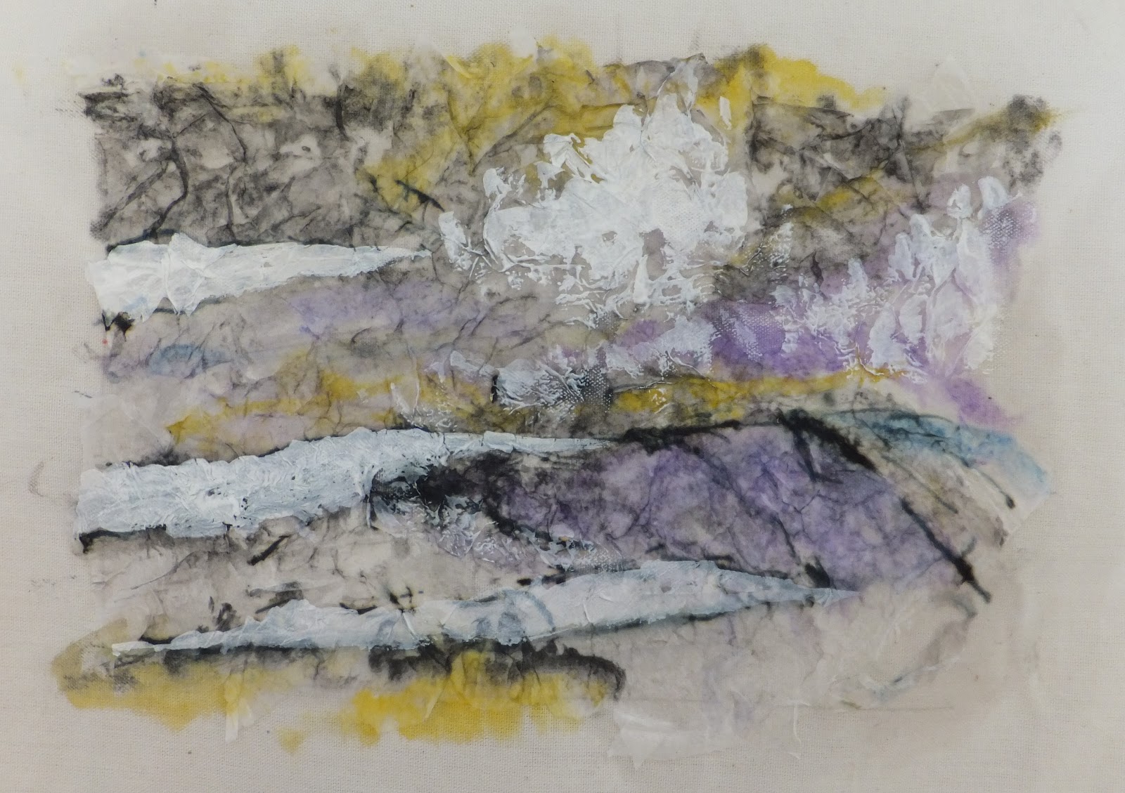
 |
| Stage 8: The finished sample |
The finished sample: a scan
The scan shows the stitches and colour combinations clearly, by this stage it was difficult to use the camera: my hand was aching and the camera shaking (even when I used the tripod)
 |
| Scanned image of the finished sample |
I decided at this stage not to work on a second sample, although it could be a later project. One that I will attempt when my hand recovers from the sheer quantity of stitching that I undertook this week.
Conclusion:
I created a stitched sample that had been developed from an image in my sketchbook work.
Perspective was achieved through the use of colour and mark making with ink and stitch.
The colour mixing was successful I was confident in using different combinations of colour that were then worked in stitch.
The exercises in Stage 6 really helped my understanding of colour theory.
I was able to look critically at my colour choices adjusting the colours of thread if the desired result was not achieved.
Taking photographs of the sample as the work progressed really helped me to 'see' my work through another medium, it was also a good way of keeping a record of the stages the sample went through.
What I learned:
That I should have paid more attention to the research I undertook before I started to sketch.
The samples in 'Drawn to Stitch' are a manageable size - most are the size of a luggage tag.
I created an area the size of a paperback within which to work - this, as I found out the hard way, was too large an area to hand stitch.
I am happy with my finished sample, but in the future I will try to keep the work smaller.
This will ensure my time is managed better and the strain on my hand will be less.
--------------------------------
Finished pages:
 |
| Developing an image 1 |
 |
| Developing an image, final piece |
No comments:
Post a Comment