Having been away for several weeks, it was hard to start the course work again...
I sat, cleared a space, gathered my ideas and art supplies around me and re read the outline for Stage 3.
Stage 3 asks us to work closely with the design ideas pinned up on a board. I selected my ideas in Stage 2.
We are to experiment freely with printing and painting techniques on different fabrics and to concentrate on developing ideas rather than on producing neat, finished samples.
Working mainly with the shell images I produced the following samples.
Sample 1:
I fixed my fabric to the printing surface and cut a stencil based on my shell drawing.
I used an off-white cotton sheeting for the fabric, the smooth surface would help produce a crisp outline.
Sticky backed plastic was used for the stencil, it would adhere well to the fabric surface and prevent colour bleed.
 |
| Stencil cut from sticky-backed plastic |
Markal sticks were used to apply colour to the fabric surface.
 |
| Sample 1: repeat pattern of shells |
The way the Markal Stick is applied by brushing colour on to the fabric, means that you can build up depth of colour gradually. The result isn't 'flat'.
Having chosen several colours to be applied to the fabric - I like the result using just the one colour.
The problem that I encountered was that the stencil was quite delicate - it didn't stand up to repeated use.
The toothbrush was too strong a tool to brush colour onto the fabric where the stencil was fragile.
Next time I wouldn't cut as many small pieces from the stencil, this would make it stronger.
Also I would choose a softer brush to apply colour to any fragile areas.
I really like the design, it is a stylised version of the original shell.
The repeated pattern leaves areas of negative space that will be interesting to work with.
Sample 2:
I used the same materials to produce sample 2: off-white sheeting; stencil made using sticky backed plastic; markal sticks.
This time I produced a repeat image to print with rather than four individual starfish stencils
 |
| Stencil cut from sticky backed plastic |
 |
| Sample 2: Starfish stencil |
I liked the result of the repeat pattern, but I think it would have been better to have the starfish as the positive image.
Although, some interesting shapes have been created using this technique.
There is some potential to develop this design further.
As a point of interest I tried overlaying the Markal sticks to see how well the colours would work.
 |
| Overlaying colours with Markal Sticks |
The fabric hasn't lost any of it's feel by adding the colour in this way.
Sample 3:
Using the round shell as inspiration I made the following stamps.
I cut out 3 different circles from dense foam (funky foam) and glued them to a stiff cardboard surface.
My intention is to use the cotton sheeting as a fabric base, and to stamp images with fabric paint.
 |
| Stamps made with funky foam on cardboard |
I applied the paint with a brush and achieved the following:
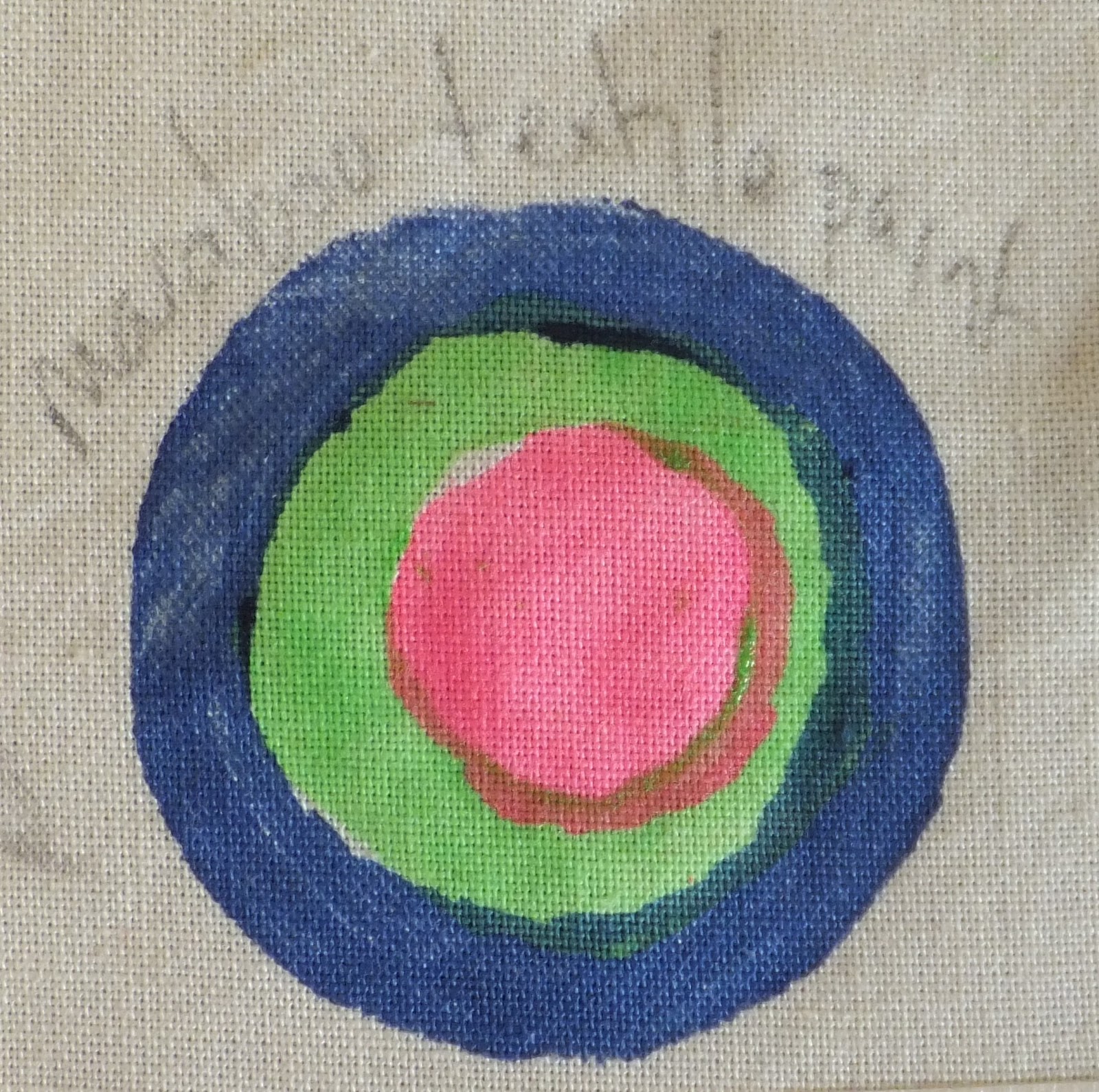 |
| Sample 3: concentric rings of fabric paint |
It may have been better if I had been able to cut the circles so that the paint didn't overlap.
I was disappointed in the thinness of the paint, it was almost translucent.
I hadn't really thought about the colour combination for this sample.
Sample 4:
I went on to make some more stamps using funky foam and cardboard.
 |
| Stamps made from funky foam on cardboard |
I overprinted the paints: the largest foam circle was yellow; the middle size circle was green and the smallest circle was a dark blue.
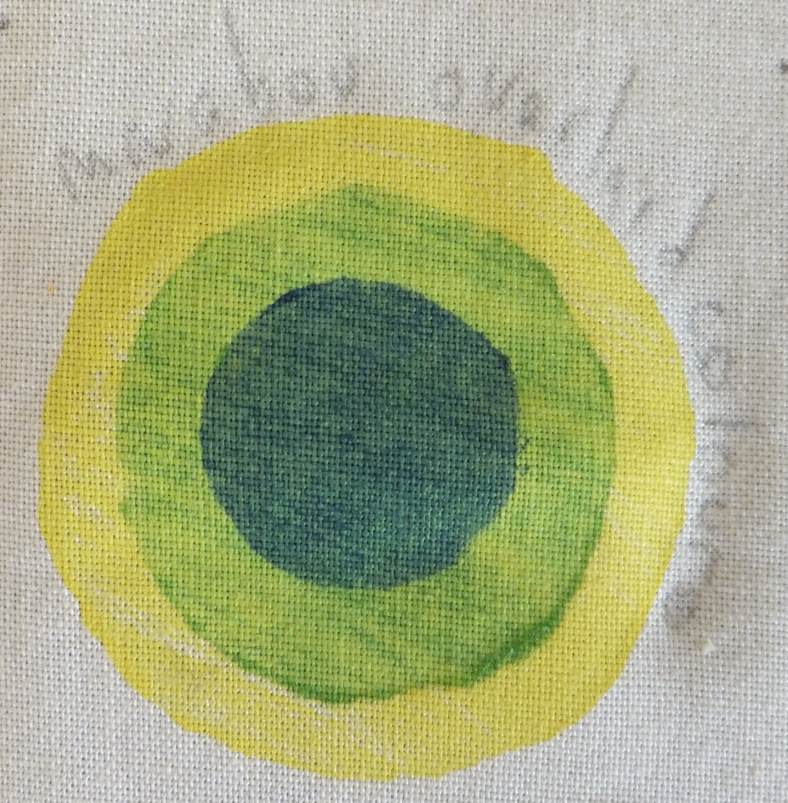 |
| Sample 4: rings of colour. |
Sample 5:
For this sample I painted sheets of paper with transfer paint: Scarlet, orange, lime, yellow.
I cut these into circles to carry on with the design I used in samples 3 & 4.
For transfer paint you need a synthetic surface; I chose a white polyester satin.
 |
| Fabric transfer paint cut into shapes for printing |
I placed the paper face down on the satin and applied heat from the iron.
 |
| Transfer paint circles |
The first print didn't work as well.
 |
| Transfer paint circles: 1st and 2nd print |
The colours were too pale and there are gaps in the colour from where the glue must have accidentally got on to the transfer paper.
The fabric has also been scorched where it wasn't protected from the iron.
I then tried a different colour combination.
This time I placed the shapes face down on the fabric and covered with a sheet of paper.
I was hoping to avoid scorching the fabric and the problems I had using the glue.
 |
| Transfer paint circles |
 |
| Transfer paint circles: 1st and 2nd print |
It is probably better to fix the shapes in place with a dab of glue, but to be more careful in the process.
The repeat pattern using both colourways:
 |
| The repeat pattern created with transfer paint |
I like the bright fresh colours in the sample, but I think it would also work using monochromatic colours.
I also like the smooth, shiny finish of the fabric, the design has a clean, crisp finish.
There is again potential to develop this sample further.
------------------------------------------------------
Although I have spent the time in preparing these samples, I probably haven't been as 'free' as we were asked to be.
I am however happy with the results.
I intend to work on linking the images; to use mark making techniques; to combine images and create more interest in the finished piece in Stage 4.
I aim to develop my ideas further for a larger sample.
----------------------------------------------------
Finished Pages:


No comments:
Post a Comment