In Exercise 2 we are asked to identify a colour mood or theme that we feel drawn to.
We are to ask ourselves the following questions:
Do I like tones of all one colour?
Do I like strongly contrasting colours; hot or cold colours?
Do I like sunsets, landscapes or seascapes?
With answers to these questions in mind, we are to find an image, or collection of images, to illustrate our theme.
Easy!
Then I realised that I'd better think about the answers to some of those questions, especially if a future piece of work depends on my choice.
So, before I started to look for images I thought "What do I think I like?"
I like bright, contrasting colours; I like warm colours...
After all, if I buy a dress I try to buy it in pink or orange or red (often it has to be black though).
If I buy fabric for quilting I intend to buy soft, sober, 'grown-up' colours and prints.... though what comes home in the bag is usually bright, cheery, 'un-grownup' colours - lime, turquoise, orange, pink.
With this in mind I looked about my house, at the pictures I have on my walls, at the books on my shelves, to see which colours I like to have about me.
Rugs: I have collected a 'few' rugs.. silk rugs, wool rugs; from Iran, Pakistan, Afghanistan... they are all beautiful.
The colours are bright, but soft. They have been dyed with vegetable dyes, so the colours are more natural.
The image below shows part of a floor runner, made up of four panels, each of a different design.
The colours are soft, warm and bright - the colours also change during the day, depending on the light.
 |
| A small section of a runner |
Paintings:
This is a painting I bought at a local exhibition, by watercolour artist Mohammed Saihati.
The colours are warm and bright, orange sits happily next to blue.
 |
| Perfume Bottle: Mohammed Saihati |
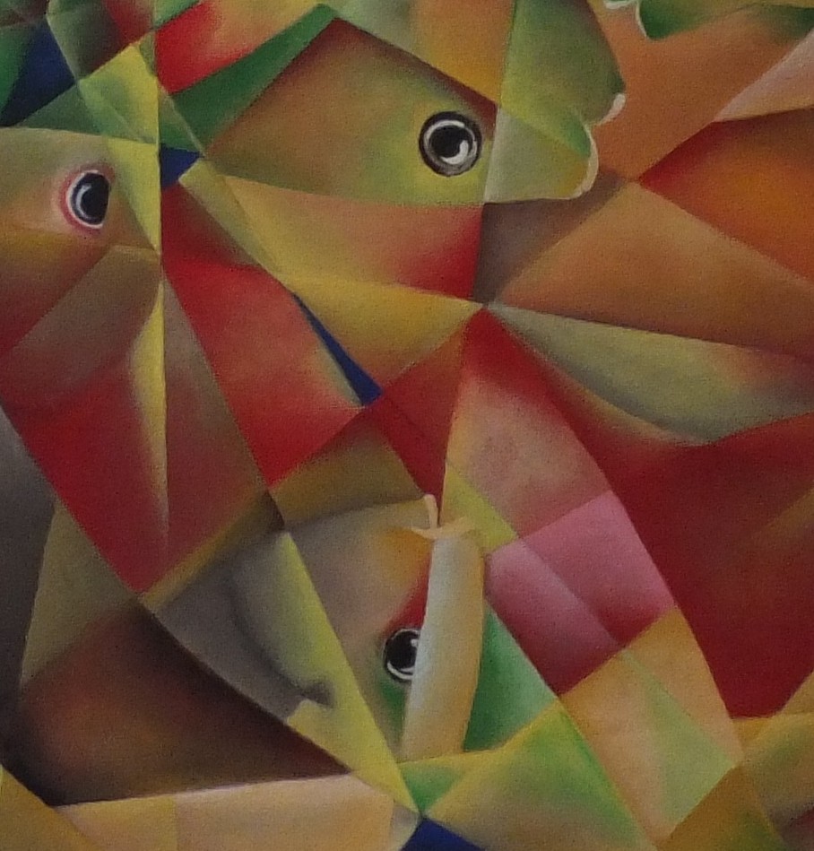
This is the first painting I bought from artist Larry Carumba.
It's a painting that first appears to be browns and golds with white, but there are splashes of red and blue as well.
It's a complex painting, I can look at it for hours and still see something new (unless I have to do my coursework).
 |
| Abstract Fish: Larry Carumba |
We loved his first picture so much we bought a second..
The colours in this are so bright, like jewels, almost the whole of the colour wheel is contained in this one picture.
 |
| Abstract Fish: Larry Carumba |
 |
| Close-up of Larry Carumba's painting |
Books:
I couldn't buy the painting, but I do have the book, "Interpreting Cezanne" by Paul Smith, which I bought when I went to see an exhibition of Cezanne's work in London in 1996 at the Tate Gallery.
This is one of my favourite of Cezanne's paintings.
I love the way the colours are layered, the fact that the 'green melon' is anything but green.
This image could have been used as an example of what to achieve in Stage 3, exercise 4 - 'mix and match colours from 3 dimensional objects'
 |
| Still Life with a Green Melon: Cezanne |
This is the cover of Michael Brennand-Wood's "Field's of Centres" book.
It is a bright, cheerful, colourful image.
I like the patterns that are created and the colours he uses.
I was very lucky to see some of the pieces from this touring exhibition when I went on a course with Gwen Hedley in Chichester, in 2004.
 |
| Wasn't born to follow: Michael Brennand-Wood |
Artists:
When looking at the question 'Do I like landscapes, seascapes or sunsets?', the artist Kurt Jackson immediately comes to mind.
I have both, "Sketchbooks 2003-2004" and "Kurt Jackson: A new genre of landscape painting".
He is an inspiration in his use of colour, his use of media and his method of working and sketching.
He generally works en plein air. as seen in this image, using a variety of media, including whatever he finds nearby: grasses, soil, sand...
 |
| Kurt Jackson:http://kurtjackson.co.uk/Kurt-jackson-tree-gwedhen-essay.htm |
The image below "I had an affair.." is beautiful. It is bright, vibrant, full of life and colour.
 |
| I had an affair with her: Kurt Jackson |
http://www.lemonstreetgallery.co.uk/artist-kurt-jackson.asp?ArtistID=3
----------------------------------------
If I had to narrow down my choice from the collection of images I have shown, I would choose either the (brightly coloured) abstract fish by Larry Carumba, or the landscape by Kurt Jackson.
The next stage is to make a colour bag: this will contain and isolate the complete range of colours that will illustrate my colour theme.
I am going to spend some time finding all the scraps of fabric, yarns and coloured papers to match the colours of my chosen images.
Colours inspired by Larry Carumba:
I looked for fabrics, yarns and fleece depicting colours that are contained within the abstract fish canvas.
Here is my collection of acid bright blues, limes, scarlets, golds and oranges to inspire me.
 |
| Fabrics, yarns and fleece. |
 |
| Machine embroidery threads |
I thought a little harder about the idea of a colour bag.
I realised it didn't have to be the actual materials and threads that would be used in creating a piece of work, or a sample based on my inspiration picture.
It is, as the exercise states "a quick and direct way of creating a bridge between source material and textile work."
A visual reference to the type of colours that you are drawn to, the one's that you enjoy looking at.
With this in mind I collected colours for the Kurt Jackson picture in a very different way.
Colours inspired by Kurt Jackson:
The picture by Kurt Jackson is filled with hot pinks, warm reds, yellows, greens and bright blues, with splashes of browns and golds.
This is my inspiration colour collection based on the image "I had an affair with her"
 |
| Yarns, fibres, paints and found objects |
I went on to make some paint swatches based on the same image, and made annotations of which colours were mixed together to make the samples:
 |
| Paint swatch 1 |
 |
| Paint swatch 2 |
 |
| Colour Swatch |
Conclusion:
I learnt a lot during this exercise.
I went from "Do I really have to make a colour bag", to, "Ooh, that's why we had to do it."
By making a colour bag I was able to create a better picture in my mind of the colours contained within the image.
I would be better prepared for starting a textile piece with the colour bag to hand.
You would be able to see, feel and touch the colours before you started work.
I may not need to have done the paint samples, but felt it was a good exercise, similar to the thread wrap we were asked to create in Project 2, Stage 6.
I will glue the remainder of the paint samples in my sketchbook for reference.
----------------------------
While I was studying a colour mood or theme that I liked and felt drawn to, my cats were otherwise distracted... studying the things that they feel drawn to....
 |
| Watching birds through the window |
Finished pages:
 |
| Colour theme for Larry Carumba's picture |
 |
| Colour theme for Kurt Jackson's picture |
Just caught up ith your blog - I thought I was subscribed but I can't have been! You've been doing some great work no wonder you're going to be featured!
ReplyDeleteThanks Penny that's really kind.
Delete