Thursday, April 7, 2011

Part One: Project 1 - Stage 4

Friday April 1st 2011 - Stage 4: Making marks - working from your sketchbook.

Time has passed since my last pieces of work were completed..... I started teaching in school, I went to India, I had an operation on my hand.
Things just got in the way! I was finally unable to multi-task and be everything to everyone.

I am now working less hours - now working in a ladies arts centre here in Saudi Arabia, just a few sessions a week. I have been able to spend more time with my family and finally, felt able to restart my course work.

I have been to art exhibitions, read (and bought!) lots of new art and textile books and have been filling up some sketchbooks....more about those later.

I started reading up on the stage 4 ...and was initially confused. Everytime I thought about starting, I looked at the exercise in a different way. Finally - I just got down to it.

Looking at Stage 3 - we started working from photographs. Then the next stage was to work from real objects. Stage 4 was to work in a similar, textural way from our sketchbooks.

I chose 3 pictures - and, using a viewing frame - isolated areas from each that had some interesting textures. I plan to create sketches from these each using a different technique or media.

Arabic basket: These are beautiful objects - made by arabic women, from palm leaves. The strips of leaves are gathered together in one hand and stitched (almost like couching) together to form a very strong, usable basket. The colours and styles are amazing.
Sketch of arabic basket from the top and the side
Concentrating on the patterns created by the placing of the colours - I decided to tackle this with printing.
I made a printing block by glueing a square of foam onto a pencil.
By dipping this into the different colours of acrylic paint, I created this:

Arabic basket - printing produced from sketch
Having produced this textural sketch - I can now see the potential for taking "arabic baskets" further:
I would like to experiment with different joining techniques.
Look at creating fragments of cloth.
Investigate the history and the different ways the baskets are made.
The finished page:
Finished page - Arabic baskets

Landscape sketch: This was drawn while we were on a trip to South Africa last April.

Moholoholo, South Africa
I isolated part of the sketch using a viewing frame.
I chose part of the sketch that depicted the tangled foliage that appears to hang down towards the ground.
Tangled undergrowth
Using a stencil, coloured inks and a sponge - I created 2 sketches to represent the image.

Sketch 1: repeated stencils of part of the image. Using yellow, green and turquoise inks.

Sketch 1
I was a little disappointed by the finished product. I had repeated the image so the pictures were 'tangled' - but it didn't 'tangle' when the inks were dry.
This was possibly due to the colours being too similar to each other - if a darker blue, rather than turquoise, had been used - the effect might have been better.

Sketch 2: repeated stencils of part of the image. Using yellow and green ink.

Sketch 2
This turned out better. Less repeats worked better.
The work shows the changes in colour.
Further work:
I would like to try this using screen printing.
Overlaid sheer fabrics may work well.
The finished page:
Stencilled sketch - South African landscape

Landscape sketch: Using the same South African sketch:

Moholoholo, South Africa
 I isolated a different part of the sketch.
I chose part of the sketch, the tree trunk, that had lots of texture.
It has lots of cross hatching.
Tree trunk
Using Quink ink, bleach, a paint brush and implements to scratch into the surface, I created 3 sketches.

Sketch 1: Using ink and bleach:
Ink and bleach 1
This was the first attempt - too much bleach was added. Either the ink was too wet, so the bleach 'bled' into it too quickly. Or the bleach should have been watered down a little more.
Also - I applied the bleach with a reasonably large brush, maybe a smaller one would have been better.

Sketch 2: Using ink and bleach:

Ink and bleach 2
I like this one more.
I used a smaller brush.
I let the ink dry slightly before I applied the bleach.
I continued to scratch into the surface as it was drying - this added some ink lines back into the bleached areas.

Sketch 3: Using ink and bleach:
Ink and bleach 3
This one depicts the sketch more - the lines have a cross hatched effect, and they aren't uniform in size or shape.
The lines were scratched with bleach using the metal edge of a pallette knife, so the bleach did not flow as far as before.
Further work:
I would like to try discharge techniques on dyed fabric.
Burnt edges of fabrics overlaid.
The finished page:
Ink and bleach South African landscape

Landscape sketch: This one was drawn in the summer in England. It has some really nice marks made from a mapping pen and ink.I also like the different greens that appear from the overlaid washes of watercolour.

England in the summer
I isolated part of the sketch that had some interesting textural marks and shapes:

Sketch through a viewing frame
I created a collage from this using: newspaper, tissue paper, watercolour, reed pens and ink.
Collage
This is my favourite of the texture exercises - I was able to just keep adding and painting!
I would really like to take this further - the variety of fabrics, papers, stitches that could be used to work on this sketch, is endless.
The finished page:

Finished page - English landscape
In conclusion: This was a great exercise - once I started!
A sketch is just that - it's not a finished piece of work - just a starting point.
Follow the direction the sketch takes you. Try out different techniques and mediums.
Make notes of your thoughts - you may come back to them later.
Be organised! Gather your materials - that way you can try out different ways of working without having to find everything.
The last point is one I'm still working on.........!

Monday, April 4, 2011

Part One: Project 1 - Stage 3: Exercise 2

Wednesday 8th September - Using marks to create surface textures: Working from objects

Looking at a tin can and my outside wall for their textures!

Tin can: Shiny, metallic, reflective, hard.
Tin can
I tackled this object in both charcoal and watercolour.

Charcoal: Used a thin stick of charcoal - blended, applied more, smudged some more.
Although a nice effect - may be more appropriate to reflections in the water.
Tin can in charcoal
Watercolour: washes of watercolour applied to the surface of the paper, gradually applying more pigment.
This created an effect that wash too 'wishy-washy', too soft - not reflective or solid.

Neither of these techniques fully captured the metallic texture and look of the tin can.

The outside wall of my house: Soft, rounded, smooth, 'pebbley'.

Outside wall
I tackled this object in many ways:

Charcoal: Having thought a rubbing would be the perfect way to recreate the texture. I took newsprint and charcoal and produced a rubbing of the surface.

Texture 1 - outside wall
This technique did not produce the soft, rounded texture I wanted - it produced sharp and spiky marks, just dots appeared.

Pencil: I used a soft, dark, smudgy pencil for the cement, and a harder, lighter pencil for the pebbles.
Texture 2 - outside wall
I liked the effect produced using pencil - some interesting lines and marks appeared in the sketch.

Watercolour wash 1: A light grey wash was applied to the paper. Using a damp brush - colour was lifted out from the damp paint. Soft black pastel was applied while the paint was drying.
Texture 3 - outside wall
This sketch was at it's most effective whilst it was wet - as it dried it lost some of the marks and shades of colour. The addition of soft black pastel helped to recreate the pebbles.

Watercolour wash 2: Grey watercolour wash applied to paper. The end of a pencil dipped in bleach removed the colour in places. Black pastel brushed into the damp paint applied at the end.
Texture 4 - outside wall
This was, again, at it's most dramatic whilst wet. The black pastel applied at the end saved the sketch from being very dull.

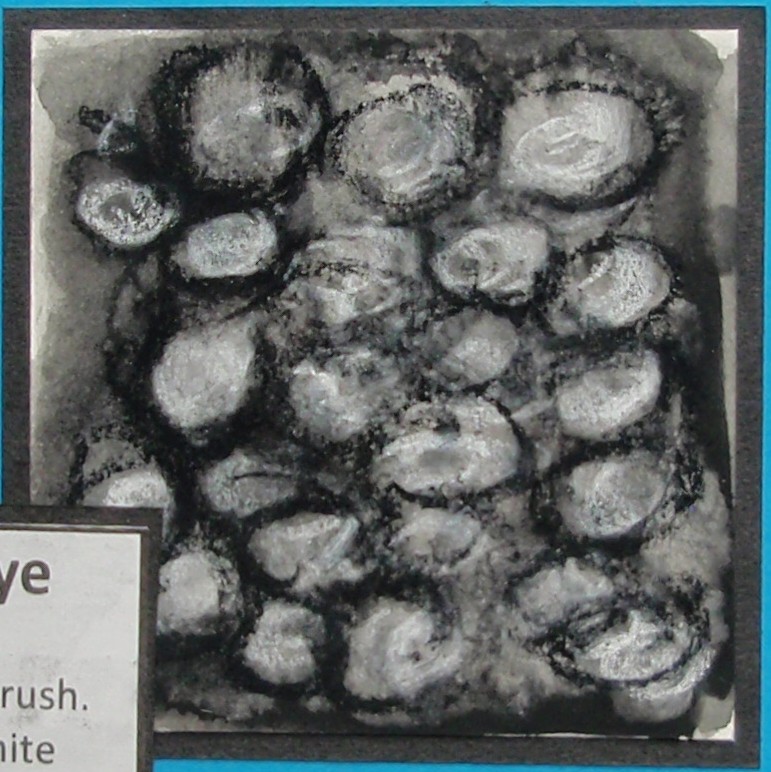
Watercolour dye: The wash this time was very dark black. Bleach was applied with a brush. Black and white pastel was added when dry.
Texture 5 - outside wall
This was my favourite sketch and the most dramatic.
The bleach again played havoc with the paint - all definition and differentiation was lost.
Pastel saved the day!

A page of all the textures created:

Final page of the texture sketches
Conclusion:
I enjoyed creating the textures - although I found it harder than when working with photographs.
Having drawing implements and paper with you means you can work in a spontaneous way.
If uninspired - just work away. Something will always happen. Recording shapes, textures or feelings means you always have a reference to use at a later date.
Don't just attempt something once, constantly the best piece appeared after the 2nd or 3rd sketch.

Part One: Project 1 - Stage 3: Exercise 2

Wednesday 8th September - Using marks to create surface textures: Working from objects.

The next objects I looked at were a cheese grater, bristles of a brush and a granite worktop.

Grater: An everyday object, shiny, sharp, metallic, reflective.

Cheese Gater
Soft pencil: Although I tried charcoal first - it was too difficult to achieve the surface texture of the grater.
I then covered the surface of the paper with thick layers of dark, soft pencil. Using an eraser and a stencil - I removed areas of the pencil.
I didn't like the results achieved using this technique, for this object.

Surface texture of the grater
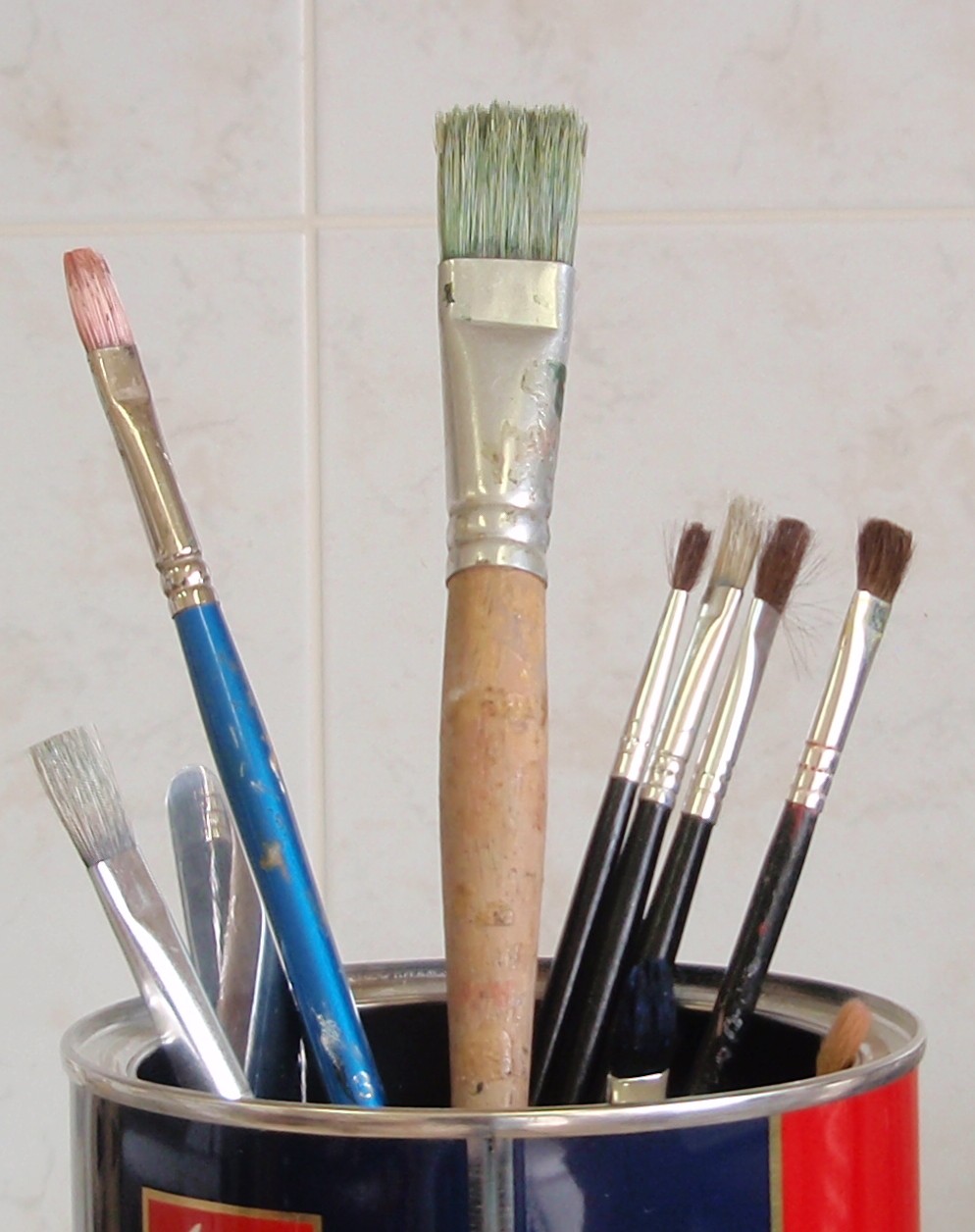
 Bristles of a paint brush: Like hair, rough, course, 'bristley'!
Paint brushes
 2H pencil: flicked in one direction repeatedly. Afterwards a darker,softer pencil was overlaid.
A good likeness to the texture.

Texture of brush in pencil
Painting with hessian: After soaking the rough edges of the hessian fabric with a watery paint, it was used to brush the surface of the paper.
Thick and thin lines were created which overlapped.
Both the movements used and the finished effect were freer than that created in pencil.

Texture of brush in paint
Granite worktop: Solid, smooth, shiny, heavy, patterned, dotty.
Granite worktop
I experimented with wax resist for this object.
Wax resist 1: Wax was 'dotted' onto the paper to act as a resist. A watercolour wash was added, as that was drying, watercolour was splattered over the top.
Wax resist 1
Wax resist 2: This time, the wax was scribbled onto the surface paper. The watercolour added after as a wash and as a splatter.

Wax resist 2
I didn't like the way either of these 2 samples worked out. They do not show enough colour changes and the white stands out too much.

Wax resist 3: Using the cheese grater under the paper, I did a rubbing with the wax. First using white, then using black. Finally a grey watercolour wash added on top.

Wax resist 3
This was my favourite - an even amount of colour showing for the white, black and grey. Also the amount of wax used help to give the finished effect a 'shiny' look.

The finished sheet of these techniques:

Texture sheet for the grater, brush and worktop.


Part One: Project 1 - Stage 3: Exercise 2

Wednesday 8th September - Using marks to create surface textures: Working from Objects.

Again, I have to create a series of marks to create a surface texture - the last exercise was to work from a photo. This time it's from an object. Right now I am thinking this has to be easier - you can see, feel and touch the object - you don't have to rely on a memory.

But, I am sitting in my kitchen looking at the 4 walls, the surfaces, the implements...... regretting not taking a sketchbook, camera, scrap of paper with me when I went out.
I had seen lots of interesting textures....but recorded none.
A habit I must change.

Coming back in - it seems uninspiring - I am just going to choose an object and see what happens!

Fridge: A large white object in my kitchen, the surface has an interesting texture. It seems to be made up of lines 'pressed' into it.
Close up of the surface texture of my fridge
Using white acrylic paint (1): I brushed thick acrylic paint onto the paper and then pressed a woven fibre sheet into it.
The marks showed up, but were not clear.
Maybe the paint should have been thicker, applied with a roller?
Surface texture of fridge 1
Using white acrylic paint (2): This time after brushing the paint on, I pressed a piece of hessian into the surface. Once this had dried I washed a thin coat of waterpaint over the top.
This allowed the texture to be seen more clearly.
Surface texture of fridge 2
Printing with acrylic paint: This time I used a piece of the woven fibre sheet, painted it with purple acylic paint, and then printed with it.
This was the best effect so far - I did it twice - the left side of the picture below is when the sheet was pressed onto the surface once. The right side is when the sheet was pressed onto the surface twice.
This technique created random lines and patterns, a texture that could be used in many ways - possibly to create hedgerows or grass in a painting.

Surface texture of the fridge 3 
I put the work together on a sheet:


Final sheet for the fridge textures.


Saturday, April 2, 2011

Part One: Project 1 - Stage 3: Exercise 1

Tuesday 7th September - Using marks to create surface texture

The final picture I decided to concentrate on was of an unusual tree trunk with coins embedded in it.

Tree trunk with coins
I created textural sketches using a range of pencils, watercolour with ink and finally charcoal. Again I used an aperture to focus in on a small area of the photograph.

Pencil: I used an HB pencil to represent hard edges and a softer 8B pencil to represent background and the soft mosses.
Although I created some interesting directional lines with the pencil, I didn't feel inspired with the result. Maybe with more work, mixing different media or adding colour would liven up the picture.


pencil sketch of tree trunk
 Watercolour and ink: A light wash of brown/black watercolour paint nicely represented the shiny, weather-worn top of the tree trunk.
Whilst the paint was still damp, Quink ink was used with a mapping pen - the lines became blurry and soft edged.
A green/blue background was added with ink lines added to create the muddle of the undergrowth.
I really enjoyed this - the texture took on a life of its own.

tree trunk in watercolour and ink
 Charcoal: This created soft smudgy lines against hard, dark lines. Texture easily created by the different ways of applying the charcoal, smudging or flicking, blending or applying layers.
The grain of the paper helped to recreate the look of grain in the wood.
study in charcoal
This was my favourite technique used for sketching the tree trunk. Charcoal was quick, effective and fun to use.

The complete page showing all the textures used to create the tree trunk.

page of textures for the tree trunk.
I enjoyed creating these textures from the photographs. A different atmosphere was created each time depending on the media used, and how the media was applied to the paper.
Each sketch grew spontaneously - you were never quite sure how each would turn out.
Another learning curve for me with this exercise, was that the more you experimented, the looser and more fun the sketches became.

Part One: Project 1 - Stage 3: Exercise 1

Monday 6th September 2010 - Using marks to create surface textures

The next photo is of a tree - the trunk is old and weathered, it has layers of soft, peeling bark.

Old Tree, Portmeirion, N. Wales
 Using an aperture to focus on just a part of the photograph, I created textural sketches using pen and ink, wax crayon and watercolour wash.

Quink ink 1: I used a wide bamboo pen - this created unexpected 'white spaces' in the work. I then worked over the area with a narrower pen - this created the feeling of layers of bark.
This is quite a nice technique - you have no control over where the ink will stay and where the spaces appear.


Sketch using wide bamboo pen
 Quink ink 2: Using a narrower pen created nice, flowing lines. I was able to work over areas, change direction of the lines - in order to create the feeling of the bark 'wrapping' itself in layers around the trunk.


Sketch using narrow reed pen
 Wax crayon and watercolour wash: 'Broken' lines were created by rolling the edge of the crayon onto the surface of the paper.
Heavy layers of dark coloured wax crayon were applied on the darker side of the trunk.
Less intense colours of crayon were applied sparingly on the lighter side of the trunk.
White crayon was used to mask the area where the sun was shining through the branches.
Watercolour paint was then washed over the top of the crayon - this also created some interesting textures, leaving 'blobs' of paint on top of the wax.
Out of the 3 techniques - this was my favourite to create.

Sketch using wax crayon and watercolour wash.

 This is finished page of textural studies of the old tree.

Textural studies of the tree


Part One: Project 1 - Stage 3: Exercise 1

Saturday 4th September - Using marks to create surface textures

This exercise is all about creating surface textures from a visual source.

Fortunately I received the course materials during my stay in the UK this summer. With their wise words in my ear, I attempted to bring home many textural photos. In particular - a day out in Portmeirion, North Wales, proved to be a good source for my requirements for this exercise.

Having looked through my pictures, I chose a selection: an old tree, a toadstool, undergrowth, slate wall, stump of a tree with coins.

The slate wall had a hard surface, but it had eroded over time creating a feeling of being delicate - as if it would eventually flake away. Using an aperture, I focussed in on an interesting area. Having my materials to hand, I am going to try several techniques to achieve the surface shown.


Pencil: Using different grades of pencil, I managed to create some nice dark and light tones. I was able to create both dramatic and delicate marks and rhythms.
The shades produced using pencil were very 'stonelike' in colour and texture.
I created a dramatic landscape in pencil although I should have used a smaller area to develop as it was very labour intensive.


study in pencil

Ink applied with reed and mapping pens: I really liked using these, especially the mapping pen. I was able to achieve graduations in colour and texture where the lines overlapped.
An atmospheric landscape appeared from the marks made.
The work built up more quickly than the pencil as you were able to build up a rhythm with the marks.

study in pen and ink

Newspaper collage with soft pastel and charcoal: I spent some time preparing the newspaper - I inked, dyed, painted, bleached and splattered the pages. I created different shades of the colours that I wanted to use.
I used both english and arabic papers to create a different effect.
I layered and glued down the torn papers - the torn edges of the papers adding to the rhythmic lines in the piece.
Charcoal was added to darken some areas, soft pastel to lighten areas.
This was my favourite technique, it created a very dramatic piece.


study in collage

 This page is a collection of the different media used for textural sketches of the slate wall.
Page showing surface textures created