Monday, August 30, 2010

Part One: Project 1 - Stage 2: Exercise 3

Sunday 29th August - making marks continued!...............using a broader range of materials.

It took me ages to find all the materials needed for this exercise. Hopefully, once found - never lost again. It does prevent you from starting something when you want to......maybe that's where i've been going wrong?

I am going to stick to cartridge and watercolour paper for tonight, I'll leave tomorrow free to find my collection of papers.

Pencil crayon / Cartridge paper: Flicked lines
Cartridge paper 120gsm, pencil crayon
The pencil crayon shows up well on this surface, the tone gets darkers where the lines cross. A slight grain in the paper gives texture to the lines.

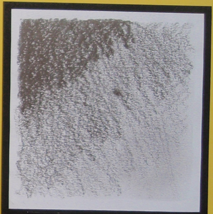
Pencil crayon / cartridge paper: dark to light tone.
Cartridge paper 120gsm, pencil crayon
 Layers of pencil crayon were added to the paper surface. Dark tone achieved by using heavier layers, light tone achieved by lighter pressure on the pencil - blending with a finger afterwards.

Pencil crayon / cartridge paper: flowing lines.
Cartridge paper 120gsm, pencil crayon
The pencil was able to move smoothly and freely across the surface of the cartridge paper.

Pencil crayon / cartridge paper: blending colours.
Cartridge paper 120gsm, pencil crayon.
The pencil crayon worked well - using yellow over blue, made green. Colours were blended and mixed with some ease on this surface.

Ink / watercolour paper: Ink applied with a stick.
Watercolour paper 200gsm, Ink.
The watercolour paper was very robust to use. Using a stick created nice uneven lines, and you could press quite hard onto the paper surface.

Acrylic paint / smooth cartridge paper: Undiluted acrylic paint brushed onto cartridge paper.
Smooth cartridge paper 130gsm, acrylic paint
The paint was applied to this smooth surface in layers of colour, and brushed into, until the paint dried. Creating an interesting texture to the paint - very 'scratchy'.

Acrylic paint / smooth cartridge paper: Dilute acrylic paint dripped onto paper and scratched into.
Smooth cartridge paper 130gsm, acrylic paint
Wet paint (red) was dropped on top of wet paint (yellow), then the colours were scratched into with a stick. The colours pulled through each other creating some colour mixing and texture.

Acrylic paint / smooth cartridge paper: Very dilute acrylic paint was applied to smooth cartridge paper and scratched into.
Smooth cartridge paper 130gsm, acrylic paint
The paint was very watery so blended well. While the surface was still wet, scratching into the surface produced some nice lines. The paper was heavy enough that it didn't buckle.

Acrylic paint / smooth cartridge paper: A thick layer of undiluted acrylic paint was added to smooth cartridge paper and drawn into.
Smooth cartridge paper 130gsm, acrylic paint
While the paint was still wet, a stick was used to draw into the surface. This produced a nice textural effect.

Acrylic paint / smooth cartridge paper: Undilute paint applied with a stick.
Smooth cartridge paper130gsm, acrylic paint
I used thick paint and applied it to the surface with a stick. I thought this would produce strong bold marks - but it made a delicate broken line. I like the effect though.

Fine stick of charcoal / cartridge paper: from dark to light tones.
Cartridge paper 120gsm, charcoal
Charcoal was applied to the paper and blended with a finger. It produced a lovely soft, smudgy effect and also created a nice range of tones.

Medium stick of charcoal / cartridge paper: The charcoal was flicked onto the paper surface.
Cartridge paper, charcoal.
This produced nice spiky lines. The grain of the paper shows through and the lines go from dark to lighter black.

Chunky charcoal / cartridge paper: Charcoal aplied heavily to the surface.
Cartridge paper 120gsm, charcoal.
This very black charcoal was scribbled onto the surface of the paper - will probably work well with 'rubbing out' techniques. It covers the paper well.

Thick stick of charcoal / watercolour paper: Charcoal drawn on paper surface and blended in.
Watercolour paper 200gsm, charcoal
This produced nice, smooth lines - but some texture manages to show through. The thicker stick of charcoal produced the lightest black line.

Broad tipped felt pen / cartridge paper: Dots were applied to the surface.
Cartridge paper 120gsm, felt pen
Nice technique - should probably be kept for filling in small areas, but it produced a nice tonal range, from dark to light. Felt pen was easy to apply to the surface.

Watercolour paint, smooth cartridge paper: Dilute watercolour paint was sprayed onto the surface, by pulling a thumb across the bristles of a brush.
Smooth cartridge paper 130gsm, watercolour paint
I really like the effect of this technique. The colour can be built up by repeated sprayings. It could also be used with both masks and stencils.

Gouache / smooth cartridge paper: Wet-on-wet technique.
Smooth cartridge paper 130gsm, gouache paint
This produced a feathery effect. It didn't spread as much as dilute watercolour paint.

Soft pastel / cartridge paper: Lines drawn onto the paper surface.
Cartridge paper 120gsm, soft pastel
The pastel is much blacker in colour than the charcoal. The pastel grips to the surface and produces a nice tonal effect where the lines cross.

Broad stick of charcoal / cartridge paper: Curvy lines drawn on the paper surface.
Cartridge paper 120gsm, charcoal.
This didn't produce as many tonal changes. Again the large stick of charcoal creates a soft black line.

Soft pastel / cartridge paper: Scribbling and blending soft pastel.
Cartridge paper, soft pastel
The texture of the drawing still showed through even after the pastel was blended. The tonal changes were good.

Soft pastel / cartridge paper: blending and colour mixing soft pastel.
Cartridge paper 120gsm, soft pastel
The colours mixed and blended well on the paper. The changes of colour were smooth and gradual.

Soft pastel / smooth cartridge paper: Soft pastel was applied over wet paper.
Smooth cartridge paper 130gsm, soft pastel
This works nicely even on wet paper. The pastel moves very smoothly across the wet surface. The colours produced are darker than when using dry paper.

Watercolour paint / smooth cartridge paper: Dilute watercolour paint applied to dry cartridge paper.
Smooth cartridge paper 130gsm, watercolour paint.
Applying the dilute watercolour paint quickly with a thin brush produced a nice cross-hatching effect. The layers of colour and tone built up well.

Watercolour paint / smooth cartridge paper: The watercolour paint was applied with a natural sponge.
Smooth cartridge paper 130gsm, watercolour paint
This produces a soft, delicate effect. The colours blend and change gradually.

Watercolour paint / smooth cartridge paper: Using a graduated wash on dry paper.
Smooth cartridge paper, watercolour paint
The paint bleeds into the next layer when the paint is wet. As the paint starts to dry on the brush, nice areas of paper start to show through.

Felt pen / cartridge paper: Using a wax resist.
Cartridge paper 120gsm, felt pen
I applied the wax resist and drew with the felt pen over te top of it. I thought this would work better - the felt pen had to be wiped off the surface of the wax.

Felt pen / cartridge paper: drawing with a broad tipped felt pen over the paper surface.
Cartridge paper 120gsm, felt pen
The pen covered the area quickly and well. Some colour blending was achievable with the red and yellow.
Interesting lines appeared where the lines crossed over each other.

Felt pen / cartridge paper: Using a fine tipped felt pen over the surface of the paper.
Cartridge paper 120gsm, felt pen
This produced fine marks with equal depth of tone and colour.
Good for spiky lines and cross-hatching. Good optical effect where the lines of colour overlap each other.
Probably not good to use for covering large areas.

                                            -------------------------------------------

 A nice messy experimenting session. Again, an excuse to see how far you can push your media, what does it do.

I used a range of media - felt tips, wax crayons, pencil crayons, charcoal, soft pastel, watercolour and acrylic in as many different ways as I could think of.
From blending to splattering to scratching through.
I also used a range of mark-making equipment - sticks, paint brushes, fingers, sponges to achieve these techniques.

I enjoyed the session, once I had gathered everything together!
Although it was a messy session, the use of a stencil helped to control some of the results.
I now have some idea of which technique, and which media could be used to represent some of the words that we were given to express.

At the moment, sponging and splattering appear to give the most delicate and soft results, whilst thick, undiluted acrylics applied with a brush, and the scratched through watercolours, appear to give the most dramatic results.

Conclusion for today - putting your materials in an accessible place means you can start any project when you feel like it!!

Some of the final pages of these experiments:
Sheet of mark making - using a variety of materials
Sheet of mark making, using a variety of materials

Part One: Project 1 - Stage 2: Exercise 1 and 2

Saturday 28th August... making marks

I have bought new stationery, re-organised my work-space, put dividers in my course folder.....and now to work!

I decided to stick to the 'dry' exercises, rather than gather ALL materials needed for the whole project. I know that if I'm not careful, no work will ever get done!

In front of me are - collection of pencils, my stencil, some A4 paper, and the course folder.

Exercise 1 - Making marks in an expressive way - using words

Working through the exercise given, and the words 'fast', 'slow', 'hard', etc, I discover a better knowledge of my materials and their capacity to make marks.

Fast: Using quick, wrist flicking movements with a sharp 2H pencil made hard, quick, fine lines.
Fast movements - 2H pencil
Slow: Using a firm grip on a 9B pencil made slow, steady lines. I used even horizontal spacing.
Slow movements - 9B pencil
Hard: Using a firm grip on an F grade pencil and hard, jabbing movements - produced small, hard, dotted lines.
Hard lines - F pencil
Sharp: Using an HB pencil, which is darker than the 'H' grades, and a firm hold, produced long, pointy, sharp lines.
Sharp lines - HB pencil
Soft: Using a nice, soft, dark pencil on its side produced a lovely soft line.
Soft lines - 6B pencil
Delicate: Using a soft B pencil and a light grip produced soft, delicate lines
Delicate lines - 4B
 Bumpy: Using a B pencil and a firm grip, I drew horizontal lines that bumped along.
Bumpy lines - B pencil
Smooth: With a 2B pencil held on its side, I drew vertical, smooth lines in varying directions.
Smooth lines - 2B pencil
Sensuous: Using an 8B pencil, I produced soft and curvy lines by holding the pencil at an angle. This created a nice, natural line.
Sensuous lines - 8B pencil
Sad: Using a 2H pencil produced a harder, lighter line. I pressed hard with the pencil at the start of the line and then used less pressure, almost 'letting go' at the bottom of the line.
Sad lines - 2H pencil.
Happy: With a 7B pencil, I created 'smiley', curvy, dark lines. The pencil was held firmly and then the line was finished with a flick of the wrist.
Happy lines - 7B pencil
Anger: With a 3B pencil, I pressed hard and scribbled with jagged motions.
Angry lines - 3B pencil
It was a nice exercise that seemed to make more sense as you worked through it - your emotions reflected in the motion and marks made by the pencil - A light grip with a flowing pencil line was easier to make, and more pleasurable than a firm grip with sharp, jagged pencil lines.

Exercise 1 - the finished pages:
Fast, Slow, hard, sharp, soft and delicate marks
Bumpy, smooth, sensuous, sad, happy and angry marks

Exercise 2 - Making marks in an expressive way - creating different areas of tone

I think this should be re-named 'getting to know your pencil, compare and contrast' !!

I worked through this exercise, getting tones from very dark to very light. I achieved this by using different ways of holding the pencil, and different ways of making marks.

2H pencil: Cross hatching: hard, firm lines crossed over each other repeatedly.
It was very hard to produce a really dark tone with this pencil.
Cross Hatching - 2H pencil
2B pencil: Single direction lines: darkness built up by pressing harder with the pencil.
Interesting effects produced when the lines overlapped each other.
Single direction lines - 2B pencil
4B pencil: Dots: I used a firm, upright grip on the pencil. The amount and intensity of the dots gradually built up to produce a darker area.
Dotty - 4B pencil
5B pencil: Squiggles: I held the pencil lightly to achieve the lightest tone, and firmly to achieve the darkest tone.
Squiggly - 5B pencil
7B pencil: Vertical lines: long, soft lines, drawn in the same direction. The length of the line was gradually reduced while, at the same time, the pressure on the pencil was increased.
Vertical lines - 7B pencil
9B pencil: Soft shading: using the pencil on its side. Heavy pressure on the pencil achieves the darkest tones.
Soft shading - 9B pencil
I used cross hatching with the hardest pencil I had, '2H', squiggles with a medium range pencil, a '5B', and soft shading with the softest pencil I had, a '9B'. I used a different technique with all the pencils in my collection.

I felt this was a really good exercise in pencil control, it enabled you to control the lights and darks, especially when working within a frame. I think this exercise will come in very handy when working my way through the forthcoming projects!

Exercise 2 - The finished page:
Different areas of tone - using a range of pencils
 Conclusion for today - I feel much better for making a start!