Experimenting with your equipment
Having gathered all the equipment and made a space, there was just the printing to do.
Stage 2 suggests trying out some basic printing techniques:
- Block printing and relief printing
- Stencils and masks
- Hand painting
These techniques allow the user to work with speed, and, they use the minimum amount of equipment.
Block Printing and Relief Printing.
Blocks and stamps can be made from:
- small offcuts of wood - eg. balsa which is easily cut and shaped
- linocuts - small blocks of lino used with lino cutting tools
- fun foam - easy to carve
- polystyrene - can be broken up into shapes, or, can be gouged or scratched to make an interesting surface
- erasers - white plastic erasers can be carved into shapes.
- formy - a reusable stamp-maker
- found objects - leaves, feathers, etc.
- everyday objects - bottle corks, caps, beads, etc.
Relief stamps can be made from string and card.
I prepared several different blocks before I started the printing process.
Erasers
These were surprisingly easy to work with.
The plastic eraser cut cleanly and did not break.
The only issue was remembering which parts you wanted to cut away; this would leave a white line.
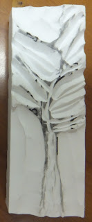
Sample 1: this was a simple drawing of a tree.
I carved out the shape with lino cutting tools, I tried to leave the background uneven so that the design would be more interesting.
 |
| Carved eraser: tree |
Using water based printing inks and a roller I coated the surface with black ink.
I placed cartridge paper on my printing board and produced the following print
 |
| Tree prints x 8 |
I really liked the way the print turned out.
- the image was clean.
- there was a simplicity in using just black and white.
- interesting shapes were formed, in the middle of the print, as the images joined together.
Sample 2: I tried to design this block so that the birds would sit on the tree branches - this did not work, I should have planned the placement of the birds better.
I left the background uneven to create interest.
 |
| Carved eraser: birds |
Using the same printing technique as before, I produced the following print.
 |
| Bird prints x 4 |
I liked the random marks that were made by the uneven background and the simple black and white colourway.
It is not as strong or as interesting as the last print, but it has potential.
Sample 3: I made the mistake of cutting the wrong parts of the design away in this sample.
I had intended to print the swirls as a colour, but cutting the block in this way should make the swirls take on the colour of the paper.
 |
| Carved eraser: swirls |
I printed the block:
 |
| Swirl print x 8 |
Although the print was not intentionally meant to look like this, I was happy with the result.
I also liked the way the colour changed with each block, depending on the amount of ink applied to it.
With a little more planning I could have added some extra carving to make links between the blocks.
This would have also worked well with the tree design where the branches could have 'touched' each other.
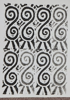
Sample 4: I thought I would carve something simple and graphically 'bold'.
After making the large "S", I added carved lines to the background.
 |
| Carved eraser: "S" |
I printed the block:
 |
| "S" print x 8 |
This one is my favourite print from the eraser blocks.
It was a bold design and printed well.
Interesting patterns formed where the blocks met.
This block has potential for further printing, trying out different placements of the block to see what patterns would emerge.
Linocut
Having practised using the lino cutting tools on the erasers I thought I would try them out on the sheets of lino.
I have done a small amount of lino cutting before, so was aware of some of the pitfalls: not enough contrast between different areas; cutting out the wrong parts of the surface; cutting yourself.
I was attempting to draw a peacock feather from memory, when I realised I had a picture, from the front of the Cyanotype Chemicals packet, right in front of me on which I could base my drawing.
 |
| Art Van Go - Cyanotype Chemicals packet |
I lightly drew the feather on the surface of the lino.
I carved the fronds of the feather using some of the smaller 'v' shaped blades.
I decided to use a flatter, broader, 'u' shaped blade to carve the background.
Not wanting the 'eye' of the peacock feather to stand out too much from the feather pattern, I carved some grooves into the surface of the lino.
 |
| Linocut: peacock feather |
Using the printing board, water based printing inks and a roller, I printed the feather onto several different paper surfaces.
Newsprint: A thin paper suited to printing on.
This produced a good clean print.
The design worked really well.
The background of thin horizontal lines worked well in contrast to the feather design
 |
| Feather printed on newsprint paper |
Tissue: This produced a nice print.
Like newsprint, tissue paper is thin and takes the ink well.
The paper is transparent so a print like this could be placed on top of a coloured background.
 |
| Feather printed on tissue paper |
Handmade paper: The texture of the fibres in the paper makes the print more interesting.
The paper is a lime green colour (this appears to have made the light brown carpet look purple in the photograph)
 |
| Feather printed on handmade paper |
Brown Paper: I printed the feather on to the dull side of the brown paper.
 |
| Feather printed onto brown paper |
Patterned card: I printed the feather onto patterned cardstock.
The slightly patterned card adds interest and colour to the image of the feather.
 |
| Feather printed onto patterned card |
Monoprinting 1:
I used masking tape to hold a sheet of acetate to the desk, added printing ink and spread it across the acetate with a printing roller.
I placed a sheet of newsprint lightly onto the inked surface and drew on the back of the paper with a pencil, again using the peacock feather as inspiration.
I created 2 prints using this technique:
This is the
first print.
There is still quite a lot of ink on the surface of the acetate that has transferred itself to the paper surface.
The drawn line becomes more interesting using this technique - it is softer and less defined
 |
| Print 1: monoprinting |
This is the
second print.
The drawing is more defined in this print, less ink has transferred to the surface of the paper.
This technique produces unique prints with unpredictable results.
 |
| Print 2: monoprinting |
Monoprinting 2:
I then drew directly onto the surface of the inky acetate to create the following image.
 |
| Monoprinting: drawing onto the inked surface before printing |
I like the image and the marks made by the ink around the image add interest to the picture
"Safeprint" Polystyrene: this material is similar to the polystyrene used for food trays.
I happened to have some in my cupboard, so thought it would be a good time to use some of it up.
It is sold as a safer, child-friendly version of lino cutting - safer because no sharp tools are required to mark it.
Any blunt tool: pens, pencils, etc can be used to score it.
Things can be pushed into the surface to create an indent.
It is a cheap, versatile printing block.
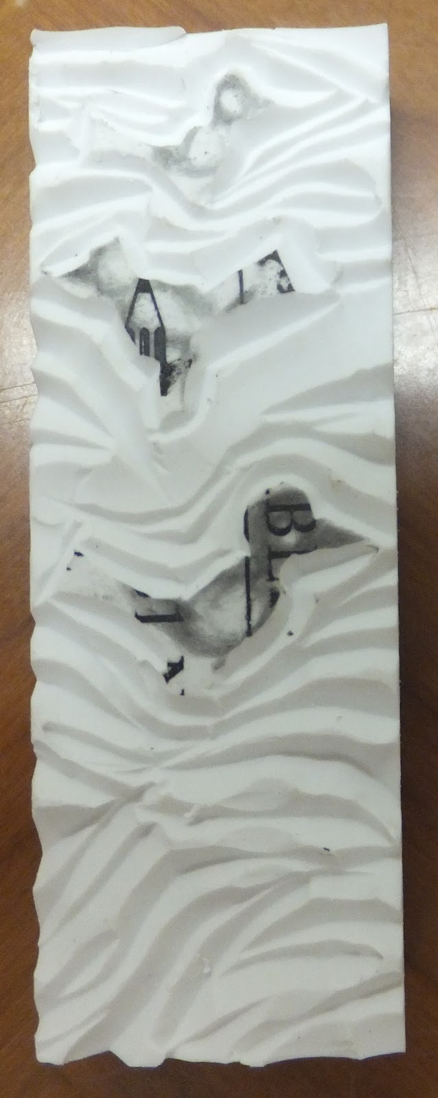
Sample 1: I pressed the lid of a tube of UHU glue into the surface, then punctured small crosses into the centre of the indented shapes.
 |
| Pattern 1: UHU glue lid |
I used a foam brush to apply poster paint to the polystyrene surface and printed onto cartridge paper:
 |
| print from polystyrene - UHU glue lid |
I like the print when less paint is used, the lines are clearer and the background is more interesting.
Sample 2: I drew into the surface of the polystyrene with a ballpoint pen.
 |
| Pattern 2: Ballpoint pen |
Using the same printing technique, I made the following print.
 |
| Ballpoint pen print |
A small amount of paint (but not too little) makes a nice print.
I liked the effect created by staggering the placement of the blocks.
Sample3: I drew diagonal lines with a pencil into the surface of the polystyrene.
 |
| Pattern 3: diagonal lines |
I then printed this onto part of a brown paper bag.
 |
| Diagonal lines print |
Too much paint made the pattern disappear on the 2 prints on the left.
Too little made the print indistinct on the print on the right.
As long as the right amount of paint is applied, this is a useful printing block for a background.
Relief Stamps using everyday objects:
I made three blocks to demonstrate this method, using: rice, spaghetti and string.
I cut a small square of corrugated card and applied a layer of glue - once this was starting to set I pressed my objects into it.
Sample 1: Rice.
I started to print with this block with no success at all - then I remembered to use the printing block that I made... it really needed the padded surface to work well.
 |
| Rice pressed into glue to make a printing block |
I applied poster paint with a brush to the rough uneven surface and produced the following print.
(photo taken after I had printed with yellow paint - the rice is uncooked)
 |
| Rice print x 4 |
This created a really good textured background.
Light and dark shades of yellow are created randomly.
Sample 2: Spaghetti.
I used the printing block to make a good print again
 |
| Spaghetti pressed into glue to make a printing block |
I applied yellow poster paint to the spaghetti with a brush and created the following print.
 |
| Spaghetti print x 4 |
This created a good print, but it was hard to keep the block clean.
Paint that got onto the cardboard by accident printed onto the surface of the paper.
It is a nice technique that produces random results.
Sample 3: String.
I drew a design on the cardboard.
I followed the outline with a thick line of glue, as the glue was drying I was able to press the string into the design.
 |
| String pattern |
I painted the string with poster paint and printed two different designs.
String pattern 1: I placed the block the same way each time I printed.
This pattern has some interesting negative spaces in the repeat.
 |
| String pattern 1 |
String pattern 2: I turned the block by 90 degrees each time I printed.
I like the curving lines in the design.
 |
| String pattern 2 |
The string produces nice lines when it is used for printing, there are no hard edges.
The string was also easy to manipulate into a curved design - the glue needs to be setting to hold the string in place on the cardboard.
The only issue I encountered when using cardboard as the base for a block was when it came into contact with water.
Next time I would use balsa wood as a base, or a thicker layer of waterproof glue/varnish to seal the surface so that it could be cleaned after.
-------------------------
Masks and Stencils
Masks: these are used to keep areas of a design clean, defined and free from any colour that is being applied to the paper/fabric surface.
Masks can be made from:
- masking tape - good for stripes and grids
- sticky backed plastic - good for complex designs
- found objects - eg. leaves, nets, lace, etc.
Paint, fabric or crayons can then be applied to the area.
Stencils: the pattern design can be drawn and cut from a sheet of card or film.
The uncut area of the stencil card protects the paper/fabric from being accidentally coloured; while the colouring media is applied to the cut areas.
Stencils can be made from:
- manilla stencil card - any strong card can be used.
- acetate - great to use; you can see through the stencil, so it is easy to reposition your design.
- sticky-backed plastic film - it is see-through, so easy to see the design; it has an adhesive surface, so keeps the stencil in position as well as stopping any paint seeping under the stencil.
Both masks and stencils are a great designing and pattern making tool - by using them it is easy to make repeat images.
I used both Markal sticks, transfer paints and transfer crayons in the exercises demonstrating masks and stencils.
Transfer Paint
I began with transfer paints and a synthetic white satin fabric.
I have two types of transfer paint in my cupboard, one is ready mixed, one is in powder form.
I used the powdered form in these examples, it comes in a larger variety of colours than the ready mixed version.
I mixed the transfer paints with water and applied the colour to photocopy paper using a foam brush.
I used yellow, orange, scarlet, claret, fuchsia and turquoise.
Once the paper dried it was difficult to see how bright the colours would turn out to be once printed onto the satin. The paints before transfer are dull and muddy.
 |
| Transfer paints on paper - before printing |
I decided to do a sample print with the paper, this way I would see how long to hold the iron on the fabric and also the final colour of the print.
The painted paper was placed face down on the fabric, another piece of copy paper was placed over the top (this protects the iron and also keeps the papers in place).
The iron was heated to just below the cotton setting.
I held the iron in one place for nearly a minute.
There were gaps where the steam holes from the iron showed through.
The print shows the colours in the same order as the paper strips - you can see the color changes from muddy and dull to bright and colourful.
 |
| First print from the transfer paints |
I tried again, this time moving the iron.
This was a better print, but the colours were not bright.
 |
| Second print from the transfer paints |
I made another sample, using the same pieces of paper as print 2, but held the iron over the design area for over a minute.
This was much more successful: the colours were clean and bright, you can also see some of the brush marks.
 |
| Third print from the transfer paints |
I was now ready to make some samples.
I went outside to collect leaves and grasses to use as a mask.
 |
| Masks for the transfer printing |
I placed some of the grasses and leaves on the surface of the fabric.
Using them as a mask, I cut a piece of yellow transfer paper, placed it face-down on the fabric and heated with the iron.
I then removed the grasses and leaves.
I placed some more grasses and leaves on top of the printed fabric to use as a mask.
I cut out a piece of orange transfer paper, placed it face-down on the fabric and heated with the iron.
This is the image that was produced.
There are white areas where the masks overlapped.
Yellow areas from the second areas that were masked off.
Orange areas from where there has been no mask.
 |
| Second print: orange over yellow |
I then placed more grasses and leaves over the print and printed over the area with scarlet.
I did lose some of the interest that had been built up in the last print, but learned a lot by the over-printing process.
I think carrying on experimenting with colour mixing and printing in this way would turn out some really interesting results.
 |
| Third print: Red over orange |
Each time I removed the leaves and grasses that had been used to mask off the area, I turned them over and placed them down on top of a clean piece of the satin.
Knowing that one surface would have transfer paint on them I decided to see what would happen if I then used the leaves and grasses to print from.
I created a really nice image, indents appeared on the fabric surface where the grasses had been pressed by the iron.
 |
| Print from the leaves and grasses |
I tried using the same technique as the first sample.
This time I used threads as a mask.
I placed the threads down on the fabric surface in a random pattern and ironed yellow over it.
I repositioned the threads and ironed orange over it.
The image was becoming blurry - I had possibly placed too thick a layer of threads in one area, or moved the iron too much.
I then placed some leaves and grasses over the print and ironed turquoise over the area.
Having accidentally used very thick stemmed grasses this time - the lines, when printed, were wide and undefined.
If I hadn't been so excited by the possibilities of the printing process, I would have slowed down and thought through the design process better.
There is so much potential using this method, just taking a little care, and not choosing the wrong type of mask and I know I can make a really exciting print from it
 |
| Less successful transfer print |
Transfer Crayons
The crayons are similar to transfer paints.
You colour with them onto a sheet of photocopy paper, then place the paper face-down onto a piece of synthetic fabric, and apply heat from an iron (cotton setting) to create a print.
They are another interesting product to use for printing.
I have two different brands of fabric transfer crayons: Scola Di-Stix (pack of 10 crayons), and Crayola (pack of 8 crayons).
I decided to try out both brands.
I scribbled with the crayola transfer crayons and cut out a spiral shape - image on the left.
I drew blocks of colours with the Scola Di-Stix and cut out the shape on the right.
 |
| Fabric transfer crayons: cut out shapes to print with |
I then placed the shapes face-down on the satin, placed another sheet of paper over the top, and heated with a dry iron.
I created the following print.
 |
| Print created from the fabric transfer crayons |
I only produced this sample using the crayons, it turned out well.
The colours changed once printed, like the paints had.
Another example I could have tried (maybe in a later experiment) would have been to scratch into the surface of the crayons - this would have created an interesting texture.
Markal Paint Sticks
I hadn't used Markal sticks before and I was excited to try them out.
I started by choosing a blue cotton fabric base.
I taped the fabric down to my printing board with masking tape, this also stretched the fabric to make it easier to colour the surface.
I added strips of tape to mask off areas of the fabric
I coloured with a gold stick onto the masking tape and brushed it onto the fabric surface with a toothbrush.
 |
| Masking off areas of fabric with strips of masking tape |
I carried on colouring the strips with more colours, using yellow, red and dark red.
I then added the vertical strips of masking tape and continued to add colour - brushing red onto the squares at the top right, gold onto the squares at the bottom right.
 |
| More masking tape: adding colour with markal sticks |
More colour was added: light and dark purple were brushed onto the remaining squares.
 |
| Adding more colour to the surface |
Once the masking tape was removed from the fabric, clean lines of colour were revealed.
The light colours showed up well on the dark colour surface: gold on red.
The dark colours showed up well when they were applied over both light and dark colours: purple on dark red; purple on yellow
 |
| After removing the masking tape from the fabric |
Working on the same piece of fabric, I created a stencil from sticky backed plastic and applied it sticky side down to the fabric.
The parts of the stencil that were cut out were then used as a mask - shown in the photo below.
Purple and red markal sticks were used and brushed onto the fabric.
Gold was applied directly over the top, a toothbrush was used to blend the colours.
 |
| Sticky backed plastic: mask & Stencil |
The stencil and masks were then removed to show a well printed design with no colour bleed.
The edges were crisp, the sticky backed plastic prevented the colour from seeping under the stencil and masks.
 |
| After removing the stencil and masks |
I worked on another area of the piece of fabric.
I created a heart stencil, and with the cut out area - a heart mask.
Adding another mask from a leftover piece of sticky backed plastic.
I then coloured over the fabric with gold, purple and red Markal sticks, blending them with a toothbrush.
 |
| Second example: using Markal sticks over stencils & masks |
I then removed the stencil and masks, revealing the finished design.
The colours were lighter this time, I did not apply the colours as thickly.
 |
| The design after removing the sticky backed plastic |
The finished piece of fabric.
 |
| The finished Markal stick sample |
----------------------------
Hand Painting on Fabric.
Silk painting
I created several samples of silk painting on one piece of Habotai silk fabric.
I stretched the silk onto a wooden frame and drew lines using gutta.
Once they dried I tried out several techniques.
Salt Crystals:
This section shows areas outlined with gutta.
The paint was applied with a foam brush until the paint reached the gutta outlines.
Salt crystals were then applied to the wet paint and left on the surface until the paint dried.
The paint is pulled out of the fabric, the salt has acted as a blotter for the excess wet paint.
It has left a beautiful pattern on the surface of the painted silk.
 |
| Silk paint, gutta lines and salt crystals |
Brown, yellow and pink silk paints were applied to the silk with a foam brush.
Salt crystals were then added to the wet paint and the fabric was allowed to dry.
Interesting patterns were left as a result of the salt.
The salt was brushed off once the paint was dry.
 |
| Silk paint & salt crystals |
The red and orange paints were applied to the fabric surface, as they were drying, stripes of black were added.
The salt crystals were then sprinkled over the top of the damp surface.
 |
| Red, orange and black silk paints, salt crystals |
The paints were applied near a line of gutta - the gutta prevented the colour from flowing any further.
Water was added which removed some of the colour from the design.
Finer salt crystals were applied to the surface, these made marks that looked like small dots on the painted surface.
 |
| Adding finer salt crystals |
Black silk paint was applied within the gutta outlines.
Dots and dashes were created by using the gutta.
Fine salt crystals were added before the paint dried, this softened the colour and made interesting marks.
 |
| Gutta lines, fine salt crystals |
This area had been painted with a rich brown silk paint.
Yellow silk paint was applied to the centre areas, this seemed to 'move' the brown silk paint away from the centre.
 |
| Colour mixing on silk fabric |
Once the outlines made using gutta had dried, a different colour was applied to each petal.
Fine salt was sprinkled into the green paint to leave interesting marks
 |
| Flower: gutta outlines |
The fabric was wet, dabs of paint were applied to the surface.
The wet silk allowed the paint to spread, no hard edges were formed.
 |
| Dabs of colour applied to a wet background |
This is the finished piece of silk with all the painting samples
 |
| The finished sample of silk techniques |
----------------------------------------------
Finished pages: