Raised and Structured Surface Textures.
I am looking forward to creating the samples for this section.
These are the techniques that are suggested:
- Gathering
- Folding and pleating
- Tucking
- Tearing, fraying and slashing
- Quilting
- Raised shapes
- Moulding
Some of these techniques seem obvious, like the act of gathering, folding and pleating material, but depending on the type of fabric used - an unusual result may occur.
In the notes it suggests trying out different fabrics because:
- gathered muslin will look very different from gathered velvet.
- a striped or checked fabric will look very different once it has been pleated.
I am interested in the visual effects that these techniques create, shadows will occur because of the raised edges of the fabric, which should enhance areas of the design.
This means it will be essential to sample each of the techniques before I create a final sample from my drawings.
Some research into these techniques led me to discover the following textile artists:
Brenda Scarman:
A highly regarded embroiderer who will be taking part in this years Knitting and Stitching Show, Harrogate.
She will be teaching two workshops there: "A Taste of Shisha" and "A Taste of Scrumpled Velvet".
A picture of the scrumpled velvet, with an outline of the workshop, can be seen
here.
Ruth Singer:
This artist uses a lot of the techniques that are contained within stage 4: pleating, gathering, applique, structured stuffing.
Her work is inspired by historical textiles, museum objects, personal heritage, memories and stories.
She is also running several workshops at the Knitting and Stitching Shows, London and Harrogate.
A link to the workshops is
here, this contains details and pictures of "Introduction to Trapunto Quilting", "Folded Flower Brooch" and "Pincushion using Bobble Technique".
This is a link to Ruth Singers's online
gallery, my favourite of her works is"Polonaise" - this is a piece of reclaimed silk, which has been hand-stitched and stuffed with wool.
Anne Selby:
This artist works in silk using Arashi Shibori techniques on hand-dyed silk.
Links to Anne Selby's work can be found
here
Shibori: Japanese term for textile technique where fabric is stitched and folded, bound and dyed.
Arashi Shibori: where the silk is wrapped around a pole, this is then bound with string, and compressed. The compression forms the pleats.
The pleats can be 'set' using steam - use polyester and the pleats will stay permanently; use silk and the pleats will remain 'set' if the fabric remains dry.
-----------------------------
Having spent some time preparing the samples... I can now share the highs and lows of this experience:
Gathering:
Stitch a line along a length of fabric using running stitch and strong thread.
Gather the fabric by pulling the thread, tie off at each end.
This will gather,or bunch up, the material.
Different effects will be achieved depending on the type of fabric, direction of the stitching and the depth of the line of stitching.
Sample 1:
The fabric used for this sample was muslin.
Muslin has a loose weave so I was able to pull a thread from the weave of the fabric to gather the material.
Stage 1 shows the first stages of gathering, these threads were pulled in parallel lines - this produced lines of ridges.
Some shadows are starting to appear on the previously flat piece of fabric.
At this stage the sample still had a controlled look.
 |
| Gathered muslin - stage 1 |
Stage 2: threads are now pulled from various directions.
There are dark areas next to light, this is where the shadows have formed.
The gathers have lost their distinct ridges where the threads had been pulled.
The sample is now less controlled and more organic in shape.
 |
| Gathered muslin - stage 2 |
Observations:
- This sample has the soft look that Brenda Scarman's scrumpled velvet developed.
- The sample is much smaller than when it started.
- There is potential for stitching this piece onto a flat backing fabric,this would 'fix' the shape.
- It would be great to stitched beads in the 'dips' within the gathered fabric.
Sample 2:
The fabric used for this sample was a red polyester voile.
I stitched lines across the fabric using a sewing machine, stitch length 5mm, in order to gather the fabric.
 |
| Red voile with stitching for the gathers |
I secured one end of the line of stitching, as I pulled the thread from the other end, the fabric began to gather.
I managed to inadvertently pull out some of the stitching lines, but most of the gathering lines remained intact.
The closer the stitching lines, the more even the rows of gathering appear.
The further away the stitching lines, the looser the gathers, the more unstructured the shape begins to appear.
The rows of gathers were all pulled in the same direction on this sample
 |
| After gathering the threads |
A close up of the gathers in the sample - this shows how the thread used for the gathering technique is an important part of the design.
The thread used could be the same colour as the background fabric - this would be discreet and would not distract visually from the design.
Or, as in this sample - a contrast thread will show up as a prominent part of the design.
 |
| Close up of the gathers |
Observations:
- Using a sheer fabric produces a very different result from an opaque fabric.
- There are shades of red produced as the fabric layers and gathers in this sample.
- In the first sample, the gathering of muslin produces an interesting surface finish - with the voile you can see through the fabric to the underneath layers.
- Stitching this onto a flat background fabric would enable objects to be placed underneath the sheer surface, it would also be interesting to see the effects of placing different coloured fabrics underneath it.
Folding and Pleating:
Folds: Fabrics are folded, pressed with an iron and held in place by stitching.
The fabric can be folded in many directions, in even or uneven groupings.
Pleats can also be created by folding the fabric in a concertina like way.
These methods are very effective on patterned or striped fabrics; this will conceal areas of pattern or create distortions
I chose striped, cotton fabric for this technique:
 |
| Striped fabric for folding and pleating |
I folded the fabric in various directions and pressed the fabric into place with an iron.
I then stitched the folds into place to secure the pleats.
 |
| The stripes change direction when pleated and folded |
The lines of the stripes distorted when the fabric was folded, the effect may have been more dramatic if I had chosen a more dynamic pattern, one with larger stripes or a piece of patterned fabric.
Observations:
- interesting shapes occur when pleating and folding the fabric - this seems like a good way to change and develop a design pattern.
- the areas of fabric that are hidden by the pleating could be used to hide parts of the design.
- small embroideries or words could be deliberately obscured - you would only see them by manipulating the fabric - it could be used to carry a subversive message.
Tucking:
Tucks are made by folding and pressing fabric, like a pleat, but they are usually stitched in horizontal or vertical lines, this gives the effect of large or small edges.
The tucks can be padded with piping cord, thick yarn or wadding - depending on the size of the tuck.
They can also be bent backwards and pressed to fold in different directions.
I used a cream cotton fabric to sample this technique.
Sample 1:
I folded the fabric, pressed it with an iron, then, using a sewing machine, stitched a line 1/4" away from the folded edge. The tuck was then pressed towards the raw edge.
I repeated this process twice more with even spacing between the tucks.
I used a matching thread for this sample - a contrast thread would create a very different look.
 |
| 1/4" tucks with even spacing |
From this angle you can see how the tuck lifts itself away from the flat surface of the background fabric, producing dramatic shadows
 |
| Tucks viewed from the side |
Sample 2:
I used the same process as sample 1 to make the tucks.
A large darning needle was threaded with wool to pad out the tucks.
I didn't have a very thick yarn so used 3 lengths of cream yarn for the padding
 |
| Tucks padded with yarn |
You can see the shadows that are produced by padding the tucks.
Using a darker yarn to pad the tucks would create different shades of colour within the design.
 |
| Padded tucks showing shadow |
View of the padded tucks from the side.
 |
| Padded Tucks viewed from the side |
As I was threading the yarn through the tucks, the fabric gathered, this created an interesting effect.
This technique would make interesting surface textures, and also outlines.
Sample 3:
I used the same process as sample one to make the tucks: folding, stitching & pressing.
The tucks were stitched down in one direction: the two outer rows of stitching.
The tucks were then folded in the opposite direction and stitched down to hold in place: the central line of stitching.
 |
| Tucks stitched in different directions |
This method made some really interesting shadows, as you can see in both the image above and below.
 |
| Shadows created from the tucks |
This technique would be even more interesting if created using a patterned or a striped fabric.
Tearing, Fraying and Slashing:
Some fabrics, such as calico, cotton or silk, will fray well to give decorative surface textures.
These fabrics, if torn from the main body of fabric will have nicely frayed edges and could be stitched onto a background like a heavy yarn.
Fabrics can be slashed at random, or regular intervals, this could be used to reveal fabrics underneath.
I found artist
Karina Thompson, she uses the slashing technique in her work.
After cutting and fraying the fabrics, she will go on to scorch, stitch or bond plastics to the surface.
A link to the online gallery of her work is
here
I used the 'faux chenille' technique to demonstrate fraying and slashing fabrics.
Faux chenille:
this is a technique where fabrics are layered together, lines of stitching are then made at 45 degrees to the grain of the fabric.
The layers of fabric are cut through between the stitched rows, leaving the bottom layer of fabric intact.
When the materials are washed, or brushed, the cut edges fray and you are left with a soft, dense fabric.
Sample 1:
I chose fabrics that I knew would fray well: Linen (top layer): Dupion silk (2nd layer), sheer red (3rd layer); calico (base layer).
(I have used this technique in the past to make bags, wall hangings, hot water bottle covers. One of my biggest mistakes when choosing fabrics has been to use cotton sheeting - this doesn't fray well and therefore you get the colour of the fabric, but no fraying.)
The fabrics that I chose are shown in this image:
 |
| Samples of the fabrics used |
I layered the fabrics and pinned them together.
The top layer of fabric is a printed linen - I chose this to see what would happen to the pattern once cuts have been created through the layers
 |
| The fabric sandwich |
Pictured from the reverse:
Stitching lines were drawn as a guide (spaced 1" apart).
These lines are marked at 45 degrees to the straight grain, fabrics will fray better if cut at this angle.
 |
| Marking the lines |
Cutting through the channels:
In between some of the channels of stitching I cut the length of the channel, and through all the layers - minus the bottom layer.
On other channels I cut through all layers - but not the full length of the channel.
On others I did not cut through all layers - leaving the red layer to show through.
 |
| Cutting through the layers |
Fraying:
With cotton fabrics the faux chenille work can be washed and tumble dried to create the soft, frayed finished look.
Using some silk fabrics that fray easily meant that I just rubbed and brushed at the surface of the materials to create the same effect.
 |
| Fraying the edges |
Observations:
- I cut the channels fairly wide (1") so the finished look is quite 'rough'. Another time I would choose to stitch the channels closer together.
- Cutting through the channels:- not cutting through complete channels creates a pattern: some areas that have been cut through begin to look distorted; other areas are left intact.
- Cutting through the layers:- depending on the amount of layers that are cut through decides the background colour for that area. In this sample some parts have the cream colour of the calico as the background colour - other areas have the red sheer fabric.
A nice technique which can be used in many ways, a small sample like this can only reveal a little of its potential.
Sample 2:
Using scraps of the linen fabric and the calico I created this sample.
I cut a rectangular piece of calico as background fabric
I used one piece of the linen and cut in a spiral, this looked like a stylised flower head, this was pinned on the calico.
I cut and layered two pieces of calico for the stem and several sizes of triangles for the leaves.
The stem and petals were cut on the bias (at 45 degrees to the grain).
These were layered and pinned on the background fabric
 |
| Sample 2: Pinning layers of fabrics |
I stitched in the centre of the strip of linen for the flower head and the stem.
I stitched in parallel rows for the leaves.
 |
| Stitching across the design with parallel lines |
After cutting through the channels the sample was rubbed and brushed until the piece began to fray.
 |
| Cutting through the stitched channels and fraying |
Observations:
- The parts that were cut on the bias frayed well - this would have been better
and softer if it had been washed and dried in the machine.
- The flower head did not fray as well when the strip of linen was on the straight grain, but frayed well when the strip was on the cross grain.
Fraying adds a lot of interesting texture and shadow to a surface.
Raised Shapes:
With this technique you can use various things for stuffing: wadding, old tights or woollen yarns.
The stuffing is enclosed within the fabric and secured by stitching.
Harder objects like buttons, curtain rings can be enclosed too.
Sample 1: hard objects
I used two layers of fabric: cotton and muslin and slipped a large button and a small curtain ring between the layers.
After pinning the objects to confine them within the fabrics, I used a small running stitch, around the object, to hold them.
The small curtain ring also required a line of running stitches on the inside, of the object, to define the shape.
 |
| A small curtain ring and a large button tapped between 2 layers of fabric |
From this angle you can see that the button is raised from the surface.
 |
| Side profile of the raised shape - the large button |
A close up of the curtain ring raised above the fabric surface.
 |
| side profile of the raised shape: the small curtain ring |
Sample 2: yarn - Corded or Italian quilting: raising the surface by padding with yarn.
Using two layers of fabric: cotton on the top, loosely woven muslin on the bottom.
Two parallel rows of stitching were formed to make a linear design, mine had a line curving under and over a straight line.
Cord or thick yarn is threaded through the stitched channels to pad out the stitched design:
Using a blunt needle threaded with a thick yarn, the needle is inserted between the two layers of fabric and the channel of stitching.
At various points in the design, a tight curve or where the lines overlap, the needle is pulled out through the muslin and reinserted at a new point.
This ensures the design is kept flat and pucker free.
This image shows the design complete with padding from the thick yarn.
 |
| Corded or Italian Quilting |
From this angle you can see the raised lines created by the corded quilting.
 |
| Close up of the stitching |
Observations:
- I should have used shorter pieces of yarn to thread through the design - I managed to pucker the fabric.
- I like the way that this technique helps to create a visual dimension to the design - as I drew the design I knew that the curved lines should appear to go over and under the straight line - the padding reaffirms this dimension of this design.
- A fabric such as satin or silk would work very well with this technique the sheen from the surface of the fabric would work well with the raised and padded surface.
- Using coloured yarns or cords underneath a pale fabric would add a coloured tint to a design.
Sample 3: Wadding - Trapunto: raising the surface by padding with wadding.
Traditionally trapunto uses two layers of fabric - natural fabrics: silk, linen or cotton for the top layer; a loosely woven fabric, muslin, is ideal for the bottom layer.
A design is stitched through both layers and a slit is made in the muslin fabric, stuffing is then inserted and the slit sewn up after.
The shapes are then in relief to the background fabric, the height of the shapes can be adjusted by adding more, or less stuffing.
I used a quicker method for my sample.
I placed a piece of synthetic wadding, in the shape of a leaf, between the cotton and the muslin.
This was pinned in place and then the shape stitched.
The image of the padded leaf was photographed after it was placed on quilt batting and a backing fabric - the piece was then quilted.
Quilting is gone into in more detail in the next heading
 |
| Padded and quilted leaf shape |
Observations:
- This seems to be a simple way of changing the surface of the top fabric.
- Synthetic batting is thicker and pads out a shape more fully than cotton batting.
- A great textural technique.
Quilting:
Several layers of fabric are held together by stitching, this gives a shadowy quality to the surface.
Materials and yarns can be trapped between the surfaces: shadow quilting.
Sheer fabrics can be used for subtle colour changes.
This technique can be combined with slashing or cutting back as in applique.
The shadow technique, sheer fabrics, slashing and cutting back were explored in stage 3, the stage covering applique.
I have done some quilting over the past couple of years - here are some examples;
Challenge quilt: this was one that I entered for a competition a few years ago.
The title was 'Journey's' and this depicted the journey of my new experiences in Saudi Arabia.
Three of the fabrics had to be included in the quilt: the gold, the red and the one used on the camels.
The maximum size could be 30" square.
The quilt top is primarily applique, with the sections joined together once each piece was decorated and embellished with stitching.
The quilt is made up of a backing fabric, batting and the quilt top.
The quilting is mainly 'echo quilting': this is where the stitches lie about 1/4" away from the edge of the fabric shape, it is used to emphasize the pattern.
 |
| Challenge quilt: Journeys |
This is the reverse of the quilt. Here you can see (if you click on the image you will see it bigger, and better) the quilting that was used on the design.
On the front it emphasizes the pattern, on the back it is a design all of its own.
 |
| Reverse of the quilt showing the quilted outlines |
Amish Quilt: This was a project we undertook in our quilt group to encourage us to do our own quilting.
Three main colours of fabric were chosen and pieced together.
The finished size is approximately 50" square.
The central square had a motif placed in the centre which was padded with trapunto quilting.
Once that had been completed the layers of backing fabric, batting and quilt top were layered together.
The design was marked in chalk pencil.
The central square was quilted with a grid design.
The trapunto work really stands out because the rest of the area is densely stitched with a grid.
 |
| Amish Quilt |
I designed my own pattern for the remaining parts of the quilt.
The marked pattern lines were stitched by machine, using free motion stitching.
I changed the colour of the thread so that the pale green thread was used on the dark red fabric, dark red thread was used on the pale green fabric.
The areas with dense stitching seem to be 'held down' and do not stand out.
The areas with outline stitching stand out.
 |
| Close up section of the quilt |
The border was stitched with matching thread, again heavy stitching holds the fabric down, areas with sparse stitching stand out.
 |
| Close up of the border |
From the back of the quilt you can really see the effects of the stitching.
In some respects the back of a quilt can appear more interesting than the front - the eye concentrates on the quilted design.
 |
| Back of the Amish quilt |
Winter quilt: This was a pattern and matching fabrics that I won in a Christmas raffle.
Finished size: approximately 80" square (photo shows quarter of the quilt)
I loved the colours and the fabrics in this set and, being a fairly new quilter, forged ahead and quilted, and quilted, and quilted.
As you can see, (or not see), the quilting is almost invisible - the prints and the patterns in the quilt disguise my stitching.
I still love the finished quilt though.
 |
| Let it snow quilt |
The reverse of the quilt.
Each snowman printed on the fabric was outlined in stitch.
The border is stipple quilted - a continuous line of stitching with no lines crossing.
At each intersection a snowflake was stitched.
There are stars, skeleton trees and large outlines of snowmen on the quilt.
I'm happy to know they exist, even if you have to turn the quilt over to see them.
 |
| Reverse side of the quilt |
I learned a lot from making this quilt:
- Never use heavy pencil to outline your design - this took several washes to remove the marks.
- Use quilting sparingly, too much quilting can stiffen the quilt and make it 'not snuggly'.
- Stitch where it matters - hold the fabrics down with stitch, but there is no point in doing too much in the middle of heavily patterned fabric - you will never see it.
My quilting samples:
Having cut a large strip of cotton fabric to make the tuck and the raised shapes samples, I carried on using the piece to make the quilted samples.
I made a 'quilt sandwich': top, batting and backing fabrics, layered and pinned together.
Echo quilting was stitched around the trapunto leaf shape and the Italian quilting.
Veins were then stitched onto the padded leaf.
I stitched an outline of a leaf in the background so that I would remember to leave this area untouched.
Stipple quilting was added to the background to add texture to the surface.
 |
| Quilted sample |
This is the outline of the small leaf shape - because it is has been left devoid of stitching, the shape appears to be more padded than the stippled background
 |
| Close up of quilting |
Observations:
- quilting adds interest, shadows and texture to the surface of the fabric.
- by working out where the stitching is best placed, definition can be added to a design.
- It is just as important to be sparing with stitching in some areas, too much will spoil the overall effect.
Moulding:
Scrim and hessian can be moulded into different shapes when damp, because they contain a special fabric dressing.
Other fabrics can be soaked in dilute PVA to achieve the same effect.
Fabrics could be moulded over buttons, corks, containers, bottles.
The mouldings can then be cut out and attached to a piece of work.
Making the samples:
I gathered some suitable shapes for moulding fabric over - I didn't want to use shapes that would be too big.
I chose cookie cutters, lids and buttons.
 |
| Shapes for moulding |
I put a piece of acetate on the draining board to protect the surface, and also to give me a base that the glued fabric would not stick to.
I poured some dilute PVA (I used a product that I had in, called "Stiffy") into a plastic container and soaked my first piece of fabric.
I used a piece of tie-dyed muslin for this sample.
Wet muslin was placed over the shapes, pressing the fabric against the edges of the shapes to give them some definition
 |
| Fabric soaked in dilute PVA, placed over shpes |
I then prepared a second sample using buttons.
I decided to tie the buttons in to the fabric before applying the dilute PVA mix.
I remember thinking that it would be hard to get the buttons out once the fabric was dry, oh how I wish I had thought more about that aspect....
 |
| Fabric soaked in PVA, placed over buttons |
The samples were left overnight in the cupboard under the stairs - very warm and dry in there.
The first sample, below, worked perfectly - I had a little trouble getting one of the cookie cutters out, so I may put oil or cling film over the shapes the next time.
I really liked the crumpled background too - the sample is quite stiff, next time I may add more water to the PVA mix.
 |
| Shapes removed after fabric has dried |
The second sample looks great - but I had to give up and leave some of the buttons in the fabric.
Even when I managed to untie the buttons - the fabric was so stiff that it was almost impossible to prise the buttons out.
I love the look of the sample - but I think crisp edges around the moulded shapes was an unrealistic expectation
 |
| Some of the buttons removed from the dried fabric |
I then thought I would try the
Shibori technique:
Shibori:
this is a Japanese term for dying cloth with a pattern created by binding, stitching, folding, twisting or compressing.
I am using the technique to mould, not dye, the fabric.
I started by transfer printing some white crystal organza fabric.
The pattern would make the sample more interesting.
 |
| Transfer printed organza |
I then tied beads into the cloth to produce bulges in the fabric.
The fabric was then placed in a steamer over a pan of simmering water for nearly an hour.
 |
| Tying beads into the fabric |
The steam did not work, the shapes didn't hold - the fabric started to flatten out.
I have used this method before with success - I do not know why it didn't work this time (I am in the middle of asking other students if and how they have been successful with this technique)
I re-tied some of the beads back into the organza.
I read on the internet that a microwave could be used to achieve the same results, there was a suggestion that it would take 30 minutes.
I erred on the side of caution and switched on for 10 minutes.
After 5 minutes there was unusual noises and a weird smell coming from the microwave....
With reluctance I opened the door.
The image below is what remains from the original sample - I cut this piece from the gloopy, burned mess that was left.
 |
| What was left of the sample |
The next day I thought I would try the microwave method again - this time watching the fabric closely, and only leaving in for 30 second sessions..
I tied buttons in to a piece of red voile fabric
 |
| Tying buttons |
After just 2 - 3 minutes the piece was ready.
I knew it was ready, because 1 of the plastic buttons had just melted!
The rest of the material was fine and the moulded shapes were intact.
The piece of fabric can be pulled and it will return to shape after.
 |
| Sample after moulding |
I have had some success with these samples, and some failures (steaming fabrics).
Most of all I have learned to create raised and structured surfaces
These samples were interesting to make and although I have made a lot of pieces, there is still a lot to learn and to experiment with.
I am looking forward to choosing a design which will work well with these techniques.
Final piece for Stage 4:
I have looked back to drawings that were selected in Stage 2.
When
I looked through the work for my final sample for Stage 3, I commented,
at that time, that some of the work would be more suitable for Stage 4.
For the final sample I need to look for a drawing which has a series of bold textures that suggests a three-dimensional quality.
The drawings that I am looking at are:
Grasses: for my original comments please see both
Stage 1 & 2, and
Stage 3.
There is both movement and texture in this piece.
The stems of the grasses form a textured background, while the soft, fluffy heads of the grasses come forwards in the image.
 |
| Grasses |
Suggested techniques that I could try for this piece:
- Quilting: this would create a textured background with lots of shadows.
- Trapping: fibres or layers of sheer fabrics could be stitched into the quilting.
- Tucks: rows and rows of tucks could be stitched, some could be
pressed in a single direction, some could be made to move in various
directions.
- Torn and frayed strips of fabrics could be stitched down to
represent the grasses - the more frayed pieces would form the heads of
the grasses.
This is not the image I want to chose for my final sample for Stage 4.
It has a lot of texture, but I can't see a 'bold' element to it.
The
layers of the image are all very similar, the textures if represented
in just one colour of fabric and thread may not stand out enough.
Palm Tree: for my original comments please see
Stage 1 & 2, and
Stage 3.
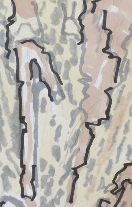
This image has texture, the outside bark, the curvy lines.
It also has contrast - the dark triangle against the light exterior.
Both these aspects, texture and contrast, help to suggest a three-dimensional quality
 |
| Palm Tree Trunk |
Abstract design 1 and 2, developed from the image of the tree trunk, could be carried out using these techniques:
- Raised shapes: trapunto
quilting, the shapes could be padded and the negative space quilted, or
the shapes could be held down by stitching and the negative spaces
padded.
- shadow quilting: with coloured fabrics placed under a sheer top layer the design could be achieved.
- Cut back quilting: where areas of the top fabrics could be cut back to expose fabrics underneath
 |
| Abstract design 1 |
 |
| Abstract design 2 |
Abstract design 3, also developed from the image of the tree trunk, could be carried out using these techniques:
- Gathering and pleating: the design as it stands, looks like it has been tightly gathered in some places, loosely in others.
- Corded / Italian quilting would deal with the wavy lines.
- A combination of the above with some cut back work
 |
| Abstract design 3 |
These are not the images I want to choose to develop for Stage 4.
There is a three-dimensional quality to each of the images, but a lack of texture.
Although the techniques that I have mentioned would certainly add texture to the finished piece.
Palm Leaves: for my original comments please see
Stage 1 & 2, and
Stage 3.
This image has lots of texture, it is spiky, it has shadows.
There is a three-dimensional quality to this image - the leaves come forward in the picture, the leaves cast shadows.
 |
| Palm Leaves |
Suggested techniques for this image are:
- Pleating and gathering: to create the folds in the leaves.
- Moulding: if the fabrics were soaked in PVA the leaves would hold a shape.
- Quilting: the palm fronds would stand out and leave shadows in the background fabric if quilted.
This is not the image I want to choose to develop for Stage 4.
Although
this image is bold and has texture, I still feel it would be best
developed into a design for print, different colour combinations could
be sampled to show the design at its best.
I think if I chose to develop this image for a final sample, it would end up looking too similar to the original image.
The image that I have decided to work from:
Tree Bark:
I have chosen this image because it has bold textures and there is a three-dimensional quality to the image.
There
are several layers to the tree bark, some areas appear to be rough and
peeling, the top layers appear smooth and weathered.
For my original comments on this image please see
Stage 1 & 2, and
Stage 3
 |
| Tree Bark |
These are the images that I developed in Stage 2:
Image 1: a soft tonal sketch
 |
| Tonal Sketch of tree bark |
Image 2: soft tonal sketch with added definition
 |
| Tonal sketch with definition |
Image 3: Using the pictures above I cut away areas of white paper to represent the peeling bark
 |
| Areas cut out of white paper |
Image 4: Photocopying the image to see if the design would work as a repeat pattern.
 |
| Image 3 made into a repeat pattern |
As I look through the development of the original tree bark image, I like the work that has been done so far, but.....
I
feel that I would either have to make a really large sample to include
all the detail, or, make a smaller, more crowded design.
The remit from the course handbook is to keep the sample to approximately 30cm square.
With this in mind I have taken a small section from image 2:
This is a more manageable section to work with, the layers and textures can be seen in this image.
 |
| Small section of Image 2 |
I then produced a repeat pattern of the section above:
 |
| Repeat pattern x 8 |
This is already starting to be more interesting visually.
I produced a larger repeat:
 |
| Repeat pattern x 32 |
I then created an even larger repeat pattern:
 |
| Repeat pattern x 128 |
I intend to produce a sample based on these repeat patterns.
At
the moment the design looks quite flat, almost like a wallpaper,
hopefully by using some of the techniques that I have used throughout
stage 4, the texture can be reintroduced to the design.
Creating the final sample for stage 4:
The
constraints that are given in the handbook, for this sample, are that
we should use a plain fabric - such as calico; and that the sewing
threads should be the same colour, as the fabric, so that they will
disappear into the background.
With this image in mind:
|
| The inspiration for the sample |
I looked back to the fabrics I selected in Stage 2:
 |
| Fabric selection for tree bark |
I realised that this selection included a very wide range of colours and textures, and that I may have to be more selective.
Initial thoughts for creating texture, layers, shadows:
- layers of sheer fabrics could create a shadow effect - shadow quilting.
- gathered muslin, cut or slashed to reveal darker fabrics underneath.
- muslin gathered using dark 'thread' made from strips of fabric.
- layers could be created by burning through layers of fabrics with a soldering iron
- some areas could be cut back, others could be padded out - these parts would then recede or come forward.
I decided to cut a piece of calico 30cm square to give me a visual reference for the finished size of the sample.
These were the decisions that I needed to consider before I started:
- Whether I would bond fabrics together to give the effect of colour
in the sample - I decided not to, the suggestion, "Don't use the fabric
as a background to attach other pieces to", had been given in the
handbook.
- Which parts of the image receded, and which parts 'came forward',
before I constructed the sample - the layers of bark shown in the source
photograph were an interesting and an important part of the image.
- Whether I would 'colour' the calico, possibly by burning the fabric.
- How to create texture with the fabric: one possibility was that the
calico could be padded and caught down, with stitches, on to a base
fabric.
I then put away most of the fabrics, I was left with
the calico square, a dark brown fabric (this had a wood colour and some
texture) and a piece of creamy coloured voile (for shadow work).
I had the drawing at the side of the fabric, so that I would be able to reference the image.
I did not want to work with just the design, but also to work with the type of fabric I had chosen.
Step 1:
- Calico (top layer), and dark brown fabric (bottom layer) were pinned together.
- I marked, with a fine pencil, the outline of the motifs from the image, on to the calico.
- With my sewing machine (stitch length - tiny), I stitched either
side of the line. This created a pair of parallel stitched lines (1/4"
gap between the lines).
- With a small, sharp pair of scissors, I cut between the lines, (calico layer only), this revealed the fabric below.
 |
| Step 1: cutting between the lines |
Step 2:
The sample looked as if it had a wood grain running through it, so I decided to add a central oval to the motif.
I
used the same technique to create the oval as in Step 1: draw the line,
stitch either side, cut between the lines (on the calico only).
 |
| Step 2: Adding ovals to the design |
This is a photo of the reverse of the design at this stage.
You can clearly see the parallel rows of stitching that form the design.
 |
| The reverse of the design at stage 2 |
Step 3:
- Looking at the paper design, I found that there was a repeating
'line' that appeared between the motif that I had stitched on to the
fabric.
- I drew a design based on these 'lines' that I would use to fill the blank spaces.
- The image was photocopied several times on to a thin paper, and this was pinned on to the calico.
- Using a small stitch length, I machined along the lines that were drawn.
- Because the paper was thin, I was able to pull the paper design away once the design was stitched.
 |
| Stitching on the lines of the design |
When the paper was torn away it looked like this:
 |
| The design after removing the paper pattern |
The reverse of the sample at this stage:
 |
| The reverse of the sample at this stage |
Step 4:
Once I had filled all the blank areas with the new design, I looked at the sample.
I
had to decide what was going to happen to the stitched line design:
would I pad, Italian quilting, the lines, or, would I cut between the
lines as I had done with the other motif.
My decision was to pad the lines - this would add another 'layer' to the work.
I
thought that if I cut between the lines - the design would start to
look uninteresting - there would be no focal point, no visual
differentiation, all areas of the design would be the same.
Using the Italian / Corded quilting technique, I threaded a large eyed, blunt needle with cream yarn.
The
needle was 'poked' through the brown fabric, from the reverse of the
sample, and threaded carefully along the stitched channels of lines.
The brown fabric had a loose weave - so I was able to pull the needle in and out of the backing fabric fairly easily.
This is the sample when some of the Italian quilting had been completed:
 |
| The sample with some of the Italian quilting completed |
A close up of the Italian quilting:
 |
| A close up of the Italian quilting |
The reverse of the sample at this stage.
Here you can see the yarn that has been threaded through the stitched channels.
The ends were all stitched in place afterwards..
 |
| The reverse of the sample during the Italian quilting |
Once the lines were all padded (and my fingers numb from pulling the needle through the fabric), the design looked like this:
 |
| Completion of the Italian quilting |
A close up of the Italian quilting:
 |
| Close up of a section of the sample |
I was quite happy with the sample at this stage.
I had achieved several different layers:
- the cut back area showing the brown fabric, complete with interesting shadow.
- the surface of the calico itself - with shadows as the fabric creased after the Italian quilting.
- the raised area of the Italian quilting, this area is also brighter
in colour - the cream yarn that was threaded through made the fabric
look 'cleaner' in the quilted areas, than the calico that was backed
with the brown fabric.
But, there wasn't enough texture.
The original image of the bark had layers that peeled and flaked, this sample was nice, but not textured.
I decided to quilt the sample.
Step 5:
- I cut a piece of calico and quilt batting just larger than the sample.
- These were layered together with the sample and pinned together: bottom - calico, middle - batting, top - sample.
- I reinforced the design by stitching over the lines from step 1.
This would emphasize this part of the design (I only stitched on one
side of the parallel lines).
- I stipple quilted around the ovals that were in the design - leaving
the ovals to 'stand proud', raised above the quilted surface. The
stipple quilting represented the marks and textures of the wood.
- I decided to stitch a small circle in the middle of the Italian
quilted lines - this had two effects: to hold down and secure parts of
the fabric and the design; and to add depth.
The finished sample:
 |
| The finished sample - with quilting |
Close ups of the design:
Close up 1:
this shows the Italian quilting after the surrounding areas have been
stipple quilted, also with the small circle stitched to hold the centre
of the design down.
This part of the design now appears to be more padded - it really stands out against the background.
 |
| Close up 1: Italian quilting |
Close up 2: this shows the stipple quilting.
On this close up you can really see how the oval is raised up and away from the quilted areas.
 |
| Close up 2: stipple quilting |
Observations and general notes:
- The
design I chose worked well with the techniques I sampled during stage
4, raised and structured surface textures: I created shadows, layers,
parts of the design receded, parts protruded, it became very three
dimensional.
- I would normally prefer to create pieces using
pictures and colour: applique, paint and stitch etc, so I was very
pleased to be able to achieve a good result using texture:- the design
showed clearly just with the use of fabric manipulation techniques.
- I
liked the limited colour palette of the finished sample - I would
normally add colour. This sample turned out well, it was simple, had
clean lines and lots of texture.
- I chose not to use voile in the final sample - I felt that the overall finish of the piece was complete without extra fabrics.
- I
was pleased that I took the time to develop and simplify the design. I
always liked the initial images that I drew, based on the photo, but I
could not imagine where I would start when I had to create a fabric
sample. The development of the design made it easier for me to
concentrate on the lines and shapes in the simplified design.
---------------------------------
After
writing up 'What have you achieved?' (next blog post) I have the
prospect of creating, 'A piece of your own' to look forward to in
Project 7.
I have enjoyed reaching the end of Project 6,
although I have learned a lot of great techniques to use during this
project - I think I have also learned the value of research and planning
- to have a goal.

.JPG)


