Tuesday, August 14, 2012

Part Three: Project 6 - Understanding the Textile world

Investigating the diversity of style and design in textiles available to the consumer

There are a wealth of fabrics available to the consumer today, from the specialist hand printed textile to the mass produced factory printed textile.

Styles and designs often go 'in' and 'out' of fashion all the time
This months editor's letter in Elle Decoration covers this theme:
"How can one thing, or look, be defined as 'good' or 'in' and another therefore be deemed 'bad' or 'out'?"
How much of the style and design that is around us in magazines and retailers is really our choice? Are we guided in our decisions, or just dictated to?

Environmental and economic concerns have brought back the 'make do and mend' philosophy, as well as ethical concerns: consumers questioning the where, the how and the who by.

Mark Thomas examines the ethical and environmental issues of the garment trade in The People's Manifesto. He questions how to tackle the consumer, who ultimately wants a 'reasonably priced' (cheap) item, with their expectations of buying from ethically sound manufacturers. Mark states:
"You can't pay a quid for a three-piece suit and expect to find a Fairtrade logo on it"
Consumers are becoming affected by not only the choice of designs that are available in the market place; but also by the type of company that is offering those designs. Is the company ethically and environmentally sound?

My first introduction to being aware of a furnishing fabric was a pair of curtains.
The curtains followed us from house to house, they were old fashioned, dark coloured, "why couldn't we just throw them out and buy some new one's?" I constantly asked.
I was told that they were very good quality, and that they would be staying - unlike me if I continued to moan.
The curtains are alive and well today, they are a beautiful pair of William Morris fabric curtains, and I'm glad my mother didn't listen to me.

This is the fabric design that my mother chose to make her curtains from:
William Morris design 1883
It is a design for an indigo-discharge printed textile.
They were a pair of full length curtains made with a width and a half of fabric in each curtain.
My mother made them herself  with a run and fell seam. The pattern was perfectly matched.
She bought the largest amount of fabric that she could afford at the time - from Birkenhead market in the 1960's, sadly she never lined them so there is a little sun damage.
                                                           -----------------------------

William Morris (1834 - 1896)
"Have nothing in your house that you do not know to be useful, or believe to be beautiful"
William Morris was a leading member of "The Arts and Crafts Movement" (c. 1860 to 1910), this movement began as a direct reaction to the Industrial Revolution.

Its members feared that the current period of industrialisation would mean a lowering of standards in the production of goods. Traditional skills and crafts would be lost to the mechanised process.

Hand crafted objects were deemed to be of superior workmanship than those made by machine.
Rural craftsmen were said to have a better lifestyle to those who worked in mills and factories in the towns and cities.

The members of the Arts and Crafts movement formed themselves into crafts guilds. The guilds were based on medieval principles, they were there to ensure and encourage high standards of design and to provide a supportive working environment.

William Morris was an artist, designer, printer, typographer, bookbinder, craftsman, poet, writer and champion of socialist ideals.

In 1862, he created his first wallpaper designs, these were produced in 1864, for the company Morris, Marshall, Faulkner and Co.
William Morris "Daisy"
William Morris "Trellis"
William Morris "Fruit"
Jasmine Trellis was his first fabric design in 1868:
Jasmine Trellis
The fabric was printed using hand woodblock printing instead of the more popular and quicker method of roller printing.
Morris also went on to learn, and to reinstate: indigo dyeing; using vegetable dyes, instead of chemical dyes, in the production of his printed textile designs.

By the 1880's Morris was an internationally renowned and commercially successful designer and manufacturer.
William Morris died in 1896.

The Arts and Crafts Movement eventually failed.
Their ideal, to produce affordable, quality, hand-crafted designs for the masses, was unachievable. The high costs of production meant that the designs that were produced could only be purchased by the wealthy.

The work of William Morris, however, lives on.
In 1940, Arthur Sanderson & Sons bought the company "Morris & Co Artworkers Ltd.
The purchase included all printing blocks, showroom wallpaper and fabric samples, stocks and stand books.

In 1965, Morris & Co wallpapers and fabrics were re-launched by Sanderson.
Just in time for my mother to create her wonderful curtains.
In 1985, the brands "Sanderson" and "Morris & Co" were marketed under their separate identities.

The designs are traditional and still manufactured in the United Kingdom.
The fabrics used are cotton and Linen.
The prices not only reflect the quality of the manufacturing process, but also that as a consumer you are buying a design that is timeless - one that you won't get bored of in a year.
                                                        ------------------------------------


Timorous Beasties: founded in Glasgow in 1990 by Alistair McAuley and Paul Simmons.
This company specialises in printed fabrics and wallpapers, although they also work with graphics, furniture, ceramics, glass etc.

They are known for textiles that, like William Morris' work, are printed with insects, plants, birds and animals, but these images are unusual, wondrous, contemporary, and as far from the traditional as you can get.

Featured below are some of Timorous Beasties designs:

Glasgow Toile: printed linen union
On first look this fabric resembles a traditional 'Toile de Jouy', but this is a design that has been brought up-to-date.
A closer inspection of the fabric reveals images depicting the under-belly of urban social realism, these are shown against the back drop of familiar, landmark buildings.

Timorous Beasties "Glasgow Toile"
Birds n Bees: printed Linen
Timorous Beasties "Birds n Bees"
Devil Damask: printed Velvet.
Timorous Beasties "Devil Damask"
Timorous Beasties hand-print many of their fabrics and wallpapers in their Glasgow Studio.
They offer a bespoke service that extends from custom colours to original artwork.

The company has been awarded 'Best luxury Design Talent' (Walpole 2010 awards in London). This was in recognition of the quality of their product, their innovations and designs.
                                                           ------------------------------------

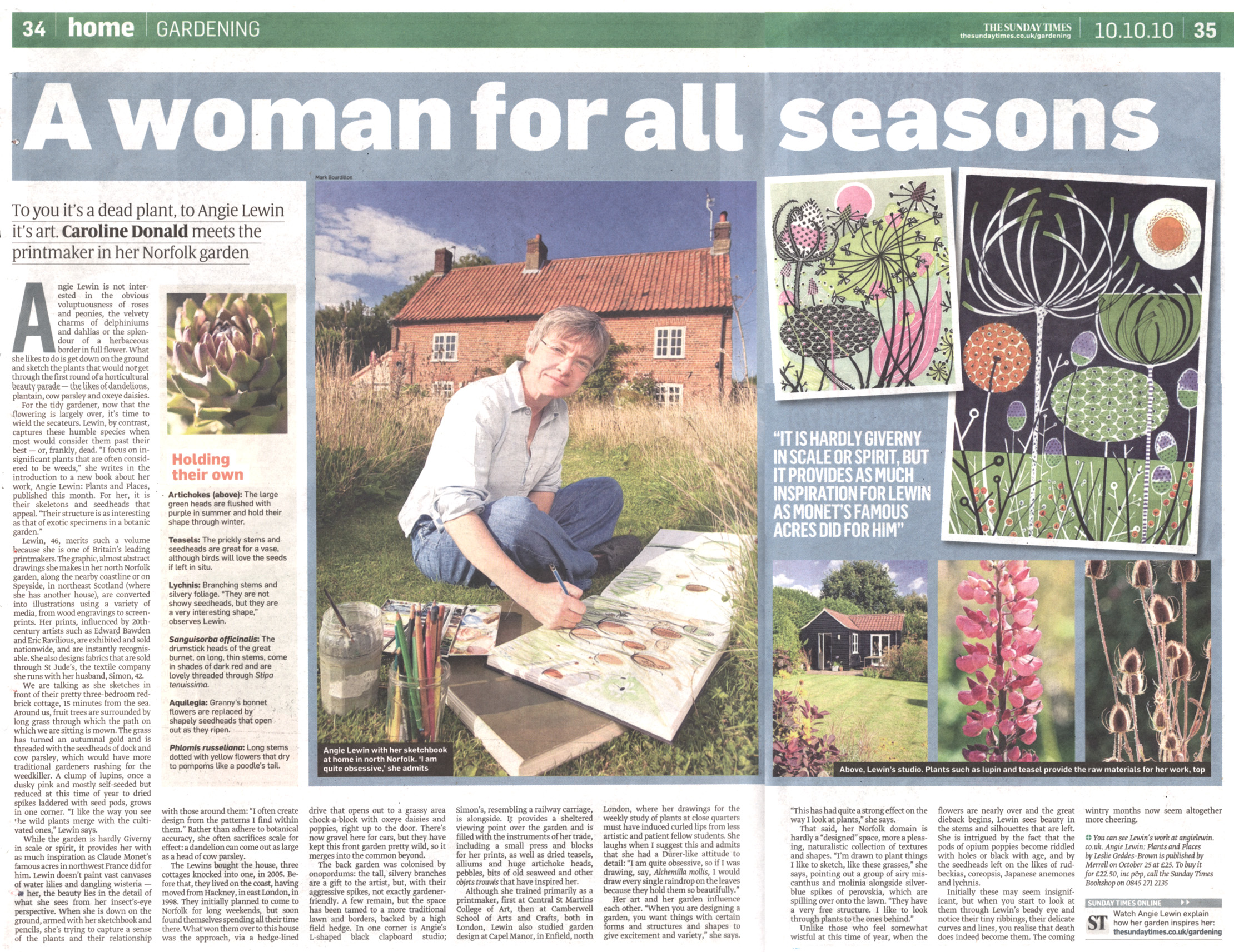
Angie Lewin: is a member of The Royal Society of Painter Printmakers, The Society of Wood Engravers and The Art Workers Guild.
She is also one of the founders of St Jude's a company whose workshop is based in North Norfolk.

St Jude's works with an eclectic range of artists producing a wide range of printed designs.
The fabrics are screen-printed in short runs within the United kingdom.

Angie Lewin was described by The Sunday Times as:
"...one of Britains leading printmakers."
She is inspired by the clifftops and saltmarshes of the North Norfolk coast and the Scottish Highlands.
Angie captures the beauty of insignificant plants, such as weeds, dandelions and seedheads, the ones that are in our everyday natural environment. She says:
"Their structure is as interesting as that of exotic specimens in a botanic garden."
Some of Angie Lewin's fabric designs:
Dandelion Two: printed heavy weight cotton
Angie Lewin "Dandelion Two"
Dandelion One: printed heavy weight cotton.
Angie Lewin "Dandelion One"
Hedgerow: printed heavy weight Oyster Linen Union.
Angie Lewin "Hedgerow"
Seedheads: printed heavy weight cotton.
Angie Lewin "Seedheads"
She is an artist who works with linocuts, wood engraving, lithograph and screen prints.
Angie is inspired by the work of Eric Ravilious (1903 - 1942), Graham Suthland (1903 - 1980), Edward Bawden (1903 - 1989), Peggy Angus (1904 - 1993) and Enid Marx (1902 - 1908).

Using traditional techniques, with a meticulous eye for detail she creates beautiful designs.
The designs are based on nature, but have a contemporary look, and a colour palette of the past.
The small print runs and the hands-on approach to her work ensure a unique and long lasting design.
                                                              ----------------------------

Marimekko: began in 1951. The founders were Viljo and Armi Ratia
Marimekko is a Finnish textile and clothing company renowned for its original prints and colours.
Their designs are:
  • Timeless: the designs and products will withstand time, they are classic and beautiful. You will want to keep hold of them for years.
  • Quality: Marimekko make practical and lasting products. They are durable - this is a key indicator of a product with an ecological quality.
  • Appropriate: Good design is beautiful, also practical and functional
Until the 1970's all Marimekko fabrics were printed by hand.
Once the manufacturing process was upgraded, production was able to increase.
The printing factory is still based in Helsinki, Marimekko have continued to invest in new printing technologies which has allowed their production to continue to grow significantly over the last decade.
Owning their own printing factory has meant that their designers can work hand-in-hand with skilled technicians, overseeing the quality of the product and design during manufacture.

Marimekko respects ethical and environmental issues:
Any company who subcontracts to Marimekko are required to conform to a Code of Conduct - this is based on the ethical rules of the ILO (International Labour Organisation), and the BSCI (Business Social Compliance Initiative).

Subcontractors are issued with a list of chemicals which may not be used to manufacture their products.

Cotton is used for the printed fabrics that Marimekko produces.
As a company concerned with both ethics and the environment, they have had to examine the impact of cotton production.

They have weighed up the plusses and minuses of using cotton:
Plus factors:
  • feels comfortable against the skin.
  • it is a renewable fibre.
  • it breaks down at the end of its life cycle faster than synthetic fibres.
Minus factors:
  • cultivation requires a lot of water and often also pesticides.
  • tracing origin is difficult. Raw cotton fibres from different countries can be blended together by wholesalers before it is spun into yarn.
Marimekko continue to research alternatives to the use of cotton, at present there is no answer to which fibre is the most ecologically acceptable.
For now they use certified (organic cottonGOTS (Global Organic Textile Standard), and ordinary cotton.
They also use other natural fibres: linen, wool and also recycled materials.
They are commited to increase the proportion of products made from ecologically sustainable materials.

Some of their wonderful designs:
"Unikko": Cotton. Marimekko's iconic pattern. Designed in 1964 by Maija Isolda
Unikko 1964 by Maija Isolda
"Siirtolapuutarha": Heavy weight Cotton. Designed in 2009 by Maija Louekari.
Siirtolapuutarha 2009 by Maija Louekari
"Lumimarja Sateen": Heavy weight cotton sateen. Designed by Erja Hirvi.
Lumimarja Sateen by Erja Hirvi
"Hetkia / Moments": Designed by Maija Louekari. This design represents the main street of Helsinki.
Hetkia / Moments by Maija Louekari

In order to reduce waste Marimekko gather the fabric remnants that the cutting machine has left behind, these 'scraps' are rescued and given a new life.
They become beautiful purses, or as Marimekko describe them:
"Cheerful little holders that have delighted the world over for nearly half a century."
This is one that was made using the Mini-Unikko fabric:
Marimekko purse

Marimekko is a company based on traditional design ethics: attention to detail, classic designs and quality workmanship.
It is also a company that has kept these ideals whilst continuing to grow.
                                                         ---------------------------------

Cath Kidston: is known as a British fashion designer, business woman and author. She opened her first shop in London in 1993.
Her company, Cath Kidston Ltd, sells home furnishings and related goods.
She is well known for her nostalgic floral patterns.

Her designs and products are always both practical and quirky.
"We work hard to ensure our products are pretty, practical and affordable"
This was said in response to the success her brand has had during the economic downturn in Britain.

Her designs are easily recognised they have that "Cath Kidston look" , the designs are as well known to the consumer now as Laura Ashley's designs were throughout the 1970's.

Some of the Cath Kidston designs:
Bath Flowers: printed cotton
Cath Kidston: Bath Flowers
Rose Bunch: printed cotton
Cath Kidston: Rose Bunch
Rose White: printed cotton
Cath Kidston: Rose White
Mini Strawberry Print: printed cotton
Cath Kidston: Mini Strawberry Print

Cath Kidston and the environment: a collaboration between Cath Kidston and Tesco, led to the production of a reusable and sought after shopping bag.
The shopping bags were made from recycled plastic bottles.
About six million plastic bottles were used to make the bags - the end product saved the bottles from landfill.
Money was raised from the sale of the bags for Marie Curie Cancer Care.

The bag designs (Left: multi floral fashion print. Right: classic blue spot print)
Cath Kidston bags for Tesco 
These bags sold out fast, neither Tesco nor Cath Kidston profited from the sale of the bags.
The consumer was able to buy a designer bag for 3.50(GBP), support a charity and save the environment by reducing landfill.
An extra bonus was owning a well designed, hardwearing bag that you would be proud to be seen out with time and time again.
                                                              ------------------------------------

Orla Kiely: has been described by The Guardian as "the Queen of Prints".
The Orla Kiely label began in 1993 after she graduated from The Royal College of Art.
She is renowned for her instantly recognisable designs, they are stylised graphic prints and patterns using everyday motifs, they have a retro feel to them.
She has gained a loyal following due to the attention to detail and carefully chosen fabrics.

The Orla Kiely design business is based in South London, there, Orla works with a small team of people to come up with anything from the initial concepts to creating the finished products

Some of the iconic Orla Kiely prints:
Multi-stem:
Multi-stem design by Orla Kiely
Striped petal:
Striped petal design by Orla Kiely
Acorn:
Acorn design by Orla Kiely
Flower abacus:
Flower abacus design by Orla Kiely

Charitable causes:
Like Cath Kidston, Orla Kiely went on to collaborate with Tesco to produce a range of exclusive designer, re-usable shopping bags, effectively 'A Bag for Life'
This bag features the design: Scribble Pear; the fabric is natural jute and cotton.
Orla's Scribble Pear shopping bag
All proceeds from the sales of the bag went to support two different charities:

  • CLIC Sargent a children's cancer charity
  • the Royal College of Art - funding bursaries for textile students
By encouraging customers to reuse shopping bags, eventually we should become less dependent on single use carrier bags.

In July 2011, Orla Kiely was presented with an Honourary OBE, this was in recognition of her contribution to British business and the UK fashion industry.

Orla Kiely's company has generated significant funds for the following charities:

  • Maggie's Cancer Care Centres
  • Target Breast Cancer
  • The bursaries for textile students at the RCA (Royal College of Art)
                                                --------------------------------------

Clements Ribeiro: Husband and wife team Suzanne Clements and Ignacio Ribeiro graduated from central Saint Martin's College in 1991. They are currently based in London.
Clements Ribeiro have just designed a limited edition print for a range of clothing for John Lewis.

Their print for John Lewis: Indian style prints on silk mixed with handpainted black lace print:
Limited edition print for John Lewis
An ethnic influence for a modern fabric.
                                                        ----------------------------------

Ptolemy Mann: graduated from the Royal College of Art in 1997.
A recurring theme in Ptolemy Mann's work has been IKAT, a dye technique.
*IKAT: a dye technique used to pattern textiles, it uses a resist dye process on either the warp, or the weft fibres. The threads are dyed prior to weaving the cloth.

She has captured a contemporary look from a very traditional textile technique.
Some of her designs have been inspired by colour theory, akin to the Bauhaus school, where colours vibrate and appear three dimensional.

Ptolemy Mann's limited edition cushion for John Lewis: Chroma Cushion, Multi.
Chroma Cushion by Ptolemy Mann
Ptolemy Mann prioritises the impact of colour on wellbeing. Seen here in her bold and uplifting print.
                                                               ----------------------------

Looking at current textile designers does not tell the whole story of what styles and designs are available to the consumer.
Computers enable us to search for a particular print or design, sites are set up to resell 'vintage' or 'out of print' textile designs.
What was once old fashioned, could now have come back into fashion with a 'timeless appeal'.

Many of the designs feature the theme of nostalgia, this seems to have stemmed from the downturn in the economic climate, Steve Sharp, marketing director of Marks & Spencer,
"Nostalgia always becomes more important when times are tough."
This style has definitely resulted from the times we are living in.
Responsibility of the designer is as important as their prints.
If the product is tainted by negative stories in the press of the production process: the age, the conditions, the salary that is associated with their company; then sales will be affected.

Conversely, reading the lengths that some producers and designers go to, to ensure the product is lovingly made, will make me choose their brand over another.

I have enjoyed looking at all the work I have featured.
If I had to choose one piece above all the others?
I would choose Timorous Beasties Devil Damask, the design is clever, fun, it has a sense of humour.

But, for a piece that I would covet, and pass down to my daughter, and she to her daughter (not yet!) would be anything made with the Unikko design from Marimekko.
I love the colours - the sheer scale of the pattern. A small purse would make me happy too.
                                  

References:

William Morris
Twentieth Century Textiles by Francesca Galloway

Collection of the Morris Society: Rodgers Catalogue
http://www.vam.ac.uk/content/articles/t/the-arts-and-crafts-movement/
http://www.artyfactory.com/art_appreciation/graphic_designers/william_morris/william_morris.html

Timorous Beasties
http://www.timorousbeasties.com/about

Angie Lewin:
Angie Lewin: Plants and Places
http://www.stjudesfabrics.co.uk/collections/angie-lewin
http://www.angielewin.co.uk/work.htm

Marimekko:
http://www.marimekko.com/

Cath Kidston:
http://www.guardian.co.uk/lifeandstyle/2009/aug/09/cath-kidston-recession-floral-empire
http://www.cathkidston.co.uk/
https://secure.tesco.com/todayattesco/green/archive/hot_buy.shtml

Orla Kiely:
Pattern by Orla Kiely
http://www.guardian.co.uk/lifeandstyle/2009/may/10/ola-kiely-designer
http://www.fashionreview.co.uk/orla-kiely-fashion/
http://news.bis.gov.uk/content/Detail.aspx?releaseID=420278&NewsAreaID=2


Clements Ribeiro:
http://www.londonfashionweek.co.uk/designer_profile.aspx?DesignerID=1247
http://www.howtospendit.com/#!/articles/7859-need-to-now-clements-ribeiro

Ptolemy Mann:
http://www.ptolemymann.com/


Saturday, August 11, 2012

Part Three: An Introduction

Part three concentrates on working with fabric as the raw material, rather than stitch.
In other words - fabric manipulation.

The work will concentrate on activities in which stitch will be used as a means of assembling fabric pieces and holding structures together.
Shapes, colours and textures from my drawings and sketchbook work will be used as a starting point for ideas for development
Images have been created with fabric for centuries now: mending, patching, re-using, recycling.
Patchwork and embroidery have crossed the boundaries of class and culture: some may have started out of necessity - lack of money; others may have come to it as a hobby - a pleasant way of filling in their time.

The result is the same - beautiful creations that have become heirlooms over time.
Each piece with it's own story, a personal history.

I grew up at a time when it was usual, normal even, to hand down clothes to a younger child, to cut up clothes to make them into something new - now it is environmentally friendly.
Wearing your mother's old dress holds no horror any more - it's vintage clothing.
An old tea set can be up-cycled into something new and beautiful (see here)

On an entirely ironic note, about re-using and recycling, this is a quote from one of David Shrigley's work entitled "Artists talk about their work":
"I use a lot of found materials in my work. My latest piece is fifty identical pairs of children's shoes which I found in a charity shop. They're brilliant and they only cost fifty pounds"
The link to the cartoon is here, the 'all about David Shrigley' info is here.

Friday, August 10, 2012

Jean Draper and Dorothy Tucker

Two contemporary embroiderers whose work may have been influenced by Kantha embroidery - please refer to project 3 - Understanding the textile world

Jean Draper and Dorothy Tucker

Jean Draper joined TSG (Textile Study Group) in 1989, she is also a member of the 62 Group

In her Artist Statement Jean states that she mainly stitches by hand,
"The rhythm of the repetitive stitch - the gesture - is a very important aspect in the making of my work. My stitching is a form of drawing, an intensely physical activity; the actual process being as meaningful as the finished work."
The picture below shows Jean's work featured in Stitch - with the Embroiderer's Guild 
Making Waves by Jean Draper
Here she "makes waves" with a simple running stitch.
Running stitch is used in Kantha work for practical and decorative reasons.
The stitching on the cloth gives it a slightly wrinkled, wavy effect.

She is also interested in:
"how land is shaped by time and natural elements and is also affected by the generations of people who have lived, worked and left their marks upon it."
This piece is called Aftermath it represents the effects of fire on rocky hillsides.
Aftermath - Jean Draper
Kantha work has always been influenced by factors like climate and geography (amongst many others). The pictures will often 'tell a story' or depict day to day activities.
In 'Aftermath' Jean tells the story of the devastating wildfires that affected the Arizona landscape through her work.

The rhythm and the meditative quality of the stitching turns the work into something that,
 "visually resembles the surface textures of the land." 
The piece below is called Rock ruins and rock shadows - evening
Jean Draper
The surface textures of the rocks have been created by the techniques Jean uses in her stitching. As the piece has been stitched, waves and ripples appear across the surface of the fabric.

Once the work is complete she will,
"treat it with clay slip, paint and sandpaper, emulating wear and erosion, creating in the piece its own history."
In traditional Kantha work old sari's and cloth are used to create a new 'piece', the fabrics already have a story, a history.
The fabrics have an aged, soft appearance that you cannot achieve with new cloth.
Once Jean has aged her fabrics with sandpaper and clay slip they begin to tell their own story and have a history of their own.

In her interview with Workshop on the Web
Jean says herself that she wouldn't have been able to create the American south-west landscapes without her trips to India.
There she learned some of the stitching techniques that have gone on to influence her work.
In order to emulate the eroded rock structures Jean realised that she had to manipulate the fabric by changing the directions of the rows of stitching and applying more tension to those stitches.

So although not a traditional approach to Kantha work - Jean draper's stitching and the tales she tells through her work show an influence from this very beautiful folk art.


Dorothy Tucker is also a member of the TSG (Textile Study Group), joining in 1979.

In her Artist Statement Dorothy's current work is inspired by her research into traditional Kantha techniques, the designs and the stitching that are used to create quilts and throws.
"I love the tactile and visual pleasure gained from handling old worn cloth and stitching into it by hand. I find that this absorbing process expands and transforms my original drawing and leads me into finding ways to evoke what I have seen and experienced"
This echoes the traditional way of working a Kantha cloth where originally the designs were outlined using a needle and thread, focal points were then worked, followed by working motifs that 'filled in' the design. It was a way of working intuitively - the designs being developed at the pace of the stitching.

Below, the piece Marigolds is one of Dorothy's working samples which explores the translation of drawing into stitch.
Marigolds - Dorothy tucker
This piece which has it's roots in tradition is very much a contemporary piece.

Dorothy has worked in collaboration with other contemporary artists using Kantha as a theme.
Surjeet Husain and Jenny Bullen (both members of TSG) created the following pieces:
Creative Dialogue
This was their Creative Dialogue.
A sari was cut and divided into three, each of the artists then stitched their Kantha in their own style.
"Over several months of stitching, meeting together and exchanging emails, their creative dialogue turned into a celebration of how pleasure, inspiration and skills can be passed on informally from person to person."
Traditionally kantha's were not made for money, during the 1980's there was a growing interest in this type of embroidery and commercial ventures began.
Women worked together on these projects - this gained them a financial independence that they had not previously experienced.

The women would share their experience and knowledge. Some things changed with the advent of a commercial rather than a personal enterprise (designs would now be traced onto the fabrics rather than drawn by hand), however the old ways of several women working on one large piece remained unchanged.

Although Dorothy, Jenny and Surjeet's project evolved into not one large quilt, but three smaller pieces - their collaboration mirrors the work of the women stitching kantha in India. They shared their knowledge and ideas, they shared an experience together.  


Additional information gathered from:
http://en.wikipedia.org/wiki/Kantha
http://en.wikipedia.org/wiki/Nakshi_Kantha
http://www.sashaworld.com/kantha/kantha.htm
http://www.sashaworld.com/family/kantha.htm
http://kkantha.com/
http://kkantha.com/design.html
http://kkantha.com/artisans.html
http://www.craftandartisans.com/kantha-embroidery-of-west-bengal.html
http://kanthathreads.com/
http://www.philamuseum.org/exhibitions/364.html
 

Thursday, August 9, 2012

Part Three: Pausing between assignment 2 & 3

The pressure is officially now on....

Time was running out for finishing the work for this module, fortunately the OCA staff have come through and allowed me to extend the deadline. That deadline which seemed so far away at the start of the course.

I think my big mistake (yes, apart from procrastination) was not letting the staff know as soon as I encountered any problems (health and family issues, not "I just can't do it" issues.)

So, having just returned from the UK I know I have to concentrate and work hard for the next few months.

I have received good feedback on Assignment 2 and some constructive hints and tips from my tutor on how to make improvements to the work that will be presented for assessment.

So far the main pointers to look at are:
  • "your development would benefit from some opportunity to undertake practical workshops"
This will be difficult to achieve, but something I will try to book myself on over the next year - not being in the UK is a problem many of the OCA students have to contend with. A compromise to this could be setting time aside to experiment with different techniques and materials.

  • To try not to add unnecessary details to your work (the pencil shadows). Achieve a better result by concentrating on mixing the colours of the shadows with paint.

  • Read some basic design books to expand my design knowledge. (book list to follow)

Jean Draper's work will be added to the post.

  • When reviewing my work - "try to vocalise why an image works for you and not another. Trust your instincts, but always ask why."
I find this hard when I go to see an exhibition never mind when I look at my own work - this point is a real challenge.
I think I may need to take more notes as I work through an exercise.
I have always tried to say why I have chosen a certain image to work on - but realise that I forget to point out why the other images were not followed through any further. 
I try to update my blog post as soon as I finish each exercise - but even when I do that, I find time has elapsed from my first thought to finished piece.

  • Visual diary - "try to show that you are keeping a visual diary of ideas and especially sketches from what you are seeing in the visual environment."
This has been missed out so far - and I intend to address this.
I spend a lot of time thinking about things - but if I don't draw / write the ideas down - how will the tutor / assessor know that i think about design, colour, artists and textiles in ways that aren't just associated with the proscribed projects and exercises.

The suggested books are:
  • Colour and Fiber: Patricia Lambert, Barbara Staepelaere, Mary Fry
  • Kandinski: Point of line to plane
  • Basic Design: The Dynamics of Visual Form
By addressing these points I should be able to improve not only the quality of my work, but also gain a better understanding of the techniques and materials that I will be using (and get an "A"!)

Tuesday, July 3, 2012

Part Two: Project 5 - What have I achieved?

I have enjoyed project 5.

It took the drawing through to the design, and then, from the design to a finished sample in a simple progression.

Did I feel that I made a good selection from my drawings to use as source material for my design ideas?
I felt happy with the selection of drawings that I chose as source material for my design ideas.
There was a lot of potential in each of the original sketches.
I had many ideas in my head of how each drawing could develop before I started the samples, and of course the results were very different from how I imagined they would be.
I really enjoyed creating the repeat patterns, the unusual shapes that appear when reflecting and rotating the shapes added interest to the design.

Which fabrics did I choose?
I chose mostly fabrics with a smooth finish: satin and cotton.
I wanted to be able to produce a clean, crisp finish to the prints that I would be making.
I also chose neutral coloured fabrics: off-white and white, so that the print would show up clearly.
This may be something that I explore further as I work through the course.

Were the scale of the marks and shapes on my samples appropriate to the fabric? Would any of my ideas have worked better on a different type of fabric? Was I aware of the negative shapes that were forming in between the positive shapes? What elements were contrasting and what elements were harmonising in each sample? Is there a balance between the two that produces an interesting tension?
The scale of the marks and shapes on the samples were appropriate to the fabrics chosen.
I chose fabrics that were suitable for the ideas that I was working on, although sample 1 in stage 3 could have worked equally well on a sheer fabric.
I was very aware of the negative shapes that were forming in between the positive shapes - that was the aspect that I found the most exciting when developing the designs.
I found that the starfish design has the most 'interesting tension' in it: there were diagonal lines, unusual negative spaces; the lines created in the design made your eye travel to all areas of the image.

How successful do I feel my larger sample is? Do I like the design? Have I recreated or extended my ideas from the smaller samples so that there is a visible development between the two? Does my repeating design flow across the surface, without obvious internal edges? Do they make an interesting composition on this larger scale?
I really, really like my larger sample. It is not at all how I envisaged it would look.
It wasn't until I finished working on it that I realised how well the design turned out.
It is the negative spaces that make the design work; the starfish aren't the predominant image that you see when you look at it now.
I extended my ideas from the smaller sample: I kept to the same design, but developed the colour scheme.
The repeating design does flow across the surface of the fabric - there are no obvious internal edges, just lots of interesting shapes.
The composition works better on this larger scale, I think it is a very interesting composition.
                                            -----------------------------------------

The assignment is now packed in its red bag, I send it off to my tutor in the morning.
I am so glad this assignment is finished, I can't believe the amount of work that I have produced for it.
The really nice thing about collating all the work to send off to the tutor is seeing all the work together - the mountains of samples that I have made.....


Monday, July 2, 2012

Part Two: Project 5 - Stage 4

A Larger Sample

I sit looking at the range of samples that I produced for stage 3.
I enjoyed the process of making the samples and creating the designs on fabric - this was a very different experience from working with paper.

For Stage 4, I have to produce a larger sample. The choices are:

1: To make an extended version of a repeating pattern: a design that can continue beyond the edges of the sample and is not a complete unit in itself.

2: To develop an image or motif built up or extended to make a 'single unit' piece: the design will be complete within itself.

I had intended to experiment more at this stage, to work on the design in my sketchbook, to perhaps amalgamate several of the design ideas into a new motif.
After dwelling on this overnight, I decided to choose my favourite sample and work with it.
I thought I would see where the design took me.

The sample I chose to develop further was the starfish design.
The original sketch
Close up of the starfish
Starfish
Repeat pattern of the starfish
Repeat pattern of starfish: Project 4; Stage 4
Stylised design of the starfish. Based on the repeat pattern above
Stylised starfish sample: stage 3
I initially thought that I would reverse the stencil, making the background neutral and emphasising the starfish.
Looking back to the repeat pattern, I realised that what I liked most about the design was the negative shapes that were produced.

I decided to keep the stencil the same - but just make ALOT of them.
I cut out 16 stencils from sticky backed plastic.
My starfish stencils
I prepared my fabric: approximately 40cm x 40cm of off-white cotton sheeting taped on to a printing board.
I placed the stencils on top of the fabric to see how they would fit together:
The fabric allowed for 12 stencils.
I realised at this stage that each stencil did not require a frame around it, as I attached each one to the fabric I trimmed off any parts of the stencil that was not needed
Laying out the stencils
I chose the colour scheme based on this sample:
I liked the colours in this sample
I started to apply Napthol Red to the fabric.
At this stage the suggested guideline of 10 hours seemed a long way away.
Applying red Markal Stick to the design
This was where I realised just how long the project might take.
I stopped to have a tea break and to gather my thoughts.
Work in progress
Second tea break, half way through applying the background colour.
Half way through
Another tea break, at this stage I could see how well the design was working out.
Near the end ....
Having completed the bright red background, I added Dioxadine Purple, Light Gold and Pearl White to some of the shapes that were repeated throughout the design.
Adding more colours to the design
I really liked the way the colours were working, but felt it needed 'something else'.
Turquiose was added to areas in the design
Adding turquiose
I decided to see what the design looked like once the stencil was removed.
I thought it may have needed over printing with small stars.
Once the stencil was pulled away I realised my design was complete.
Finished design with stencil removed
A close up of the finished design.
Close-up of the design

I am very happy with the finished design.
The colour combination works well.
Using strong colours in the negative spaces of the design makes the design look very different to the original repeat pattern.
The starfish are now almost lost in the design.

The stencils worked well, occasionally part of the stencil would come unstuck and there are some blurred edges.
The fabric was also a good choice. The smooth finish helped produce a nice crisp design.
Markal sticks worked well to colour the fabric - the shading worked very well. Applying the initial layer of red took a huge amount of time - maybe try to learn how to use my silk screen next time.

I have such a feeling of relief that I have now completed this project - now to send off my second assignment.
                                              ------------------------------------------------
Finished page: