Monday, April 9, 2012

Part Two: Project 5 - Interlude: Stage 1

Preparation.

I made a printing surface by following the instructions in the course book.

I took a piece of wood approximately 50cm x 70cm.
Covered it with 2 layers of quilt batting.
Added some sheeting material.
The edges were then stretched taut and held tight with a staple gun.
Printing Board

I didn't make a printing pad, I intend to use rollers or brushes instead.

I gathered together some of the equipment I have for printing and painting.
Some of my printing and painting equipment
This is a selection of:
  •  Markal paint sticks
  •  Sheets of lino, lino cutting tools and water based printing ink.
  •  Transfer dyes
  •  Transfer crayons
  •  Jacquard "Dye-na-flow" for sun printing and silk painting
  •  Cyanotype chemicals for "blue-prints"
  •  Softsculpt
  • Tyvek
I have also gathered together some other items for printing in a less conventional way:
  • white plastic erasers
  • stiff card
  • string
  • acetate
  • sticky-backed plastic
I have a collection of different types of paper (brown paper, photocopy paper, tissue, handmade papers, newspaper etc.) to use in this project.

I intend to experiment with many of these papers to see what effect the printing process has on them.
I will use some of them smooth, some crumpled, some folded and pleated.

I have also gathered my drawings and reference material nearby.

Stage 2 uses the following processes:
  • Block Printing and Relief Printing.
  • Masks and Stencils
  • Hand Painting on Fabric
Although some of these techniques are not new to me, it is a while since I have done any and I am looking forward to experimenting and recording the results.

It is probably better at this stage to make the move back to the kitchen table for Project 5, where there is space, lots of natural light, wipeable surfaces and a water supply.

Part Two: Project 5 - Interlude

Experiments with Printing and Painting.

I am really looking forward to this project.

After finishing project 4, mounting, labelling and uploading all the photographs, I felt as if I needed to lie down in a darkened room.
I took a day off, had some quality time with my family and now feel like I can face my coursework again.

The interlude: experiments with printing and painting, is exactly that.
Preparations that are essential to successful completion of Project 5.

Of the recommended books, I own Color on Paper and Fabric by Ruth Issett.
I also attended a workshop with Ruth Issett a few years ago at Textiles in Focus - held at Cottenham Village College near Cambridge.
This is usually held every year in February.

The book is full of pictures and instructions to create exciting experiments with inks, dyes and Markal sticks.
The workshop I went on enabled me to practise some of of these techniques over 2 hours with a fantastic tutor.

For Christmas I was given Print Workshop by Christine Schmidt
This book appears to be well laid out, has simple clear instructions and covers several hand-printing techniques, such as: relief printing, stencil printing, sun printing and image transfer printing.

In Stage 1 we have to prepare materials, surfaces and papers for printing.

This is where I may have to own up to several 'essential' purchases I have made over the past couple of years, it all began when I visited the Art Van Go studios in person ... it's just so much easier to be sensible when ordering online.

Monday, April 2, 2012

Part Two: Project 4 - What have I achieved

This has been a labour intensive project, but one in which all the building blocks of design and development have been taught.

I did feel at times that the instructions were 'wordy' - I had to read and re-read to get an understanding of where my work should be heading.

Overall though I enjoyed creating, designing and developing my sketches.

Did I manage to 'make space move'?
Yes I did!
I worked through Stage 1 which concentrated on using black squares and lines to create static and dynamic arrangements.
I then applied these practices to the rest of the project.
I was able to work out which images were static and calm, and which were dynamic and full of visual energy.

The knowledge acquired by working through this stage will help me in the planning stage and composition of any piece of art that I want to create.
It was also helpful when I was deciding on which images to work on and develop throughout the rest of the project - which images would be interesting and for what reason.

Was I pleased with the drawings that I did in Stage 3?
Yes I was.
I used Stage 3 mainly as an exercise in which to choose drawings with potential for Stage 4.
I completed design and development work throughout all the exercises in Project 4, but I sometimes felt that it was difficult to separate the work into the individual exercises.

Was I able to use my drawings successfully as a basis for further work?
I was.
I really enjoyed making the repeat patterns, I am looking forward to making stencils to screen print with from these designs.

I also felt that some of the sketches that were developed took me away from the original image, so I was able to look at it with fresh eyes.
The resulting developed images were often much livelier and interesting.

The worrying part for this section was knowing where to stop.
The development of an image is endless, and fun.

Having developed a good working method - do I feel confident that I can now carry on working in this way on my own?
Yes I do.
I enjoy painting and drawing, but the results are always more interesting when the image has been developed, and the composition has been thought about.

I think the methods and techniques that have been taught throughout this project will make me think harder about what I want to achieve before I put pencil to paper.
I should now be able to make more considered pieces of art.

Part Two: Project 4 - Stage 4

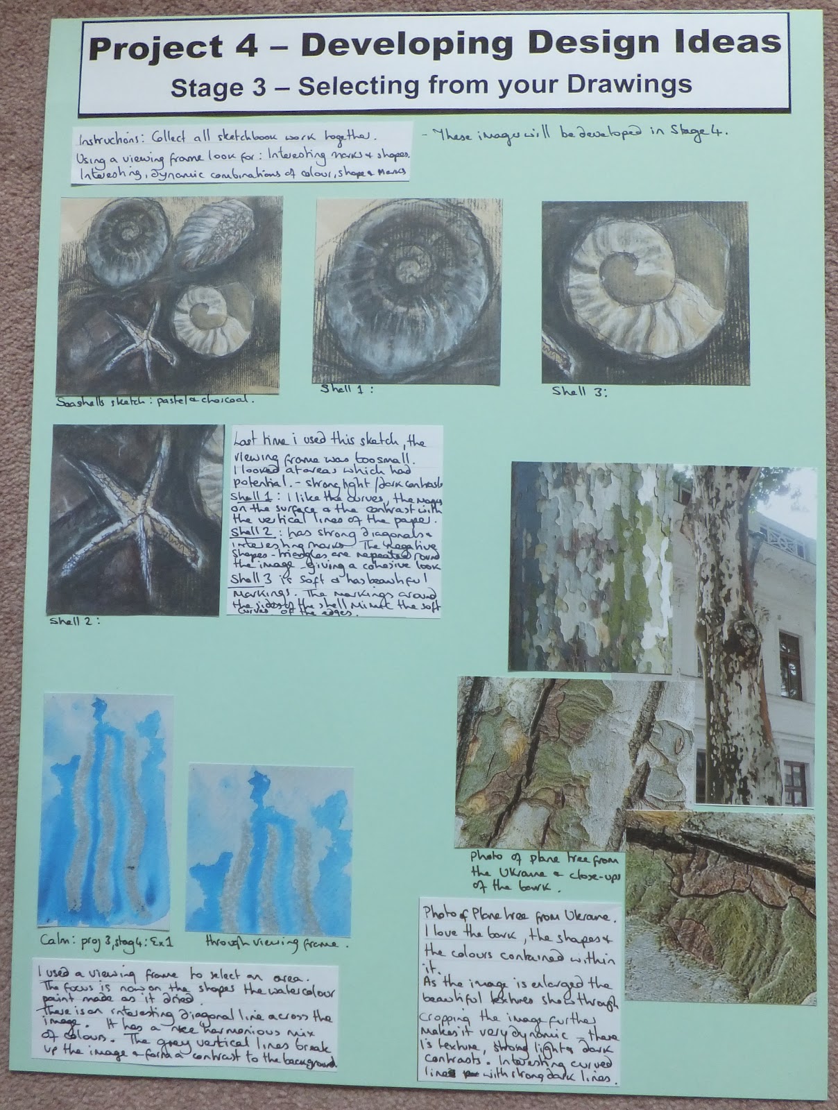
Developing Design Ideas

Stage 4 takes the observational drawings we have been working on so far, and uses these as a starting point to generate new ideas.

I decided to use some of the images I selected in Stage 3 for this exercise.

We were given some methods to use to help develop a series of visual ideas, such as:
  • redraw using a different medium
  • change the scale of a drawing by enlarging or reducing it
  • select interesting bits of different drawings and redraw them together to make a new drawing or image
Image 1: this was taken from project 3, stage 4, exercise 1
Calm

I decided to make a repeat pattern using this image.
After struggling to use Photoshop, I managed to create the patterns on PowerPoint.
Using the computer made developing the pattern easy. I was able to rotate and flip the image to create this piece.
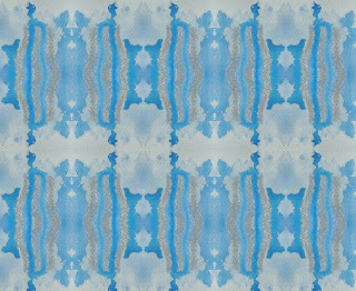
Repeat pattern of 'calm'
I really liked the shapes that were created using this technique.

I decided to remove the grey lines as I felt they were a visual distraction.
I painted sheets of paper with blue watercolour.
I cut out the images and created a collage that represented part of the repeat pattern. 
This made the shapes within the image clearer, but the delicate colour changes that happened within the original sample were lost.
After removing the grey lines: 'Calm'

I repeated the pattern with a vertical rotation.
Here the emphasis is on the lighter, central part of the reflection.
With vertical rotation

I repeated the pattern further.
This time adding a vertical and a horizontal rotation.
I liked the result better.
The emphasis is now on the darker, central part.
The middle of the picture resembles figures reflected in the water, with buildings in the distance.
With vertical & horizontal rotation

I went back to one of the earlier samples (the vertical rotation) and sliced the image into 1cm strips.
I placed and glued these on a white background.
I spaced the strips closely together near the edge, further apart towards the centre.
Slicing the image and placing it on white paper
This was a more interesting image than the original.

I used the same sample (vertical rotation) to weave with.
Using the photocopier I made 1 colour image, 1 black and white image.
These were cut and woven together to produce the following result.
Weaving with a colour and a black & white image
This is now a very abstract image, it would work well either as a background, or, the whole design process could start again.
First find your viewfinder..........

Image 2: this is one from a sketch featured in project 4, stage 3
Starfish

I used the computer to repeat and rotate the image.
Starfish repeated and reflected.

I then made the image smaller and carried on the process.
More repeats of the image
The shape of the starfish is now lost in the pattern, other shapes have taken precedence.
I decided not to carry on working on this design, but will keep a record of it for future projects.

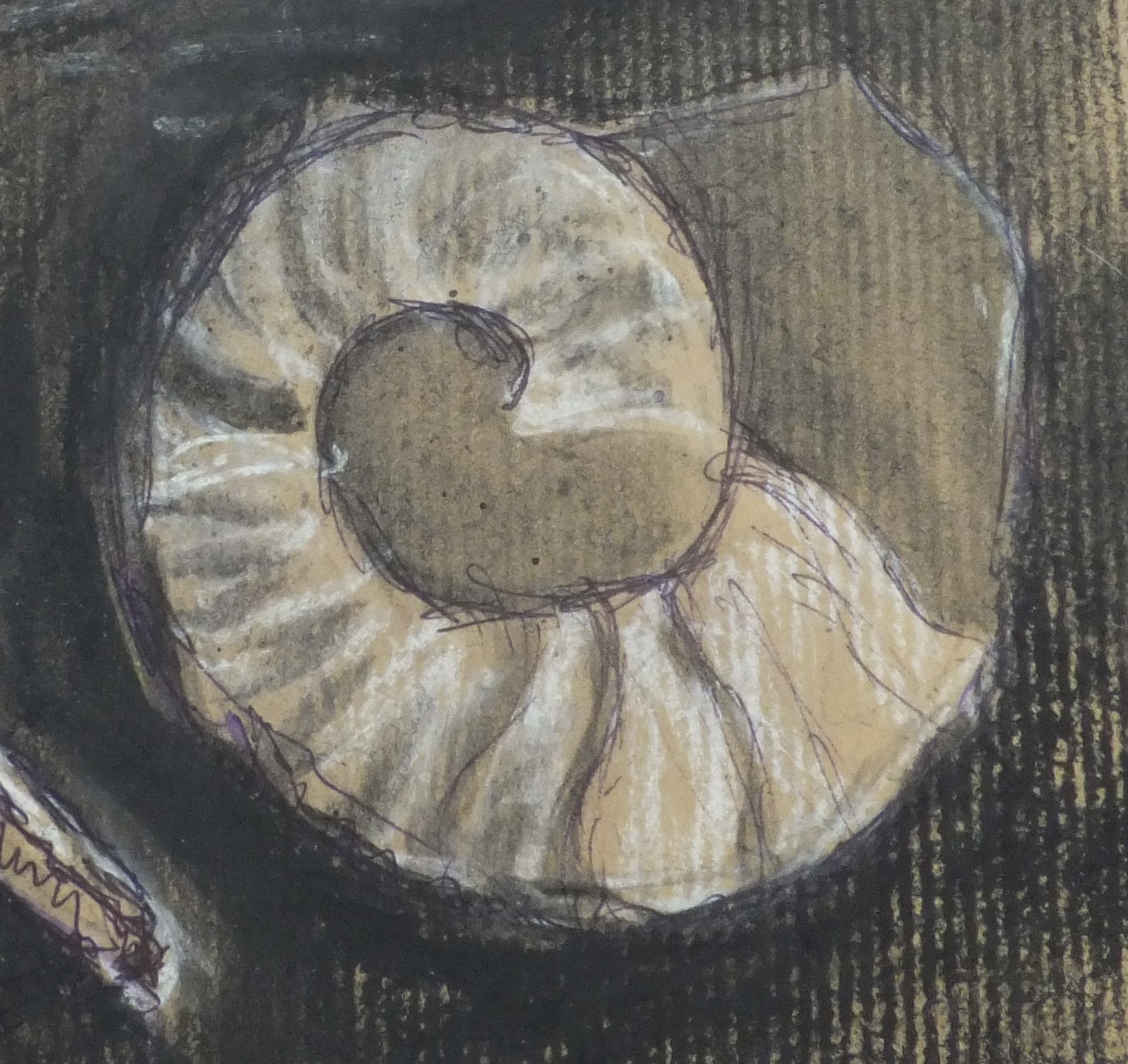
Image 3: from the same sketch as the starfish
Round shell

The image was reduced in size, repeated and rotated.
Image of shell, repeated and rotated
I liked the way the design turned out, almost like a batik.
Marks and shapes appeared once the image was repeated that did not seem to be there in the original sketch.

I went on to develop a picture based on the repeat pattern.
I liked the colours of the original sketch so I kept to brown, beige, white and black.
Materials used were: brown craft paper, cardboard, soft pastels and charcoal.
Design based on repeat pattern of round shell
This turned out to be very different from the original image.
It is very simple and would work well in a textile piece.
The next stage in the design process of this piece could have been to use brighter colours.

Image 4: from the same sketch as the starfish and round shell.
Shell

The image was repeated and rotated.
Repeated and rotated shell.
At this stage the shells were beginning to resemble sheep's horns.

I then reduced the image and, using the computer, repeated and rotated the image again.
More repetitions and rotations of the shell
I really liked the patterns that were emerging from the spaces between the shells.

I decided to work on the shapes of the shells.
I cut out several shapes from cream card and glued them down on brown paper.
I still liked the natural colourway of the original sketch.
Design using the shell shapes
The plain cream card on the brown paper backing looked too plain.
I then added drawn outlines of the shells, using charcoal and cream pastel.

I assessed the drawing again and added the ink marks to the cream card shells.
I used a different design on each shell.

I liked the drawing but still felt it lacked depth.
I decided to cut out parts of the brown paper.
Originally I was going to cut out small pieces from all over the image.
As I was cutting I realised these small cuts were very effective at leading the eye.
This was when I made the decision to cut out pieces from a small section of the picture.

I am really happy with the final image that I created.
It is very different from the starting point of the single shell.
This image resembles sand with the water running over, and in between, the shells embedded in it.

Conclusion.
I started this project with reluctance.
I felt I had done the development and design already at other stages in the course.
BUT, I am glad I persevered and developed these designs.

I like the work that I produced.
I was glad that I mastered the computer (although not Photoshop) so that I was able to produce the repeat patterns easily.
I remembered how much enjoyment is gained once you produce your own, original piece of work.

I know that sometimes ideas flow automatically, a piece or drawing can inspire you.
Sometimes that is not the case.
That is when these methods and ways of working will come in really useful, new ideas were generated easily by going through a few, simple stages.
                                                            --------------------

Finished Pages:


Sunday, March 25, 2012

Part Two: Project 4 - Stage3

Selecting from your Drawings

Stage 3 carries on with the idea of selecting an interesting visual image with the potential for further development.

We are to collect all drawing, colour and sketchbook work done so far.
Then, using a viewing frame, look for:
  • interesting marks and shapes contained within the area.
  • interesting, dynamic combinations of colour, shapes and marks.

There is quite a large body of work completed so far.
There are sketches I have done, work and samples produced for each of the exercises, as well as all the colour study and texture work.
Where to begin?

I returned to a sketch that I liked previously from project 4, stage 2.
Seashells: pastel and charcoal
When I looked at this image through a viewing frame in Stage 2, the area I chose to look at did not work.
This time I used a larger viewing frame for the picture.
This opened up the possibilities. 

I looked at the following areas which appear to have potential.
All the images have strong light and dark contrasts.

I really like the curved shape, the way the shell is rounded.
I like the marks that are laid on the surface of the image.
The soft, curving lines are in contrast to the vertical lines caused by the grain in the paper that run through the image
Shell 1

This image has a strong diagonal and interesting marks.
The negative shapes, the triangles, that form the starfish are repeated around the edges of the image, giving it a cohesive look.
Shell 2

This image is softer and has beautiful markings.
The markings around the sides of the shell mimic the soft curves of the edges of the shape.
Shell 3

I then returned to project 3, stage 4, exercise 1 to one of the samples that represented the word 'calm'.
Calm: oil pastel and watercolour
I used the viewing frame and selected the following area.
Calm: a close up
This focus is now on the shapes the watercolour paint made as it dried.
There is a diagonal line across the image, which I feel makes it more interesting.
It has a nice mix of harmonious colours, and an even mix of deep and light blue.
The vertical lines drawn in grey oil pastel break up the image and form a contrast to the painted background.

Looking through some of my source pictures I came across one of my photos that I took when we visited the Ukraine.
The Plane Tree
This tree had really beautiful bark.
I didn't have a photo which showed the bark at its best, so I found these images on the Internet.
This image was found on the following site
I love the shapes that are created naturally by the peeling bark, and the soft grey colours which are in contrast to the bright greens.
Close up of the Plane Tree bark

I then found another great close up of the bark on this site
The texture is now more evident and more dominant than the shapes from the previous image.
Detail of the bark
Cropping this image further makes it more dynamic.
There are some great textural marks within the picture.
There are strong light and dark contrasts.
I like the soft colours and the curving lines which are in contrast to the straight dark lines.
Using a viewing frame

Conclusion
These are the parts of drawings that I have chosen from my collection of work.
They are all interesting for different reasons.

Having found and selected these drawings; listing the reasons why I liked the images helped to formulate some design ideas.
I had to think about:
  • Whether it was the shape, colour or texture which was important. 
  • What it was about the composition that made it appealing
This seems to be a great way to start the design process.
I am usually guilty of envisioning a finished product before I start.

By working my way through a slightly structured investigation into an image, the results are bound to be more interesting.
It also is a great way to stimulate some inspiration and generate some new ideas.

These images are going to be developed in Stage 4.
                                                        ------------------------

Finished Page:

Saturday, March 24, 2012

Part Two: Project 4 - Stage2: Exercise 4

Looking for Shapes and Drawing 

Exercise 4 asks us to apply everything we have learned so far in order to draw from real objects. 

Instructions:
Find a collection of objects that are visually stimulating and group them in a way that looks interesting.
Then make a series of studies separating shapes, colours and textures.
Use any media and work on a scale that feels comfortable.

Remember:
  • to have a point of view or attitude when drawing.
  • to be aware of what is interesting about the group of objects.

The group of objects I chose were things that we have been using to create the work for each project.
These were: a machine embroidery hoop; a scalpel: large scissors; small scissors; a pencil; a rotary cutter; a paintbrush and a tube of glue.
The group of objects that I chose for Exercise 4
I rearranged the objects and drew the outlines of each object.
I was most interested in the shapes that would be created by the interlocking and overlaying of these objects.
The outlines of each object.
In order to try and see the negative spaces I made a monochromatic study of the group.
This enabled me to see the shapes contained within the arrangement, but I felt I needed to explore the design more.
Monochromatic study
I wasn't particularly interested in recording the real colours of the objects, so I produced a warm and a cool study of the arrangement.

So that I would not just see the real objects contained within the sketch, I painted according to the following rules:
  • Include all the lines of the objects.
  • Change colours each time a line is crossed.

Warm colour study:
With warm colours
Cool colour study:
With cool colours
I liked both of these colour studies and felt the warm colours were more successful.

Abstracting the shapes within the image helped me to see the different areas that were contained within the design.
The objects were no longer identifiable as individual, real looking items.

I liked these watercolour sketches but still felt I had not pushed the original image, the design had not developed.

I used a viewing frame against the original line drawing to isolate an interesting area.
I liked the strong shapes that were contained within this image.
Close-up of a section: Scissors and glue
I used some of the shapes that were contained within the above image to create a repeat pattern.
Using felt pens I used muted colours to see if the pattern worked.

Repeat pattern using shapes
Although I felt the design had some merit, I didn't think that I had taken it far enough.

I took the original line drawing and used it to make a stylised sketch.
I now had a more interesting arrangement of shapes to work with.

A stylised sketch of the line drawing.
I took a section from this drawing and painted the shapes contained within it, using black as a background.

Colour sketch in acrylics
I liked the shapes in the arrangement.
I was unhappy with the colours against the black background
I was also unhappy with the composition, I felt it was too cluttered.

I knew I had to narrow down the choice of shapes that I wanted to use.
I also needed to experiment with the shapes and the colour of the background.

I played with the layout of two of the shapes and the concept of using white as a background.
I used a strong alizarin crimson for one shape and a soft pink for the other, against the white background the difference in the colours was lost.
It still felt a little flat.
Shapes against a white background
I placed the shapes against a black background.
The difference in the colours of the shapes showed up better, but it still didn't work.
It felt dull and too minimalist.

Shapes against a black background.
I then painted a sheet of paper in shades of green, from bright to dark.
I hoped that the complementary colour would brighten up the composition.
I knew I had to think about adding some more shapes to the arrangement.


I was happier with the new arrangement.
I liked the effect of using two shades of green in the background.
The addition of the extra shapes helped to unify the composition.
With a green background

Conclusion:
I liked my final design and I enjoyed the design process.

My final image did not resemble, but was based on my original line drawing of familiar artist tools.

My emphasis throughout the drawing and design process had been the shapes and the colours.

When you look at the image your eye looks around the whole picture, it is unable to settle in any one place.

The final design was no longer static and dull, but vibrant and dynamic.
The colours were eye-catching.

I now feel more confident about my ability to design and develop a piece of work.
                                                          -------------------------
Finished Pages: