Sunday, February 12, 2012

Part Two: Project 3 - Stage 3: Exercise 4

Recording Colours Accurately:
I put off starting exercise 4.............. drawing, painting, getting out paper, looking hard..... I forget how much I enjoy pottering around mixing colours. 
There's no real finished project, there's only me to judge it (fortunately my family think everything I do is brilliant!) I just have to start.... The starting part is the hardest!

This exercise is about matching colours, but this time using real objects.

Place the objects on a piece of coloured paper, look hard and record the colours you see, not the ones you think you see!

Exercise 4:
I chose fruit for my objects - 2 apples (a nice green one and a red/green one), and a lemon, and placed them on coloured paper 

I made the mistake of starting this exercise in the evening under artificial light - there were highlights, but no interesting shadows, the colours were not changing as they should have done.

So I thought I would make a pencil drawing of the objects and work in colour in the daylight.

I worked for a little while using pencil, I cross hatched directional lines to give the fruit shape, create shadows and add depth. 
Initial pencil sketch of the fruit

I finished the sketch by using an eraser to add the highlights and more directional lines; black biro to intensify the darker shadows.
Adding shadows and highlights
I didn't prop the drawing pad up though, so when I looked at my finished drawing the shapes were all a little 'off'' (the above photograph shows the sketch from its 'best' angle!)

It was good to practice drawing the objects, although this was not a required part of this exercise. The actual instructions were, "Don't try to paint your objects as things."
                                             ------------------------------------------------

In the morning I started using colour, I also made the decision to use just the bright green apple and the lemon.
I placed the objects on a red piece of paper, immediately the colours of the fruit began to reflect the colour of the paper.
Apple and lemon on red background

I used watercolour paint and a round, soft, squirrel hair brush.

I used washes of colour, building up the layers.
Apple and lemon on a red background
Red tints appeared to be reflected on the surface of the lemon and the apple, green and yellow were reflected onto the shadows of the red background.
This influenced the colours of the washes as the paint was mixed.

The yellows and greens of the fruit became bright and warm in tone.

The palette after mixing the warm tones
"Prang" Semi-moist watercolours - warm colour mixes

Next, I placed the apple and lemon on a bright blue background.
Again, using washes of watercolour, I began to build up the layers of colour.
Apple and lemon on a blue background
The introduction of a new background colour changed the appearance of the objects.

Blue tints appeared to be reflected on the surface of the apple and the lemon, the green and yellow reflected on the blue background.
The blue in the background influenced the colours that were mixed for the fruit.

The greens and yellows of the fruit became cool and dark in tone.

The palette after mixing the cool tones:
"Prang" Semi-moist watercolours - cool colour mixes

Remembering the instructions, "Don't try to paint your objects as things." I thought I had better develop the work I had created, so that it would be a study of colour, not just a painting of fruit.

So, I cut up the pictures (well, a photocopy).
I really like the way the pieces randomly lay on the surface, the image being gently broken apart. 
One red, one blue picture cut up into 1cm square
Having the red and blue pictures near to each other shows the difference in the colours of the yellows of the lemon, and the greens of the apple.


I rebuilt the picture using 1 column from the blue picture, 1 from the red.
Rebuilding the picture in both colourways
Although using the photocopy allowed me to 'save' the original work, once the pieces were glued down the images were a lot paler than they had been.

I really like the sample I created using these mosaic pieces, it allowed the differences in the colours used in the two original samples to be shown together. It was a happy accident that both the red and the blue pictures were almost identical in size.

It was interesting to see the colours in the shadows change with the different backgrounds, and although I emphasized the shadow by drawing with a pencil into the wet paint, black paint was not used in the making of these works.

This was my favourite of the four exercises in stage 3.
With careful observation I was able to produce two very different paintings from the same source material.
  
It also makes you realise how important each component of a picture is, placing one colour next to another can dramatically change the feel of a picture.
                                                              --------------------------

Finished pages:
Initial sketch

With a red background

With a blue background

Mosaic in warm & cool colours
                                                 

Saturday, February 11, 2012

Part two: Project 3 - Stage 3: Exercise 3

Recording Colours Accurately:
Having got out a pile of fabrics for the previous exercise, I need to move them out of the danger area, well, away from the paints anyway.

I mentioned in an earlier post that moving my work area upstairs made life easier.....
It's also an easier place for my cats to be!
There's a nice soft bed, a pile of fabrics, and, if they get thirsty - there's always the painting water!!!!!

I now need to look for a postcard of a painting, or an image from my collection of resource material that is rich in colour for this exercise.

Exercise 3: We are asked to choose an image, to mask off an area and to record the colours as accurately as possible.

It sounds similar to the last exercise - again, concentration is required, patience and a little confidence in my abilities to mix a good range of colours.

I have decided to use acrylic and watercolour paints for this exercise, they are more transparent and are richer in colour than the gouache paint.

Having looked through my resource material I settled on an image by a Bahraini artist, Rashid bin Khalifa Al Khalifa, this is the book the work features in:
rashid, 40 years of painting
His images are 'particularly rich in colour'

The introduction of this book is written by Modhir Ahmed in 2008 (Sweden).
He tells us, "Shortly before his death, Picasso asked, "What is colour?" After 85 years of a relationship with colour he couldn't define it" - I feel this gives me a little longer to understand colour as a whole, maybe I should work really hard on these exercises after all?

Modhir goes on to say, "For me, colour can be seen but it can never be felt. It can never be expressed. It is absorbed into a personal vision, charged with emotional inferences." - Summing up accurately the emotions we are being asked to express in the world of colour and the mixing of paint throughout project 3.

This is the image I chose:
Fragmented figures III 2008
As well as the image being rich in colour, there is a lot of movement created by the brush strokes.
I really liked this image, several "fragmented figures" are featured in the book, all are colourful, all are beautiful, all feature the female figure.

Having chosen the image I then had to mask off an interesting area 5cm:
The image with a viewing frame
Selecting an interesting area was almost as difficult as selecting the image.
There is a lot going on across the picture, so, I moved the viewing frame around until I was happy with the chosen area.

 The viewing frame allowed me to concentrate on the area:
The masked area
I now had to mix and match a range of colours that could be seen within the area.
Mixing the colours was fun, you know the colour you want to create, but it takes a while to find the right balance of colours.

The idea was not to copy the image, but to record the colours as accurately as possible.
The masked area painted - colours annotated by the side
Having tested out several colours, I chose to work with a size 6 brush and one a little larger.
Using a dabbing technique allowed me to stop trying to re-create the image perfectly.

This was the finished sample - the hardest part, apart from the many layered colours I could see, was not to copy the image, just record the colours.

Conclusion:
I was glad I chose acrylic and watercolours in preference to gouache for this exercise, I think the matt finish of the gouache paint would have made matching the colours very difficult.

The layers of colour in the image made accurate matching very hard. I tried to work around this and added hints of the underneath colours, (in the masked off area), to the sample.

I feel that colour matching and colour mixing will become easier as time, and the course work progresses.

There is a value in recreating part of a picture that you find interesting, it makes you look harder at it, and I think it may also help you understand what it is you like about the image.
                                                                 -------------------------

Finished page:
Mixing and matching colour to an image

Friday, February 10, 2012

Part two: Project 3 - Stage 3: Exercise 2

Recording Colours Accurately:
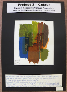
The last exercise was gentle, to sit and mix colours slowly and carefully; just make sure that there are no big jumps in colour..... now we have to find a brightly patterned piece of fabric and reproduce the colours at the side.

Well it sounds interesting, surely the hardest part is going to be finding a piece of fabric with a suitable scale for the design?

Exercise 2:
I went through my shelves of fabrics and narrowed the choice down.
My selection of fabrics
If the pattern was too small I felt the exercise would not work - the design at the edges of the piece of fabric would be too complicated.
If the pattern was too big, the finished result would not show enough changes in colour.

I finally found a piece of fabric, from my collection that I was happy with.
The pattern was interesting, not too big, not too small and it had some interesting colours.
I cut it into an 8cm square, glued it down onto a sheet of paper and looked hard at the colours around the edge.

My final selection
At the edge I could see blue, green, orange, brown - and all the shades of each colour.

Using gouache paint I practised mixing my colours and once I was happy with them I proceeded to paint.

As shown in the picture below I continued the colours and patterns produced at the edge of the fabric.
                                                      ----------------------------------------
Conclusion:
The gouache paint produces a flat, matt finish, whereas the fabric has a sheen to it - this didn't matter as it was only apparent once the paint had dried.

The hardest colours to mix and get right were the browns.

I was happy with the final result - you have to look hard to find the fabric in the middle of the painting. 
                                                      -----------------------------------------------

Finished Page:
Mixing and matching colours to fabric

Part two: Project 3 - Stage 3: Exercise 1

Recording Colours Accurately:
The paints have returned, the workspace is clear. 

I often find it hard to make a start when everything has been cleared - but having moved upstairs with my work things, it is slightly easier. 
The paints are where I left them - nobody has "tidied" and I can clear away when it suits me. 
The downside is having carpet on the floor - but, if I can find something to put down to cover it up, then I can relax. For now though, I'm just going to have to be careful!

Exercise 1:
We have worked through exercises which helped us to see colours more accurately, now we tackle the next important step of mixing colours.

At the start of project 3 we mixed colours and created a colour wheel.
The colours shown in the colour wheel were all intense saturated colour.
In this exercise we are asked to mix duller, paler, more dilute colours; we are asked to do this in the following ways:

1. Dilute colours with white to obtain paler tints:
Red, Yellow and Blue Primary Colours with White
With this sample I added the saturated colour to the white, this is far simpler and more economical with the paint than adding the white to the colour.
It took longer for red to reach the white than it did with the blue or yellow saturated colours. (The red line carries on a lot further than is shown in the picture)
With the addition of white, the colours became softer and lighter - a tint.
                                                   ----------------------------------------
                                    
2. Mix colours with black to take the light out of them and make them much duller:
Red, Yellow and Blue Primary Colours with Black
With this sample I added the colour black, very slowly, to the saturated colour, this is far simpler than trying to add the colour to the black.
It took longer for red to reach black than it did with either blue or yellow.
With the addition of black the colours became duller and darker - a shade.
                                                     ----------------------------------------

3. Mix colours with grey to make them less intense:
Red, Yellow and Blue Primary Colours with Grey
With this sample I mixed a large amount of grey and gradually added the colour.
With the addition of grey, the colours became softer and less intense.
                                                     -----------------------------------------

4. Mix pure colours with their complementary colour to make all the darker, duller tones of a particular colour:
Red, Yellow and Blue Primary Colours with their Complementary Colour
With this sample I added the complementary colour to the pure colour.
Yellow slowly became purple; blue slowly became orange; red slowly became green.
With the addition of the complementary colour, darker, duller tones were produced.
                                                         ----------------------------------

Conclusion:
I enjoyed this exercise, carefully adding a mixer colour (white, black, grey, complementary) in order to avoid 'jumps' in colour.
An example is shown below:
The addition of black
I used gouache paints to complete these samples due to the opaque coverage of the paper that this type of paint allows.

My favourite sample of the 4 is the one in which I added the complementary colour to the primary - the colours produced were interesting and lively.
Some of the tones produced would make an interesting addition to a painting, they are dark enough to be used instead of black.
Black seemed to deaden a colour whereas a colour toned down by its complementary seems to be livelier.

This exercise really proves you should never (if you can help it) use a colour straight from the tube.
Mixing colours will always produce something nicer and more natural than the straight unmixed colour.

I think this exercise is a great one to do to improve your colour mixing, it takes away some of the fear of using colour in your work.
                                                        -------------------------

Finished pages:
Mixing colours: adding black and white

Mixing colours: adding grey and complementary

Part Two: Project 3 - Stage 2: Exercise 2

Colour Perception:
My equipment is all to hand - apart from finding some grey paper, everything that is needed was used in the last exercise.

This is another exercise where I am going to have to look hard and study what I think I am seeing.


Exercise 2:
We are asked to glue down 9 bright coloured squares of paper (8cm square).
Then to cut out 9 small squares of grey paper (1cm square) and stick them in the centre of the large squares.
Next we are asked to look hard at the grey squares and see what colour they become, - the colour that is generated is an "after image"
Small Grey squares on 9 large Squares
I completed this exercise in artificial light, so initially I didn't see anything unusual, but, when I stood over the paper and kept the squares in shadow the after image appeared.


Each grey square took on a tinge of the complementary colour to the background.
When the grey square was on the red background - it took on a green tinge.
When it was on the green background it took on a reddish tinge and so on.


Conclusion:
This exercise was unusual - I hadn't seen this before, I'm glad I took the time and waited to see the after image.

This is something our eyes must register all the time, something that without completing exercises like this we would never notice or realise that it happens.
                                                        ---------------------------

The finished page:
Colour Illusion with grey square

Part Two: Project 3 - Stage 2: Exercise 1

Color Perception:
 The next two exercises deal with the deceptions and illusions that colour can create. They teach you to trust your eye not your brain!

The paints have been put away and a surface prepared (well, cleared!).

Exercise 1
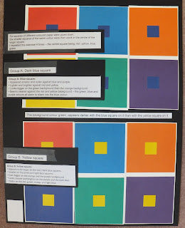
We are asked to glue down six squares of different coloured paper, then glue down six smaller squares (all the same colour) in the centre of the larger coloured square.
The larger square is 8cm, the smaller square is 2cm.

We are asked to make observations based on what we "see" happening, how the centre colour changes.

I repeated this exercise 4 times - with the centre square colour changing - I used: yellow, blue, green and red.

I knew I would see change, we've all looked at optical illusions, but taking the time out to see what they are...

These are my findings:
Central Blue Square
Blue Square:
The blue square appeared smaller and duller against the blue and the purple.
It appears lighter, brighter and bigger next to the red and the yellow.
It looks bigger against the green background than the orange background colour.
The blue square does not stand out against the green, blue and purple backgrounds - the colours bleed into each other.
                                                                -------------------------
Central Yellow Square
Yellow Square:
The yellow square appeared larger on the red and dark blue backgrounds, smaller on the green and light blue backgrounds.
It appeared even bigger on the orange and purple backgrounds.
The yellow square seems cleaner and brighter against the purple and dark blue; duller against the red, green, orange and light blue.
                                                             ----------------------------
Central Red Square
Red Square:
The red square appears to float against the background of green, but sinks into the background of orange.
It seems to be darker against the yellow and lightest against dark blue.
The red square is larger when placed on the dark blue square, smaller when placed on the orange square.
                                                              ---------------------------
Central Green Square
Green Square:
The green square appears darkest against the yellow background, lightest against the dark blue background.
It seems bigger when placed on the light blue, smaller when placed on the yellow.
It appears to float on the red background, but sinks into the light blue background.
                                                                -------------------------
In conclusion:
A great exercise that really makes you think - I keep revising what I think I have seen with all these colours.

I enjoyed this exercise, although it was a challenge, trusting what you think you see.

My eyes hurt by the time I had looked, looked and looked again - several times I called others into the room to see if they agreed with what I thought I had observed.

Sometimes they did - great; sometimes they didn't - I had to look again!

Several times I remeasured the squares to see that they really were the same size.

By the time I had finished, the colours began to float and move around.... time to look away before starting the next exercise.
 
Without working through this exercise I may have missed the impact and effect that one colour can have when placed against another.
                                                              -------------------------

The finished pages:
Colour Illusion with blue & yellow square

Colour Illusion with green & red

Wednesday, February 8, 2012

Part Two: Project 3 - an introduction. Stage 1

I've started my research and begun my sketchbook work, but thought I ought to post the work I've completed so far for Project 3.

Introduction
The project is outlined as simple colour theory and basic observation in colour perception.

"The Art of Color" by Johannes Itten (1888-1967) is a beautiful book which deals with contrast, saturation and hue.
The exercises in this project are a small part of the work that Johannes Itten wrote about and taught, he created the colour wheel as we know it today; an organised way of looking at colour.

It's been a while since I've done any colour mixing exercises, there's always a value in completing them, there's always something new to learn, even if it's recording and keeping a record of the colours you mix.

Preparation
I've gathered my materials together to create a colour wheel - I am going to use Gouache paint; this is an opaque paint which will show the colours produced cleanly and brightly.

I am creating a colour wheel with 12 colours - a 6 colour circle will have big jumps in hue, using 12 should ease this transition.

The completed colour wheel:

12 Colour Circle
The colours produced were marked on the wheel: I worked hard to try and have colours that flowed seamlessly from one to the other - I don't think you can practice enough!

Primary colours:     Red, yellow, blue
Secondary colours: Orange, Green, Violet
Tertiary colours:    Yellow orange/red orange; Red violet/blue violet; Blue green/yellow green.
Complementary colours: Red/green; Yellow/purple; Blue/orange - these are all found on the opposite side of the colour wheel.

The 12 colour wheel that Itten created:

It was a nice exercise - great to get the paints out again.

I always try to mix colours when I'm painting, the colours that come straight out of a tube often don't resemble the colours represented in nature. Once you start to mix your own, you are able to produce a nicer, deeper, richer colour.
                                            ----------------------------------------------------

The next stage is colour perception, time to pack away the paints and reach for the coloured paper!
                                               ---------------------------------------------

The finished page:
12 colour circle - stage 1: preparation